O R D E R A N D D I S O R D E R
|
order
ˈɔːdə/ noun
|
disorder
dɪsˈɔːdə/ verb |
ARTIST ANALYSIS
Thomas Lindahl Robinson
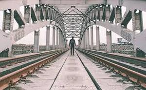
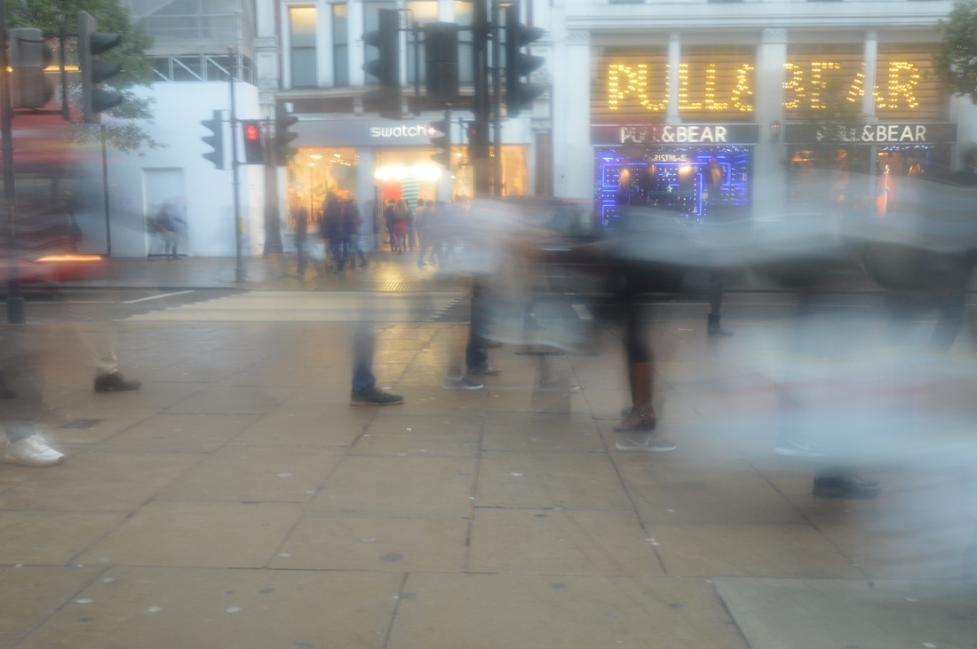
Thomas Lindahl Robinson's images really capture the rush and mayhem of everyday life, whether it is the physical movement of people hurrying from one place to another, or the movement of time and how nothing ever stops even for a moment.
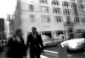
This image shows two people on a street with a building and a car in the background. There isn't really any main point of focus and the whole image is slightly blurred. The way the picture is framed makes everything look slightly askew or lopsided. This has a very messy, disorderly effect. The photographer must have done this either by moving his hand while taking the image, or using photoshop to make another layer and moving it slightly out of place. Most likely he moved his hand because you can see the light in the background forming lines which suggests that there must have been movement.
|
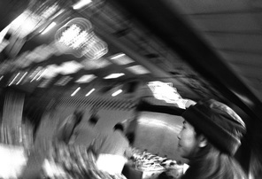
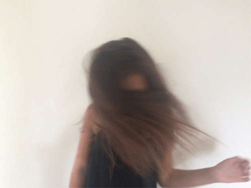
This image shows a woman in a room, but only the woman is in focus and the rest of the image is unclear so it is hard to tell exactly what the room is. The picture is blurred but in a sort of circular motion so the photographer must have moved his hand around while taking the image. Like the other images by this artist, it is in black and white.
About this image, Robinson says 'moments lost and burried, in a well of memories that are now irrelevant, always moving forward, only to be caught in the past, by a singular moment'. He uses the blur and disorder of the image to capture reality and time. |
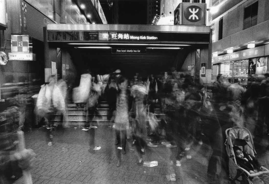
The photograph shows people moving in and out of a station in Hong Kong. The station is still and in focus, while the people are moving and are shown to be blurred.This creates a feel of disorder because it links through keywords such as busy, rushed, movement. This was probably taken with a slow shutter speed to make the people blurred and show them rushing about their daily lives, and I can also imagine that a tripod was probably used to keep the background of the station from being blurred too.
|
Tilt
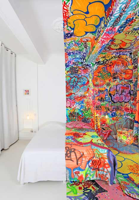
This picture shows a room split directly down the middle, half of which is plain and white, and the other half of which is doodled and graffitied on so that every inch is completely covered. The right side is colourful, vibrant, exciting, choatic and is probably considered the 'disorderly' side. The left is boring, plain, tidy and 'orderly'. This creates a juxtaposition as the two sides are placed right next to each other, yet completely contrast.
|
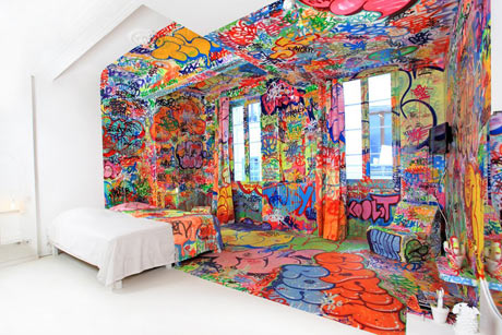
The framing of the photo makes the grafitti side look smaller and more condensed, and the white side a lot more spacious. This intensifies the fact that a busy, crowded, more disorderly look tends to give a more claustrophobic feel whereas light colours and emptiness does the opposite.
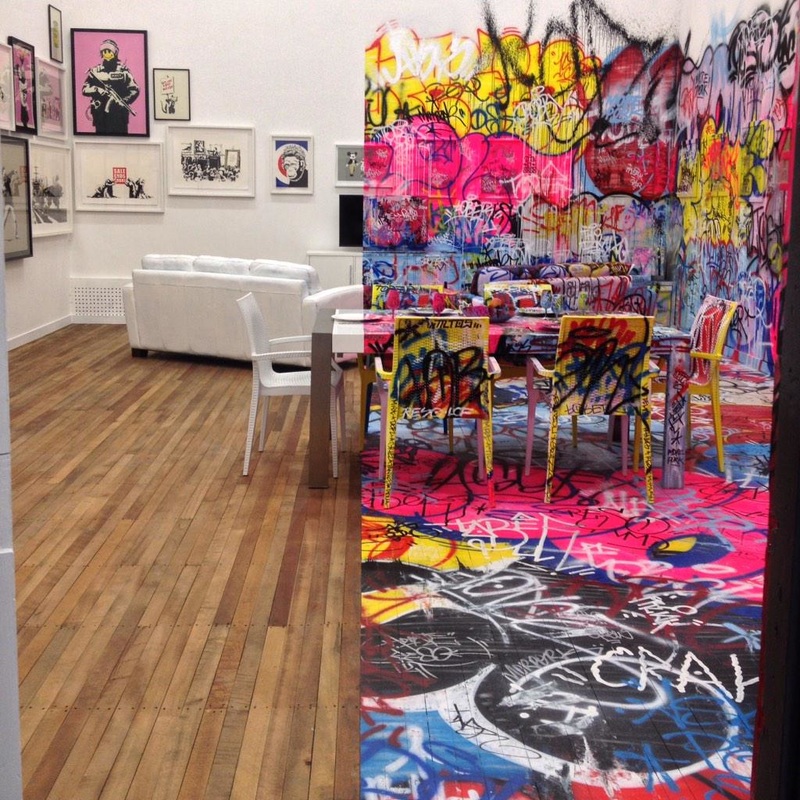
The room used in this image has unpainted wooden floorboards and pictures hanging on the wall of the supposed 'plain' side, which adds a lot more life and colour that the 'plain' sides in the other images. Therefore there is less so much of a drastic contrast, but it is still effective.
|
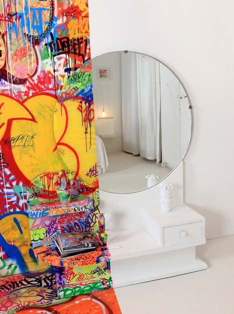
The way that the paint of the graffiti drips down the wall makes the colours all merge and overlap each other, however at no point does it drip onto the plain, unpainted white side which creates a very defined line between the two sides. This makes the contrast stand out more. Also the way the mirror is used is very interesting, because the photographer must have angled the shot very carefully; the unpainted side of the mirror only reflects the plain side of the room, and does not reflect the grafittied side at all which could have ruined the effect.
|
Andreas Gursky
Andreas Gusky's work often uses a large scale, encompassing an immense amount of detail and colour as he focuses on the modern world and the strict order that we follow to satisfy our need for everything to be aesthetically pleasing. He increases these effects by digitally manipulating his images.
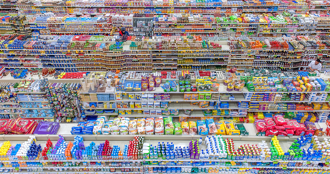
The picture shows a supermarket, taken from a birds eye view. The organisation of the products on the shelves and the aisles all parallel to each other creates a very orderly effect. The colours are all very vibrant. By capturing all of this, Gursky shows how everything has to be neat and in some sort of order to lure in the consumer, and that this is how the world functions. He frames it so that the products take up the entirety of the image and there is no background or negative space, highlighting immensity.
|
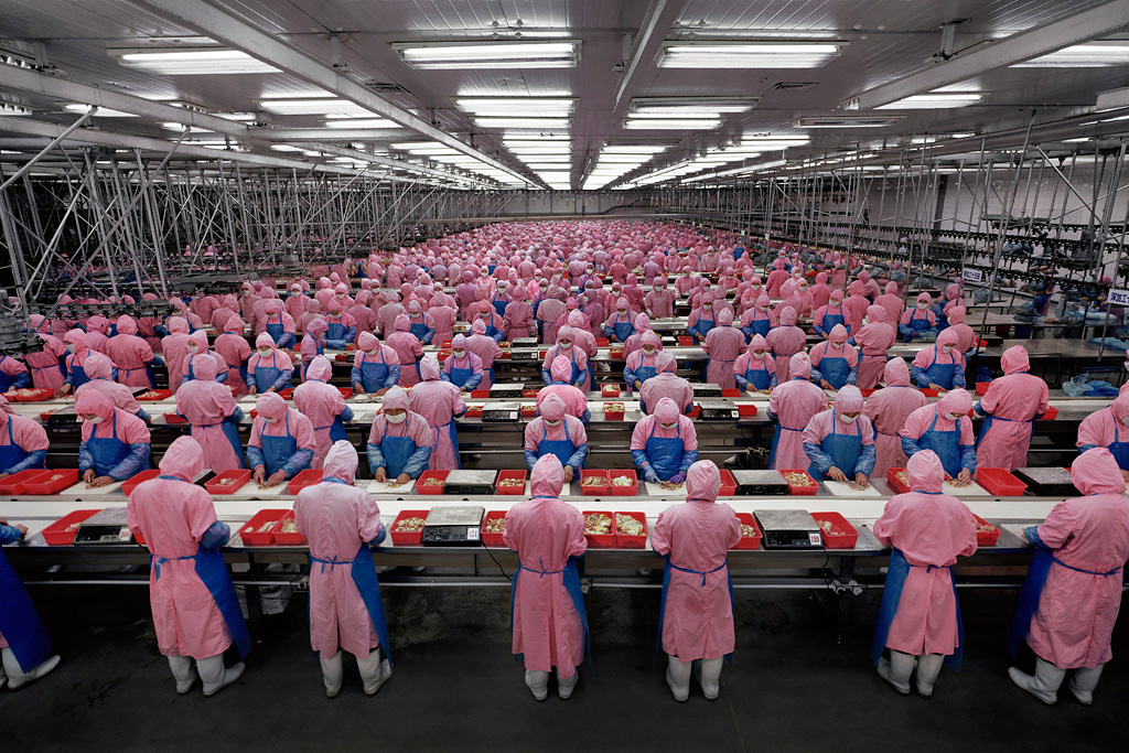
This image shows workers in a factory. The factory workers are all dressed in uniform, making the image seem very structured and systematic. The vivid pink and blue of the uniforms contrast with the dull, metallic grey of the surroundings and the background. My interpretation of this image is that Gursky is highlighting how order and perfection in our society is eliminating individuality. The length of the factory room with the image taken at one end shows perspective which accentuates immensity and scale.
|
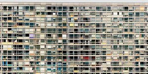
The photograph shows windows on a building. Despite all the windows having different coloured curtains or which could make it look quite messy and disorderly, it is taken straight on and is framed in such a way that it looks neat and orderly. Furthermore I think that unlike the last image, Gursky is showing how there can still be diversity and individuality where there is order and perfection. Size is emphasized in this image, and again there is no background or negative space which makes the building look much bigger and vast.
|
ARTIST AND ME
Andreas Gursky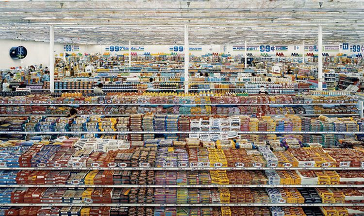
|
Me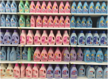
|
Andreas Gursky's image is taken from a higher viewpoint and shows not just the neatly arranged rows of products, but also the parallel aisles, which increases the orderly and systematic effect. My picture is taken from a straight on angle and shows just a few shelves, but Gurky's image captures a much larger scale and therefore is more effective.
In my image however, there is not background space like there is in this particular image of Andreas Gursky's. The product on the shelves take up the whole of the frame, and I prefer this because it means there is no main focal point and it increases attention across the image as a whole.
In my image however, there is not background space like there is in this particular image of Andreas Gursky's. The product on the shelves take up the whole of the frame, and I prefer this because it means there is no main focal point and it increases attention across the image as a whole.
R E F I N I N G M Y W O R K :
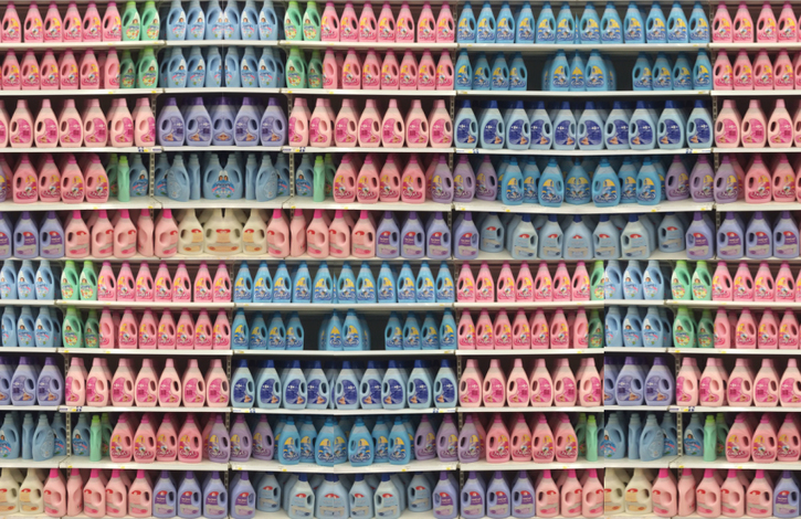
Seeing as most of Andreas Gursky's images emphasize size and scale, I used photoshop to apply this to my own image. I started by increasing the canvas size, and then simply copied and pasted the original image multiple times and lined them all up so that it looks as though there are many more bottles than in the original image.
SUMMER HOMEWORK
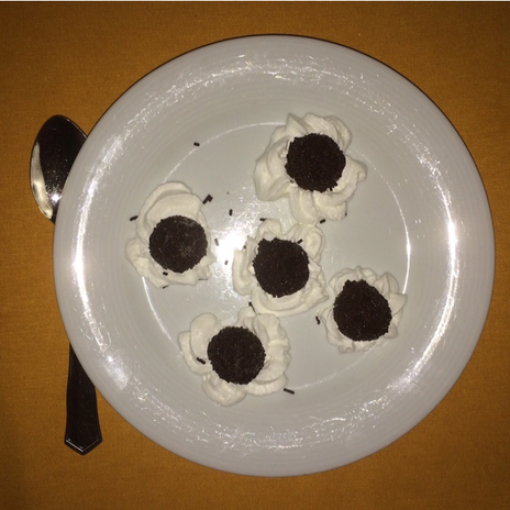
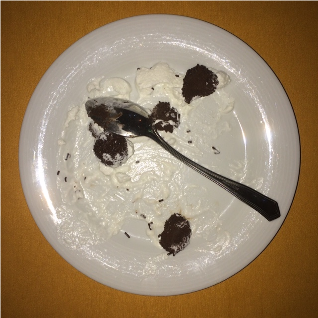
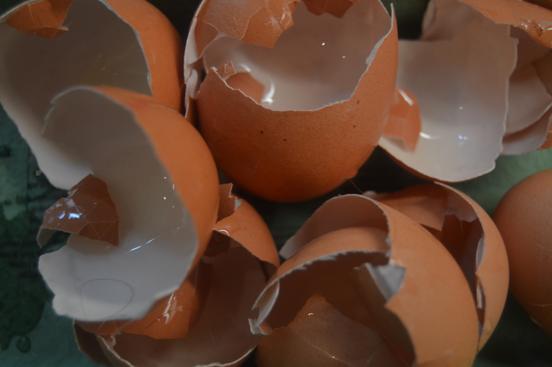
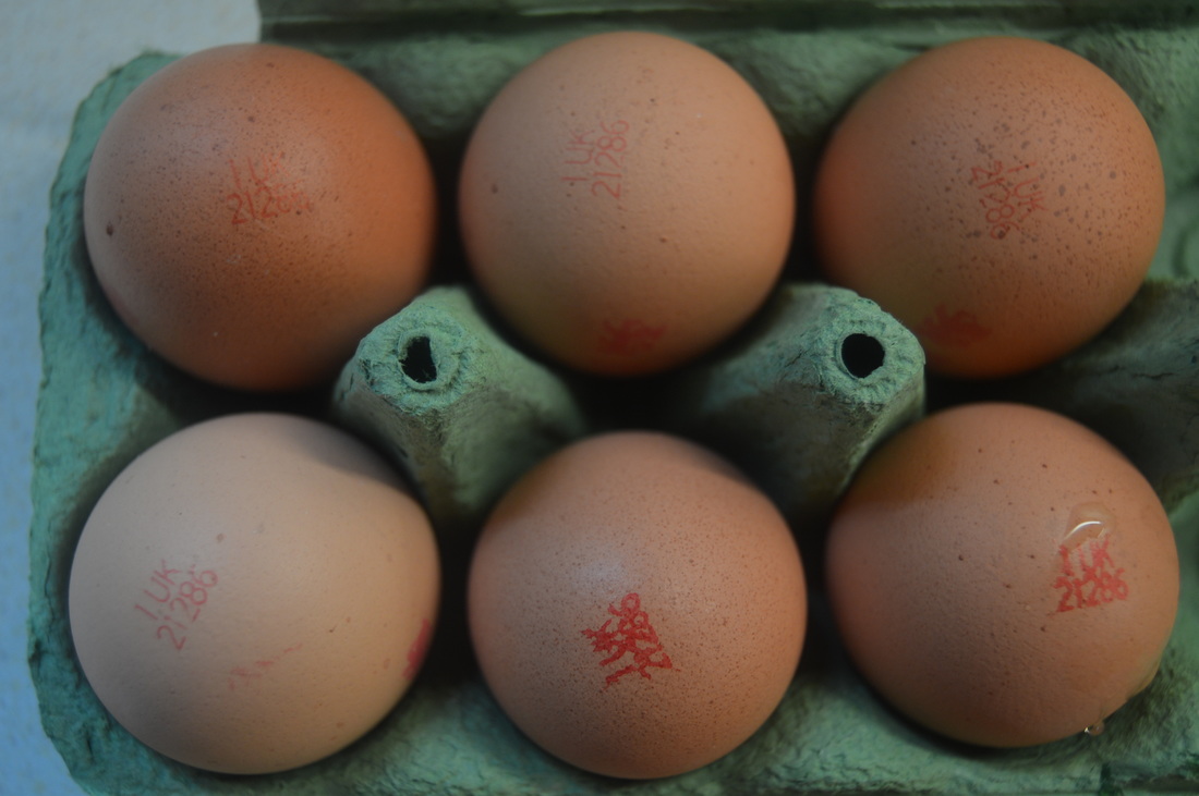
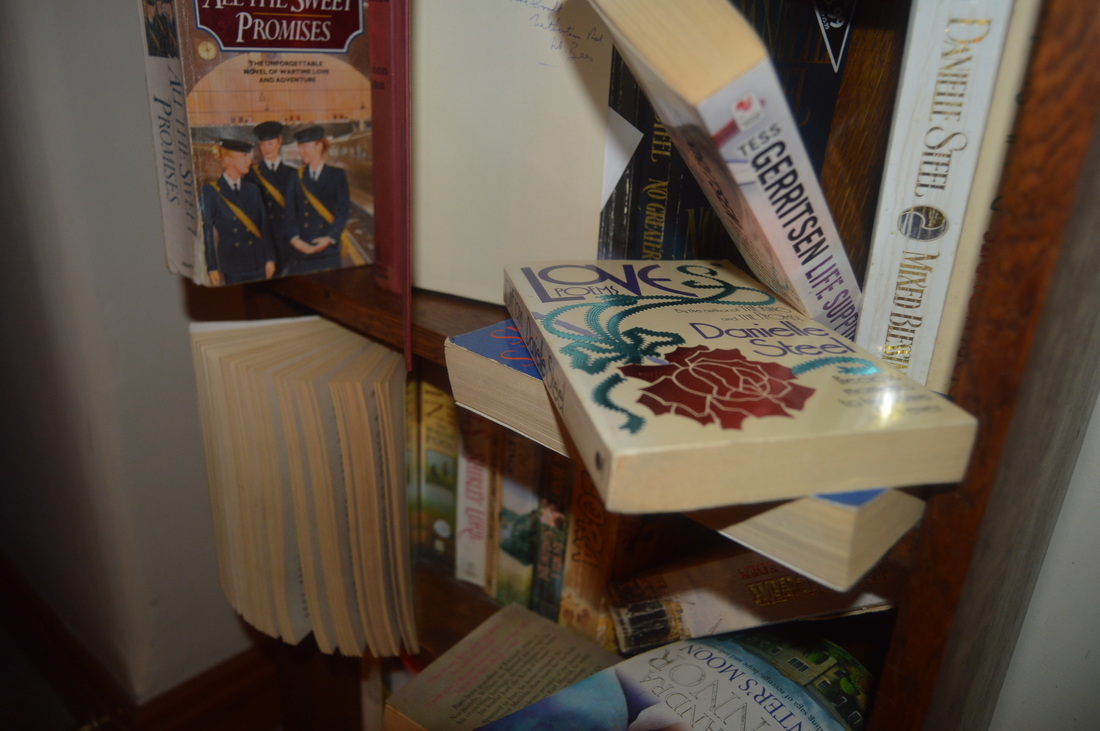
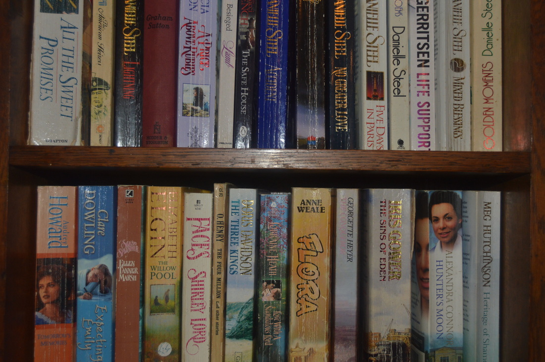
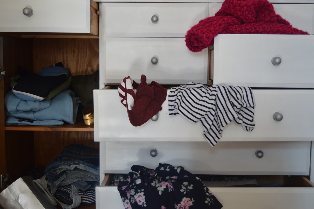
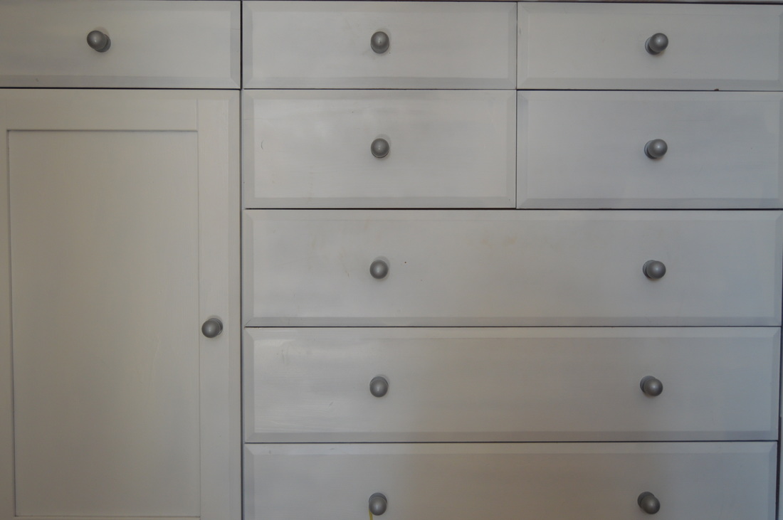
I began to look at order and disorder by simply taking two images each day; one orderly and the other disorderly. One of the most obvious responses to this is with food. I also used a bookshelf and my drawer. To make the images more effective. I focused on the framing and vibrancy of the colours.
|
|
|
|
|
|
|
|
|
|
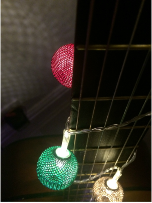
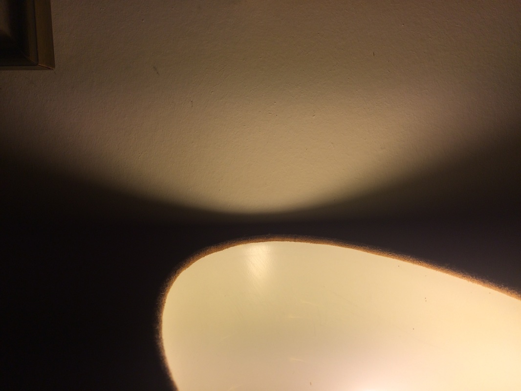
DISORDER
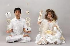
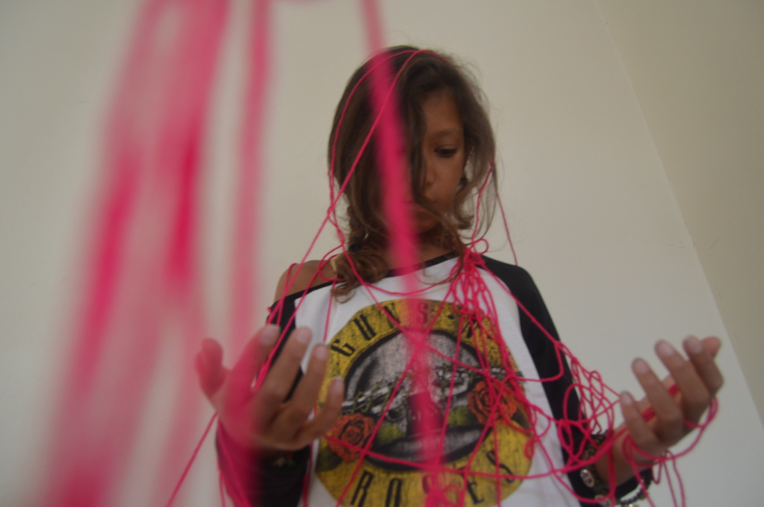
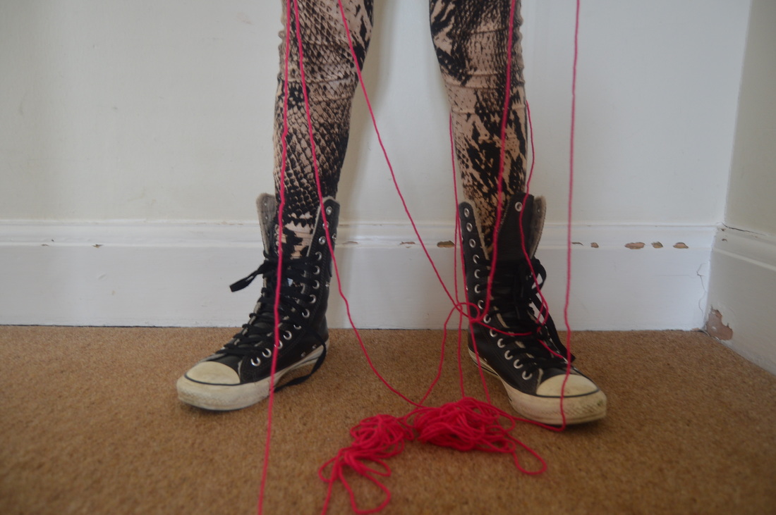
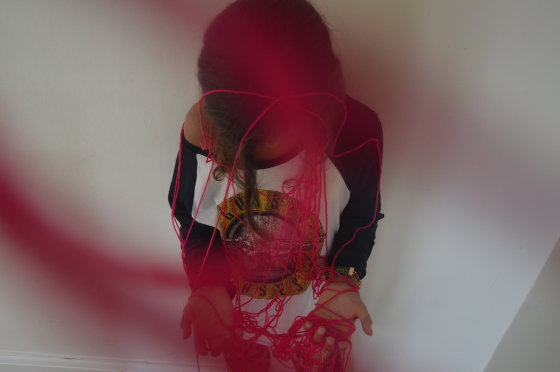
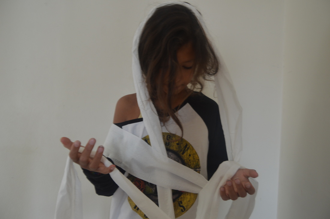
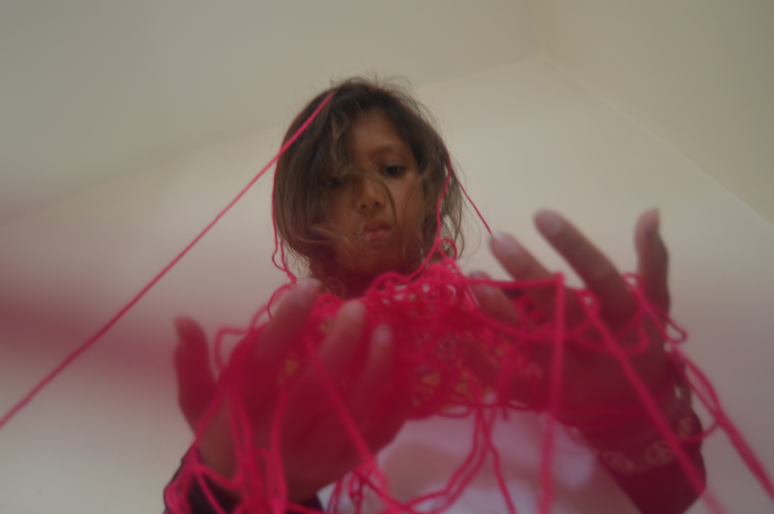
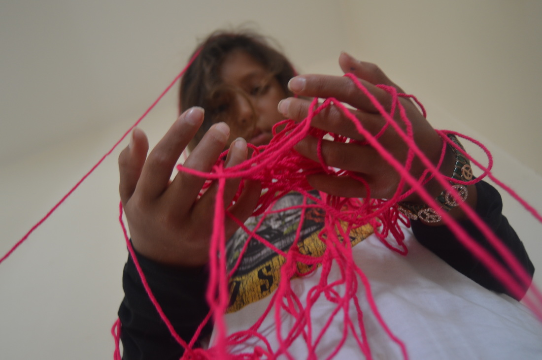
I took a series of disorder images based on this picture by Yugi Mamamoto, which was actually taken to ilustrate the words 'order' and 'disorder', and relates to this unit directly.
In my images I placed some of the string over the camera lens as well as around the person, which adds to the messy, disorderly effect.
In my images I placed some of the string over the camera lens as well as around the person, which adds to the messy, disorderly effect.
|
|
|
IMPACT TO CREATE DISORDER
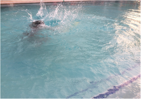
|
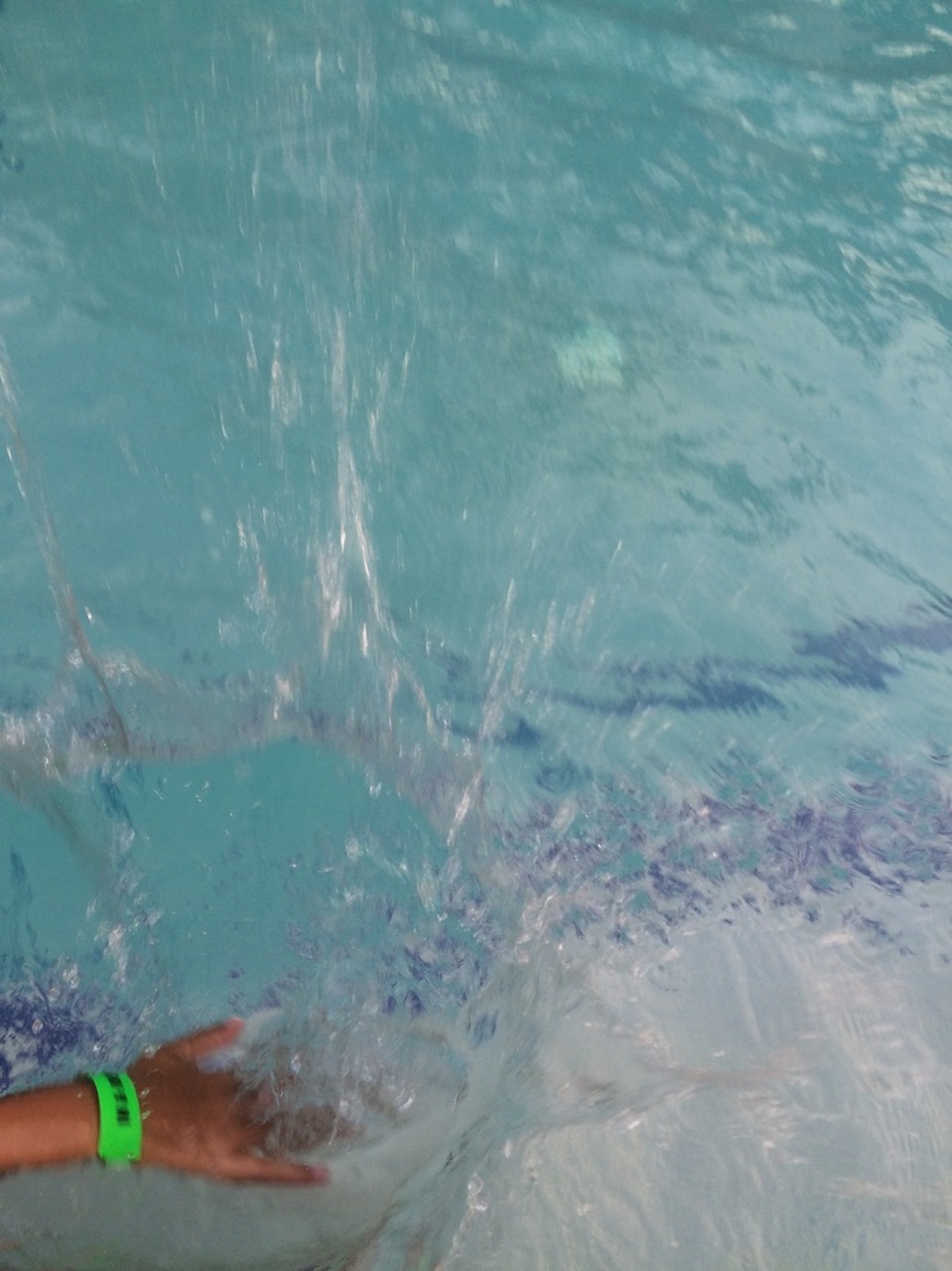
|
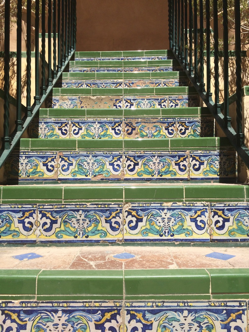
ORDER IN SEVILLE

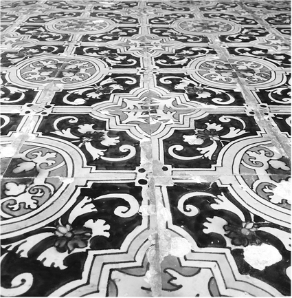
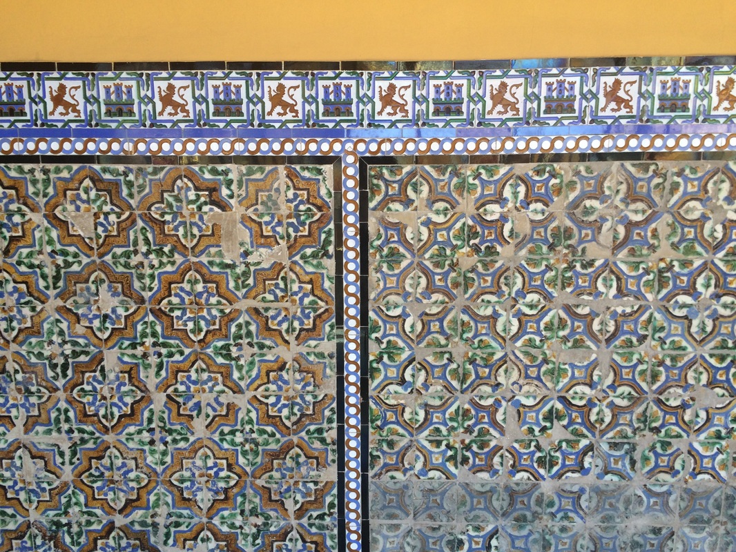
|
|
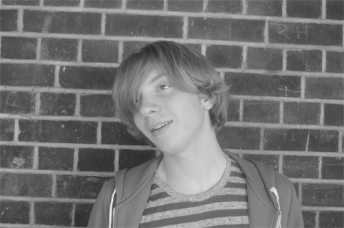
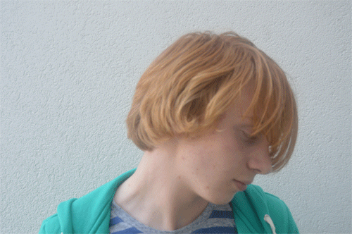
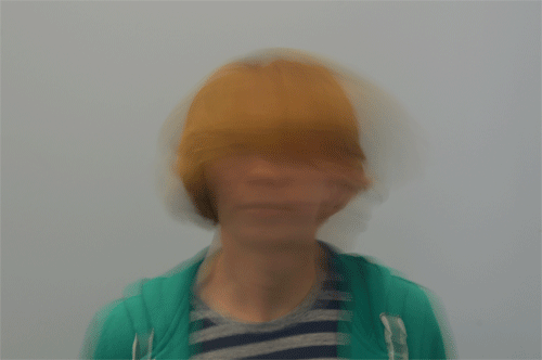
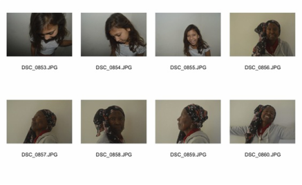
DISORDER PORTRAIT GIFS
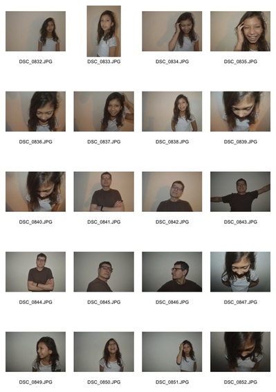
I took a series of photographs in which the only difference was the person moving their head, and put them together in a gif.
Class Response
|
|
|
|
Unless I'm using a tripod, the more simple the background of my image the better. In this gif, the brick wall can be seen moving slightly from image to image which distracts you from the subject of the gif and the main idea which is the person moving their head.
|
This gif is more effective than the last because the background is more simple and there is more focus on the person, but I also think it is in some ways less effective than the last because the images are sharp and clear, and so it looks less disorderly and a lot neater, which isn't the point.
|
Taking each individual picture with a slower shutter speed and making them more unfocused gives a better 'disorder' effect when they are put together in a gif. It gives more of a messy, blurry look as opposed to a clear and sharp image which is more likely to be called 'orderly'. For this reason, this is my favourite gif of the three.
|
Home Response
In my home response, I used my phone instead of a camera to take images quicker with a much shorter length of time in between each shot. The iPhone allows you to take 'bursts' of images that when put together, look a lot more like a video of the person moving as opposed to just a series of photographs. Therefore I think my home response is better than my class response.
|
|
ARTIST ANALYSIS
Romain Laurent
In Romain Laurent's gifs, only one part of the image is moving and the rest is very still. This is very effective and looks slightly bizarre. They are a lot less messy and more precise then mine, because in mine the background does move around a lot from frame to frame even though it isn't meant to. I could fix this by using a tripod. Also each shot in Romain Laurent's gifs are sharp and the transition is smooth, making it look orderly and giving it a different effect to what I was aiming for in my disorder portraits. I purposely made each shot blurry, and the parts that were meant to move messy.
|
|
|
|
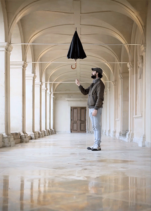
In this image, the only things moving are the man's hand and the umbrella which is opening and closing. Everything else is completely still. The picture is framed perfectly to show the hallway in which the man is standing and it's symmetry and perspective. This makes the it look very orderly.
|
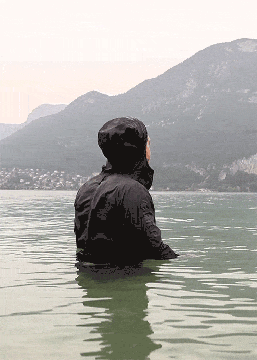
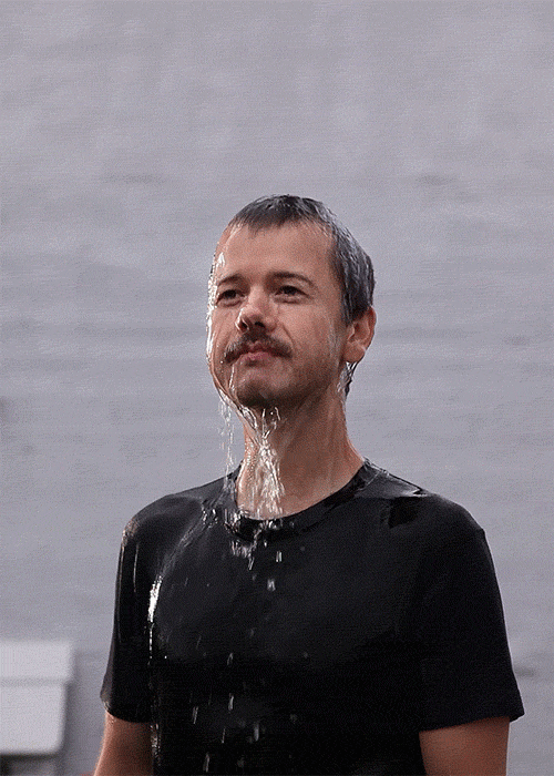
In these two images, only the water is moving and everything else is still. The one on the right has a very simple background so that all the focus is on the man and the moving water, whereas the picture on the left has the man as the man focal point but also shows mountains in the background and so really the focus is on the man, the water, and the background too. The image on the left seems to have some sort of fly or butterfly moving across the in each frame of the GIF. I'm not sure if this is intentional, but it looks effective.
|
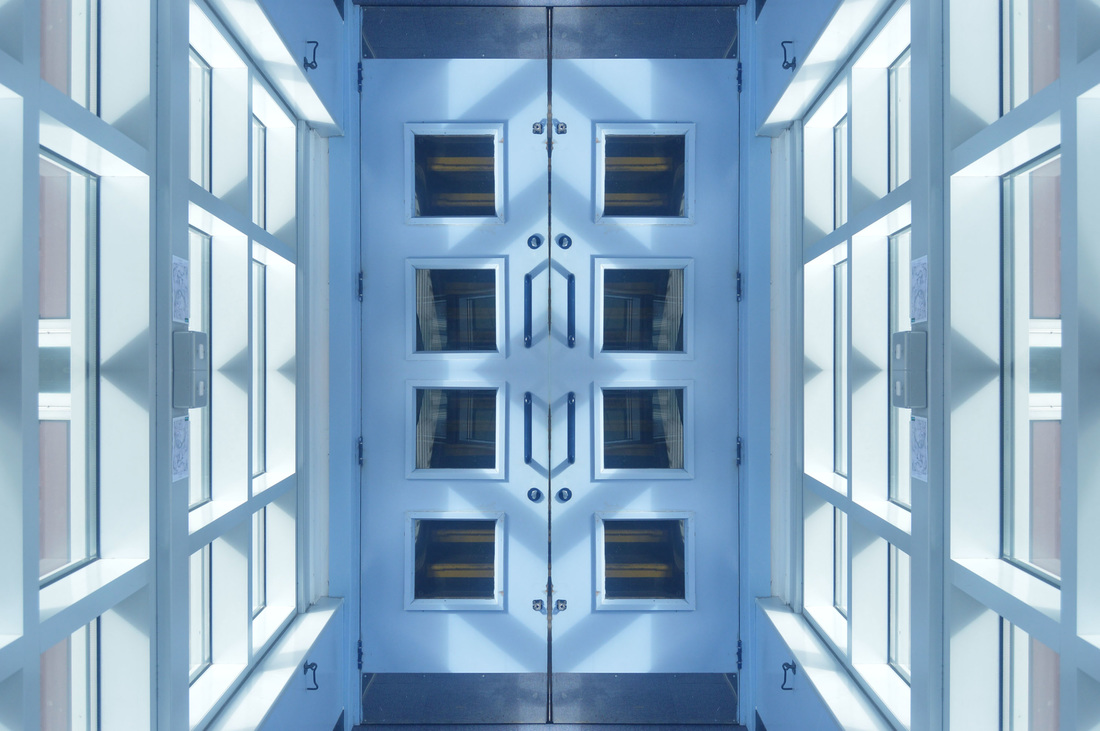
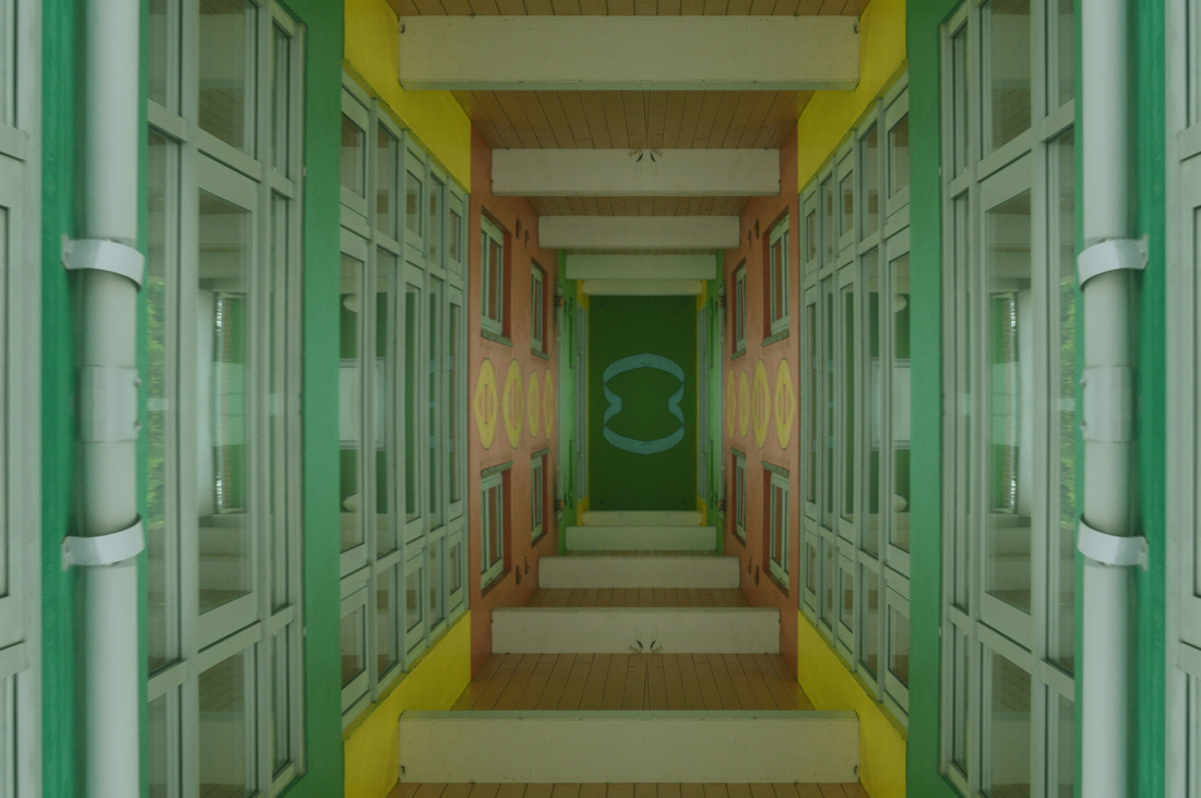
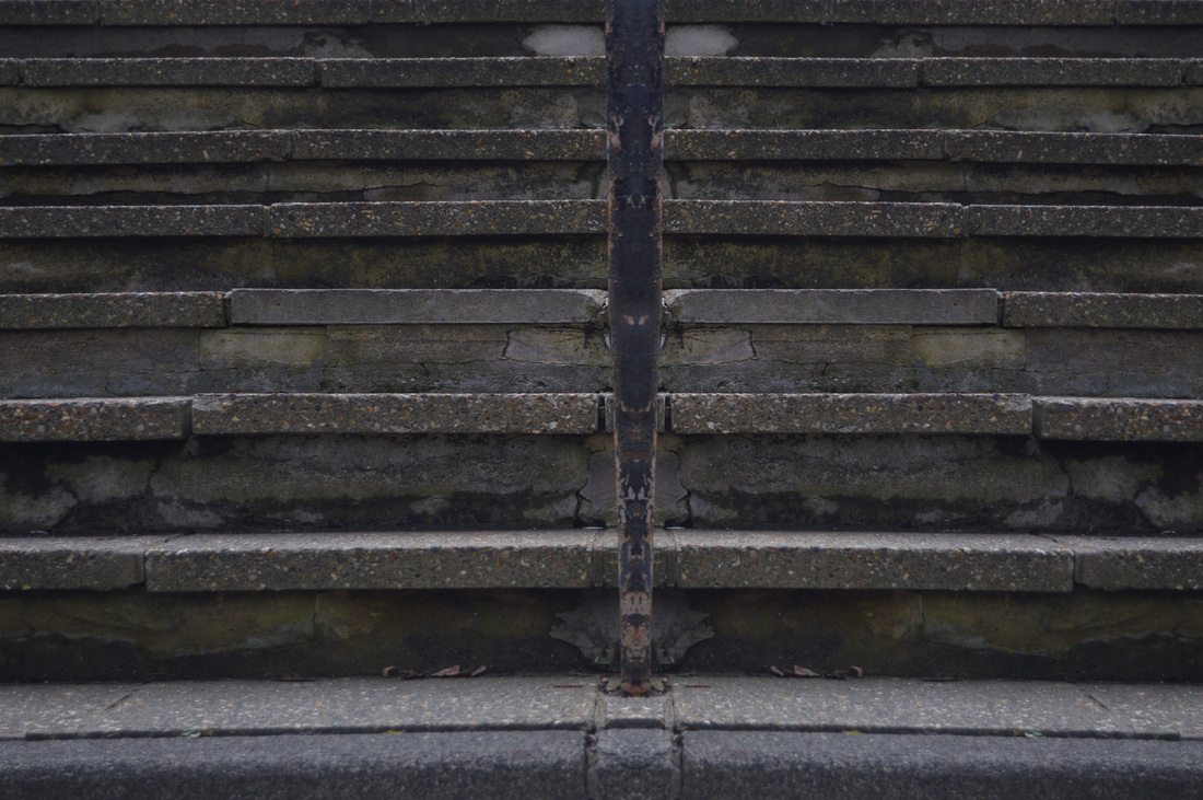
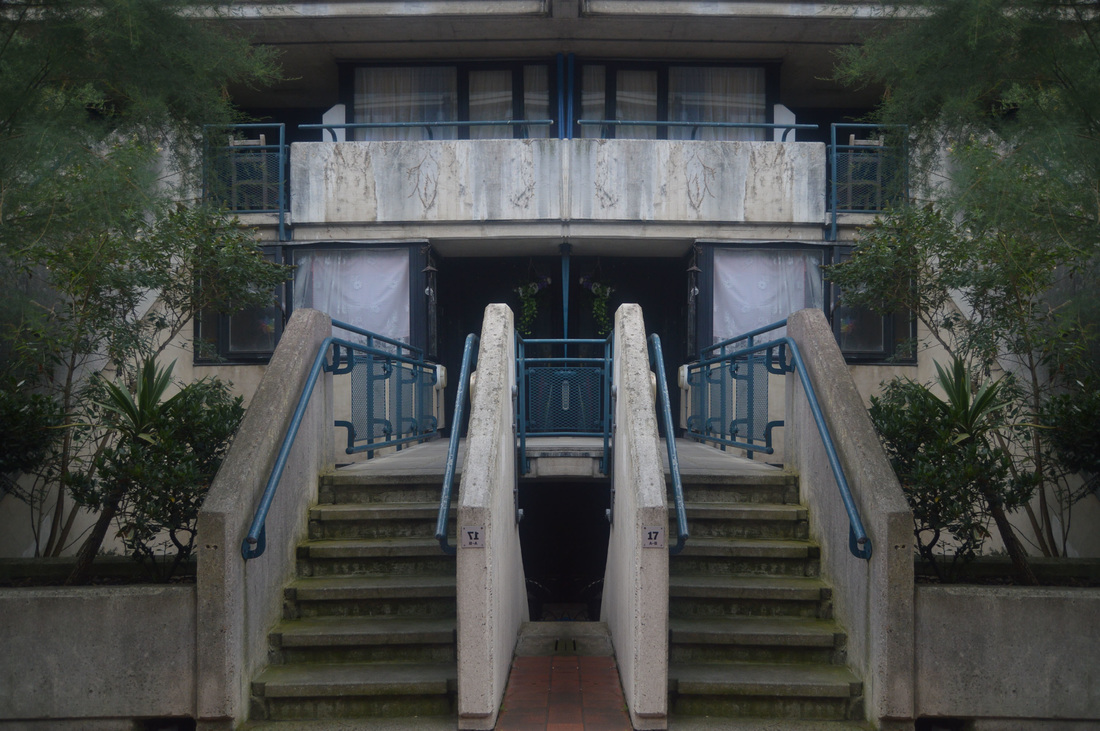
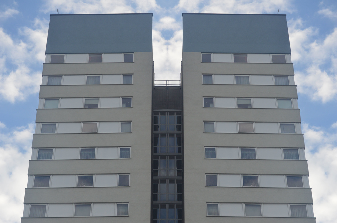
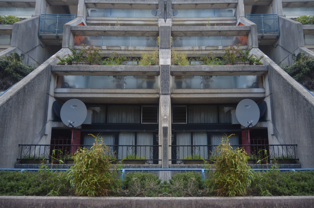
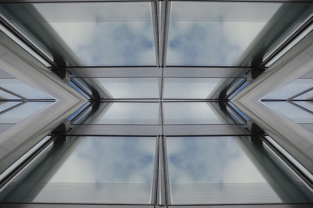
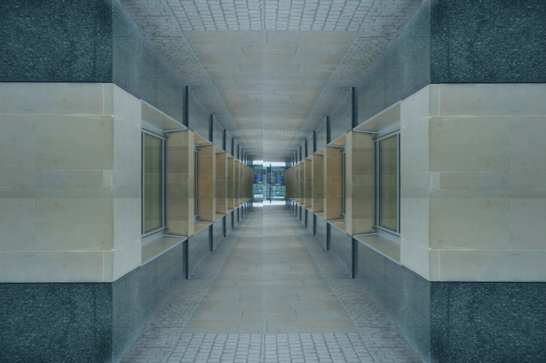
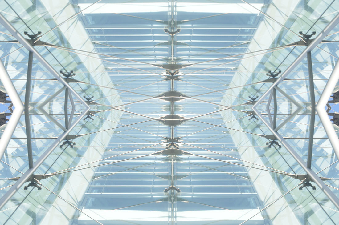
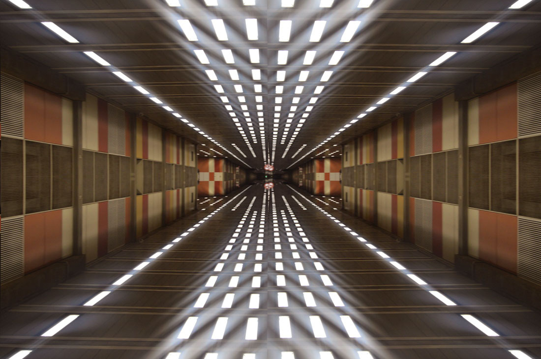
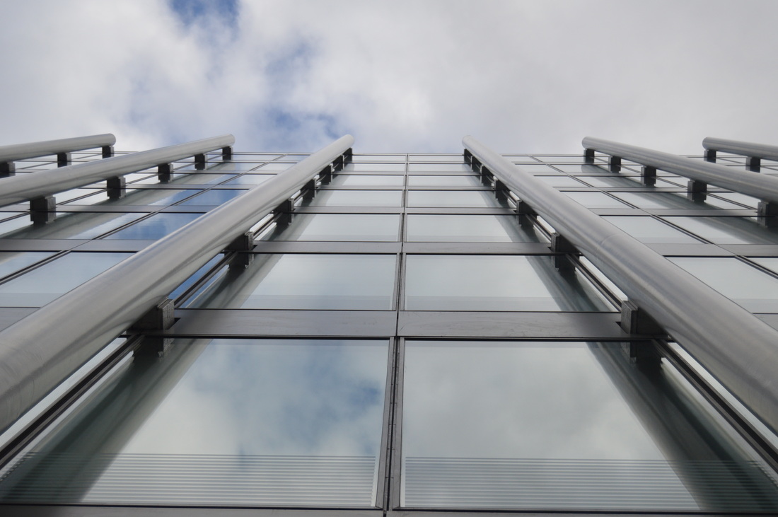
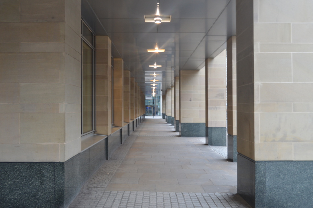
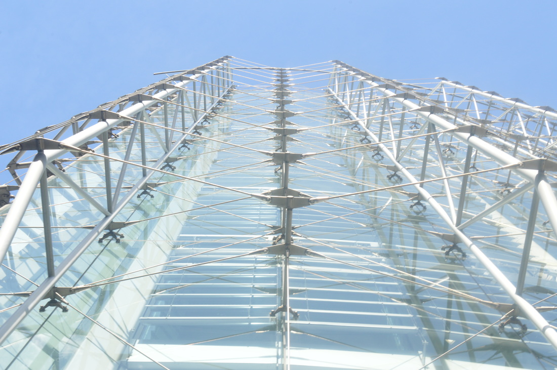
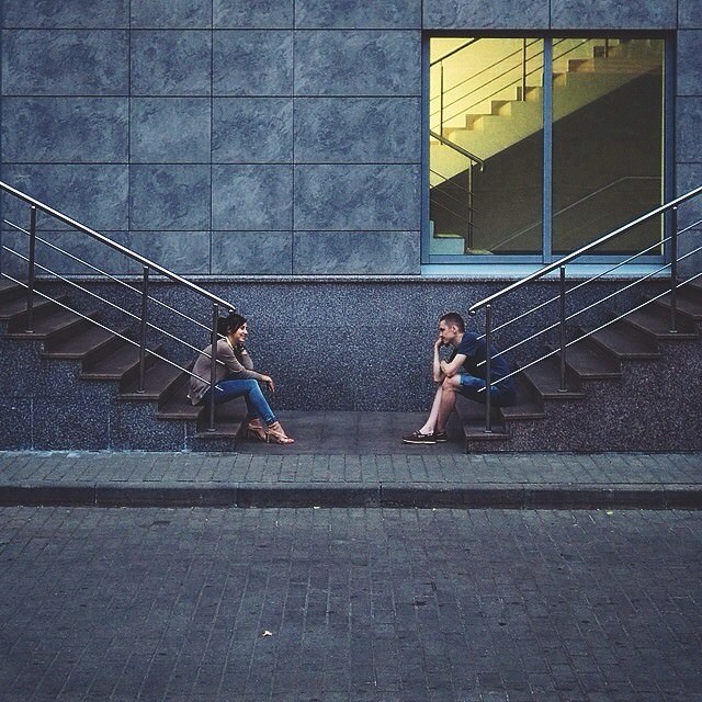
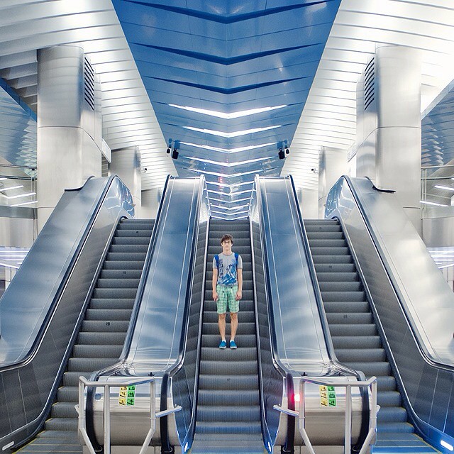
SYMMETRICAL ORDER
Class Reponse
|
|
|
|
|
|
Home Response 1
To create the symmetry on photoshop I simply selected one half of the image and flipped it over the other.
|
|
Original Images:
|
|
|
|
Home Response 2
in the first home response I used one line of symmetry in each image whereas in this one, I flipped it both vertically and horizontally. This has the effect of making it look slightly more abstract/unrealistic. I think the most successful ones where the images in which there is perspective.
|
|
Original Images:
|
|
|
|
Date: 23/09/15
Homework title: Portrait disorder/Architectural symmetry
Teacher comment:
Portrait disorder: Well done a strong second response to improve them further you should use a tripod to avoid the slight jerkiness that is in the frames at present.
Architectural symmetry: outstanding work that demonstrates an excellent understanding of the techniques taught in class well done. To improve this section I would like to see the original image alongside contact sheets
Student comment: WWW,EBI
For the architectural symmetry I have added either contact sheets or the original image.
ARTIST ANALYSIS
Sasha Levin
Unlike in my symmetrical order photographs, Sasha Levin often uses people. It has a very interesting effect, as the person often is the main focal point, yet the photo is still about the landscape and symmetry. Instead of taking away the focus from each other, the person often compliments the rest of the photo.
It is very effective especially where there is perspective, as the person is often placed in the centre.
It is very effective especially where there is perspective, as the person is often placed in the centre.
|
I really like the perspective in this image, because I think it makes the symmetry stand out more as it looks like everything is coming from a single point. Again, Sasha Levin uses a person in the image and even though they are quite small/standing in the distance, they are still the main point of focus because of their positioning in the centre.
|
CUT UPS
We tore up an article until one random word was left over, which we had to find ways of photographing.
Class Response

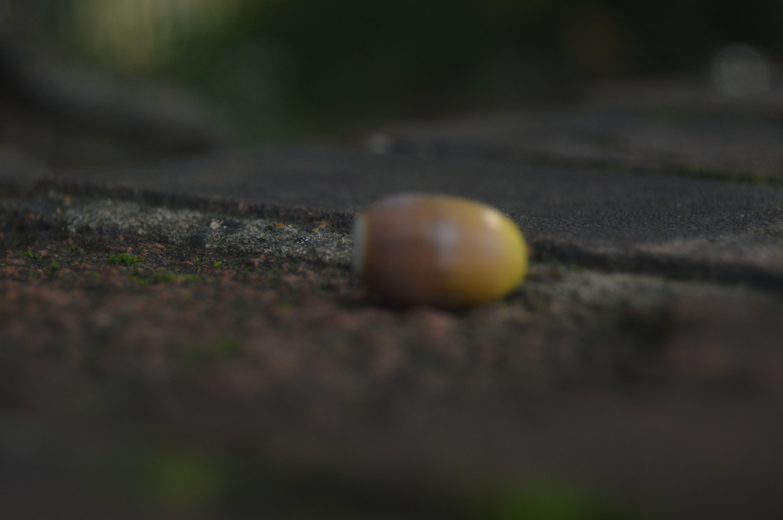
My word in my class response was 'find', so I focused on photographing small things that you wouldn't normally notice, such as bits of chipped paint on a wall, or taking images from odd angles.
|
|
|
|
|
Home response
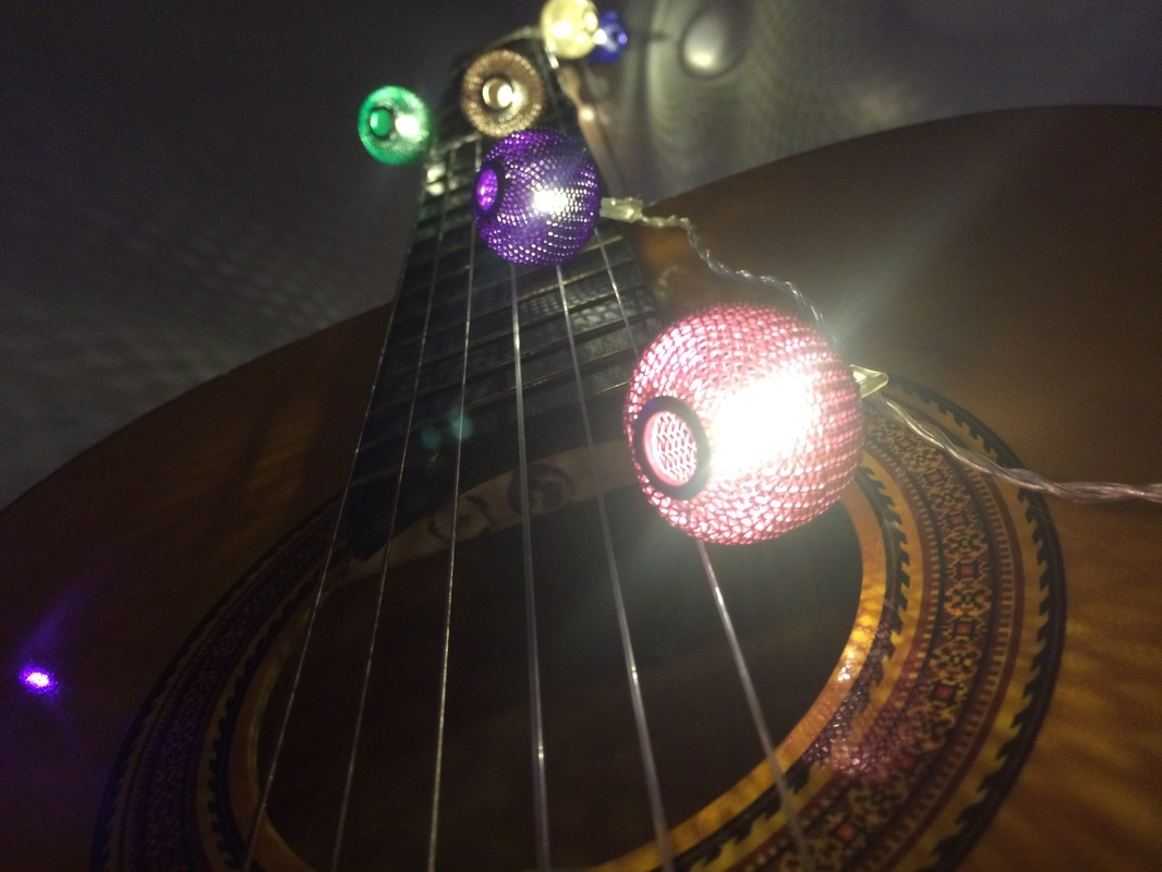
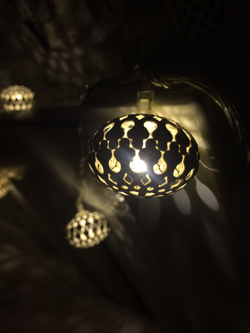
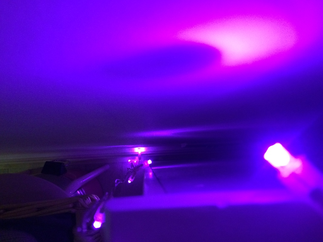
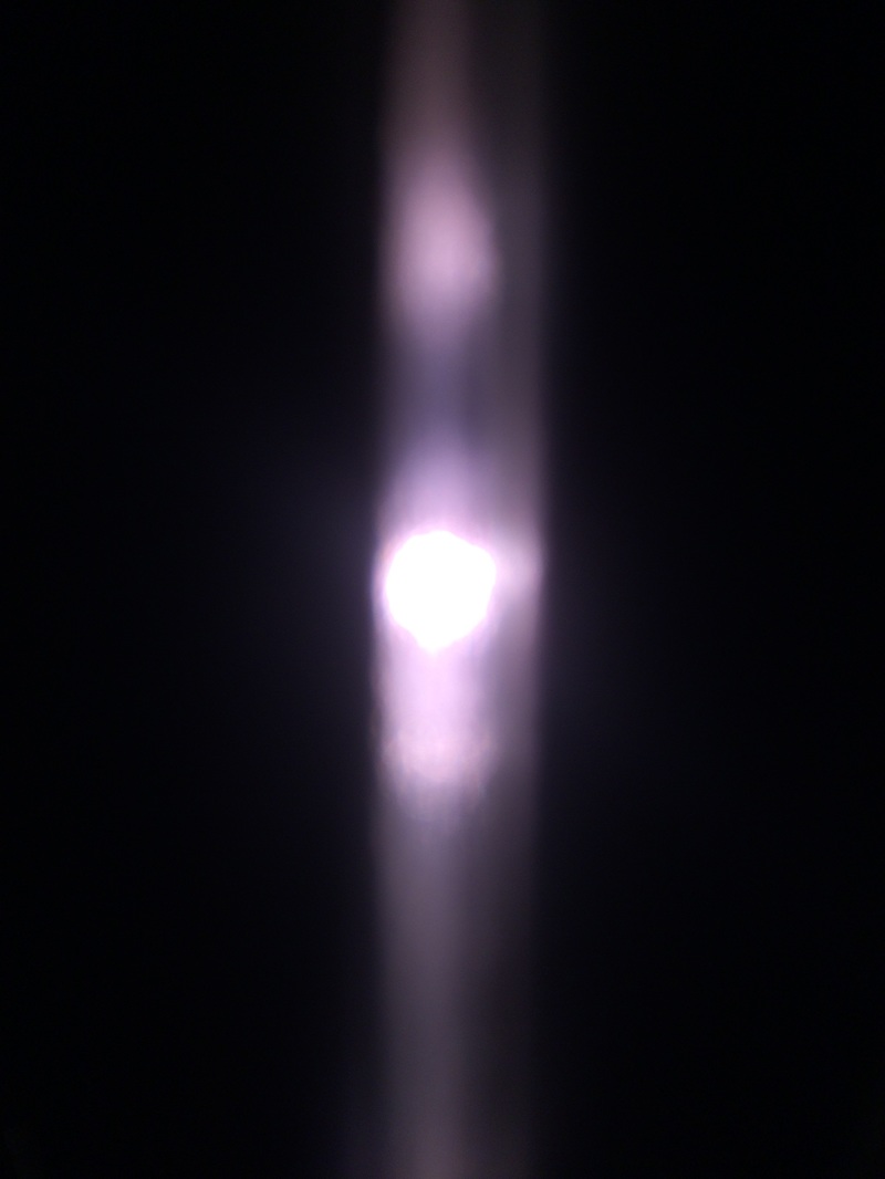
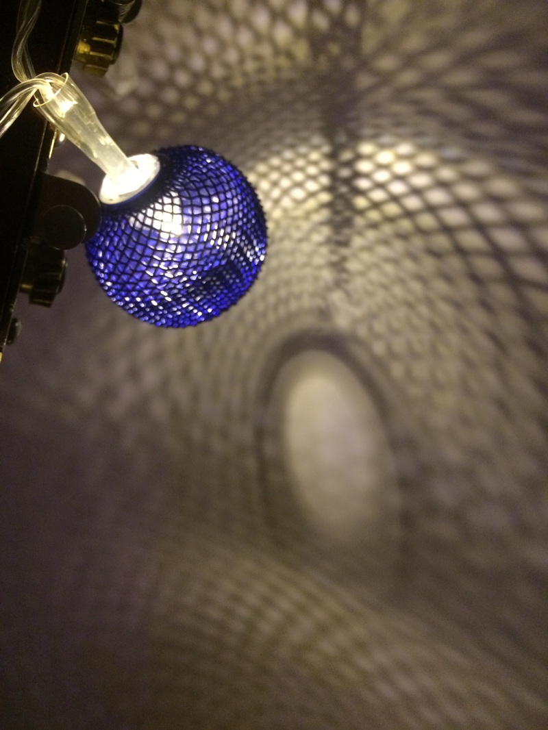
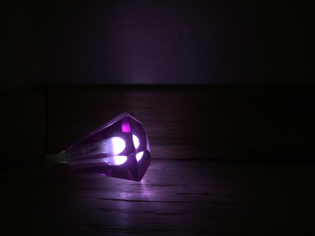
My random cut up word for my home response was 'lights', so I photographed lights around my house, and also the patterns and shadows they cast on the walls/surrounding surfaces to make it a bit more interesting.
|
|
|
|
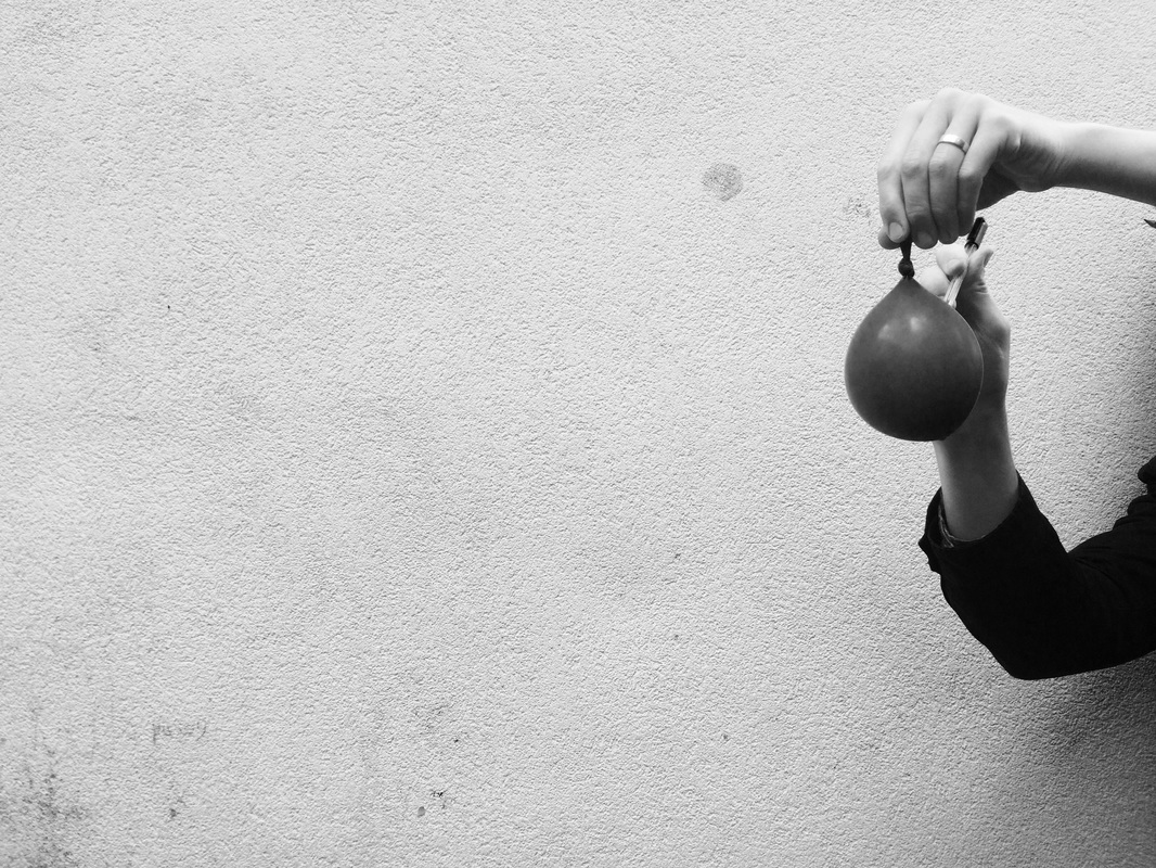
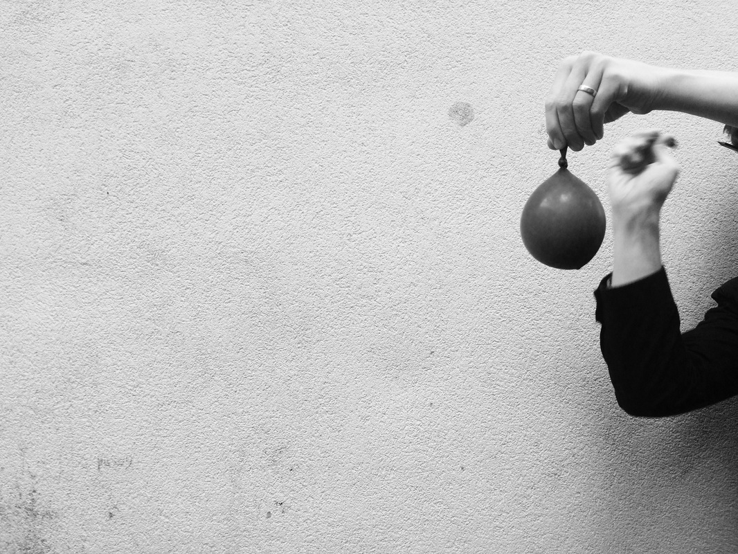
WATER BALLOON
Class response
|

|
|
|
|
Home Response
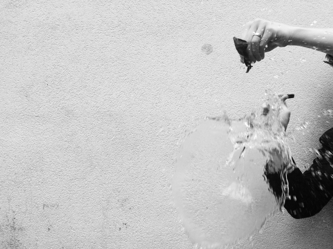
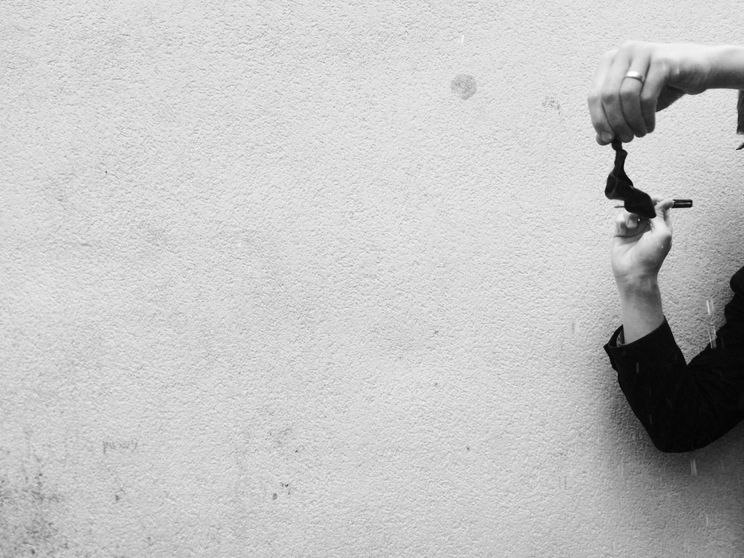
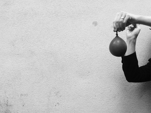
|
For my home response I used food colouring to make the water in the balloons colourful. In the class response, I made the images black and white whereas in this response, the colours make the explosion more vibrant. I also captured it using slow motion video instead of gifs
|
ARTIST ANALYSIS
Harold Edgerton
Harold Edgerton's aim was to analyse motion. He used a stroboscope process along with the camera to capture things that were too quick to capture otherwise. In the images below, the bullet can be seen as well as the effect of the explosion of the object being shot. They would have had to be taken very quickly for the bullet to still be in the shot. It represents disorder because of the explosion and the destruction of the objects, however it could represent order because of the framing of the images and how clear and precise they are, to a level that the human eye could not see. It shows a combination of science and photography. In this way it is different to the water balloon task we did as it only really represented disorder.
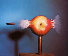
The image shows a wooden bullet being shot through an apple. The background is very simple and dark; only the shadow of the apple can be seen in it and so it distracts less and makes the colours of the apple and bullet stand out more. It is framed so the bullet can be seen going out from the side.
|
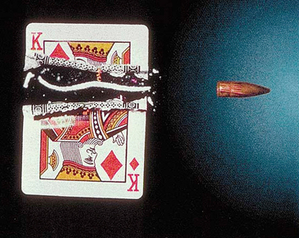
This photograph shows the bullet being shot through a playing card. Again, the background is dark and plain, and the it is framed perfectly. so the edges of the image are parallel to the edges of the playing card.The bullet can be seen going out from the side.
|
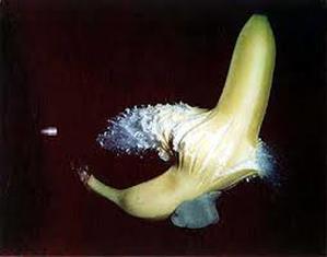
the bullet can be seen having just been shot through the banana, and the banana is bursting out of the skin. I feel like there is more destruction in this image because the explosion is bigger than in the other two pictures.
|
THREE STRANDS PLAN
|
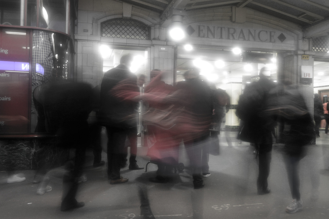
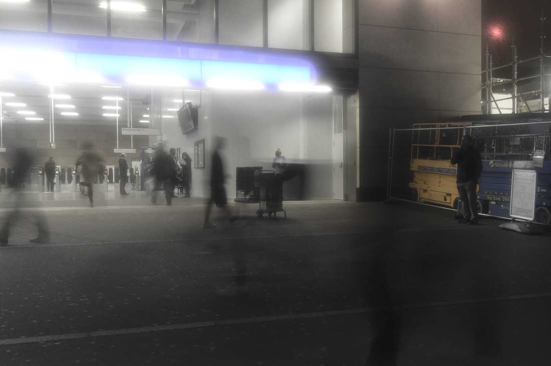
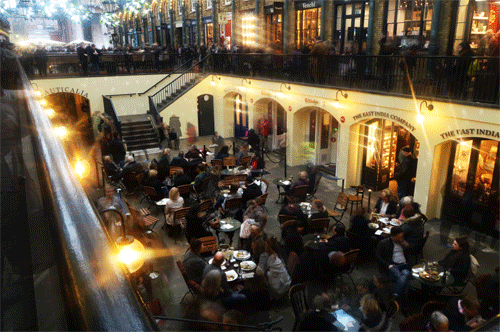
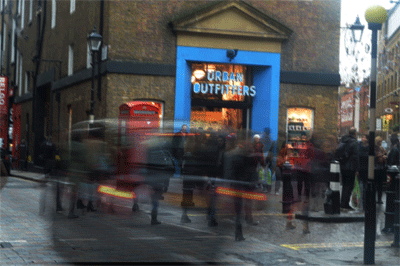
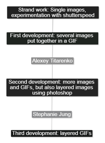
1. City movement - using a tripod and a slow shutterspeed to capture people going about their daily lives and the disorder in busy city locations. I can also use photoshop to combine images and make GIFs. I can analyse and take inspiration from artists like Thomas Lindahl Robinson, Alexey Titarenko, and Stephanie Jung.
|

|
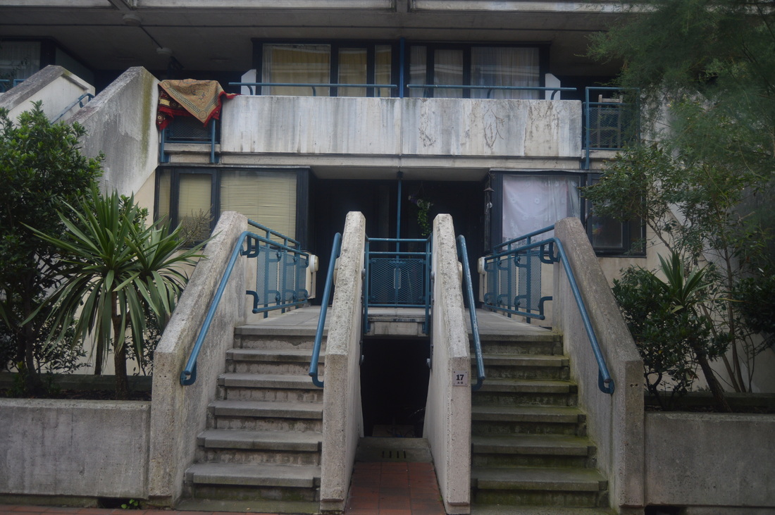
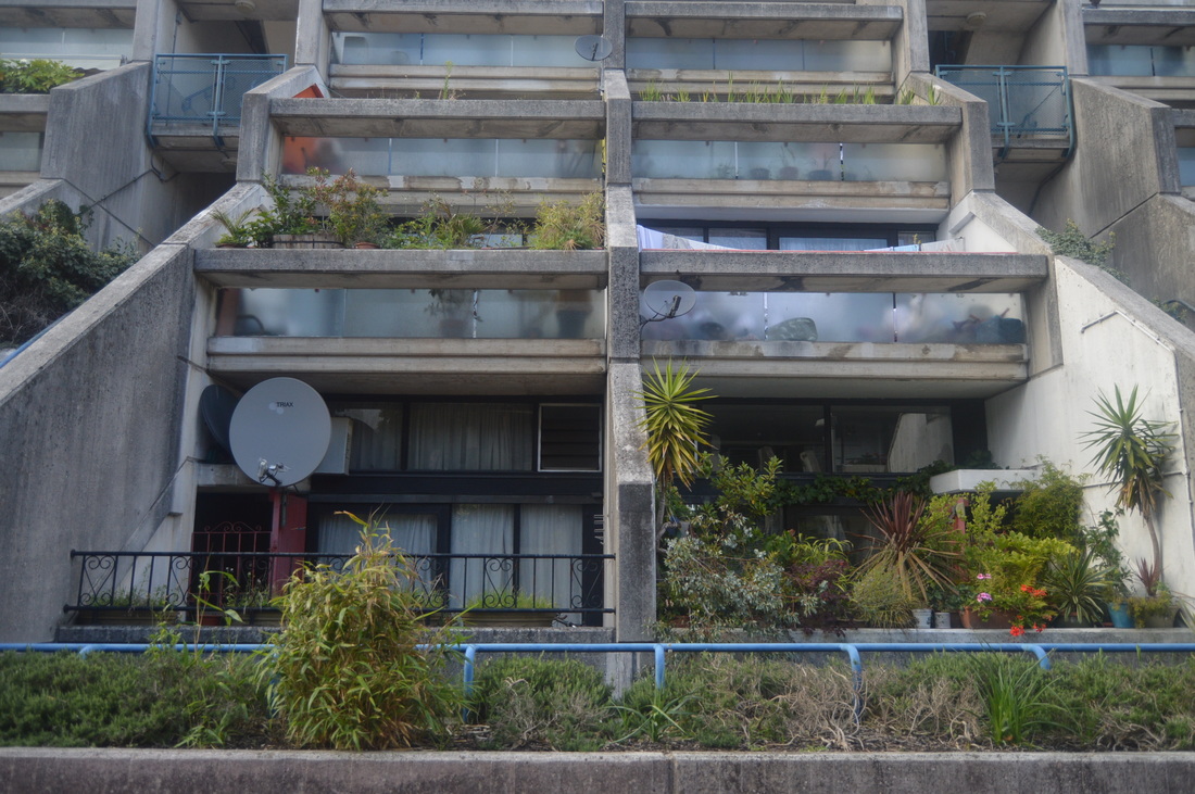
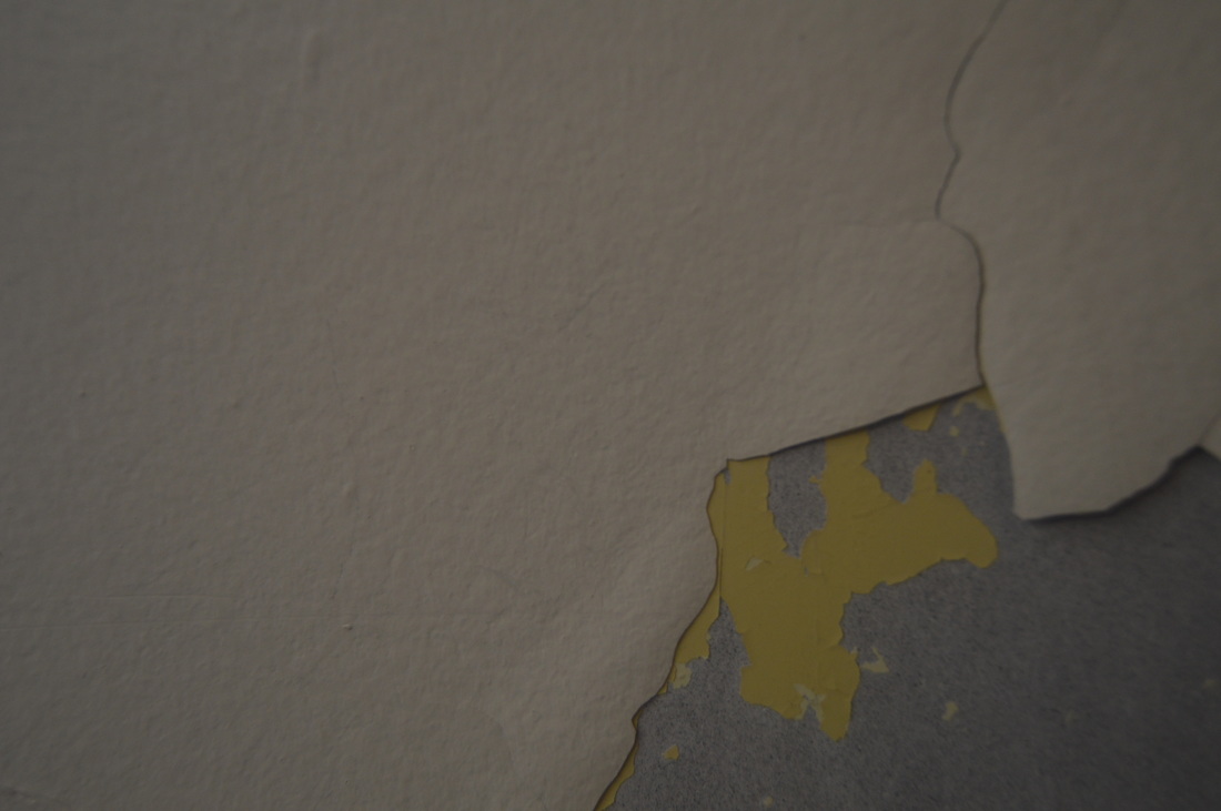
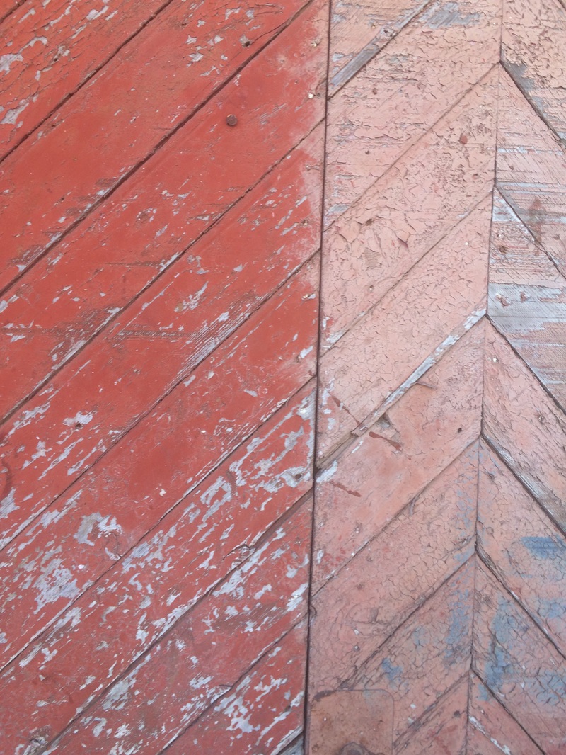
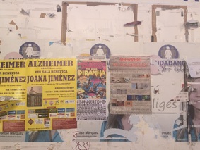
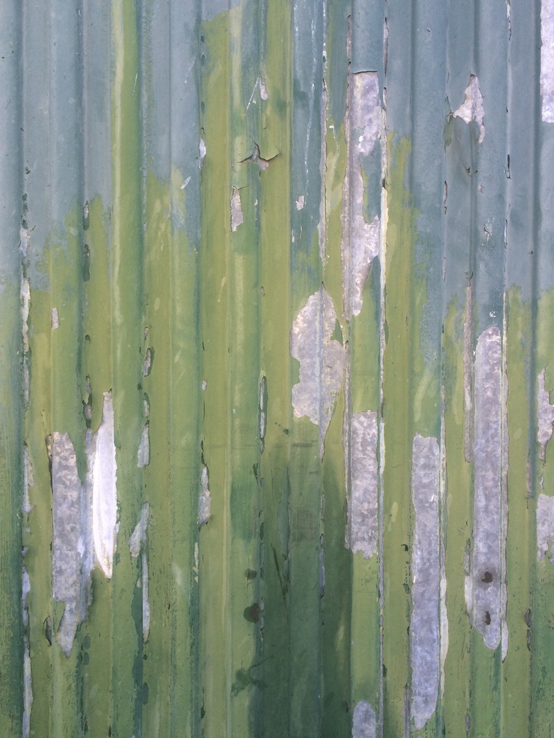
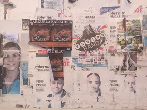
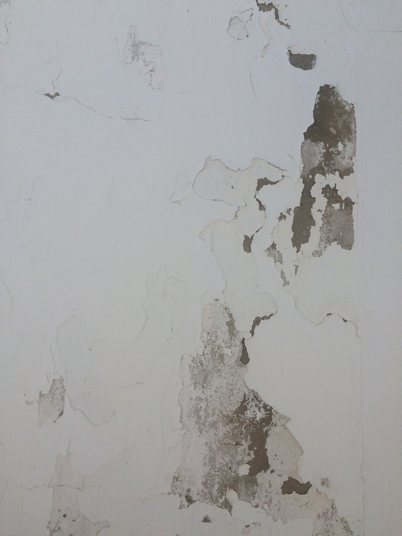
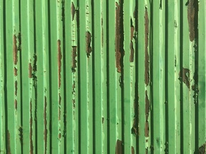
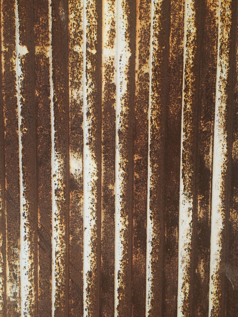
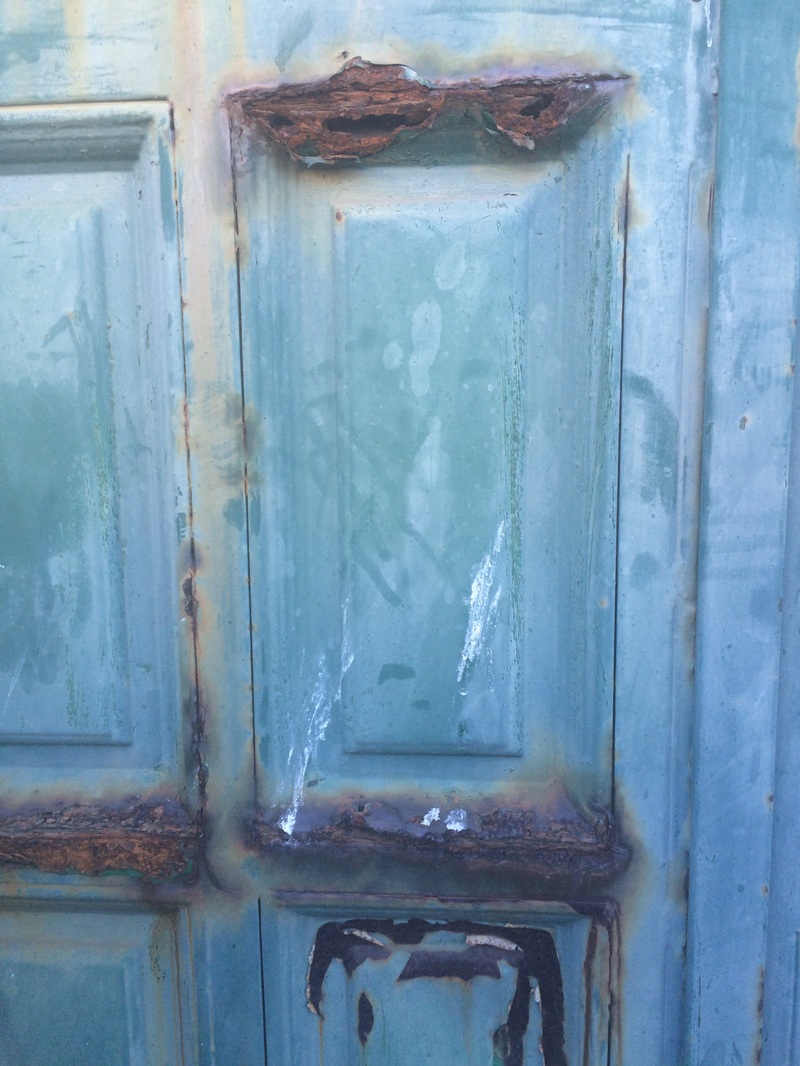
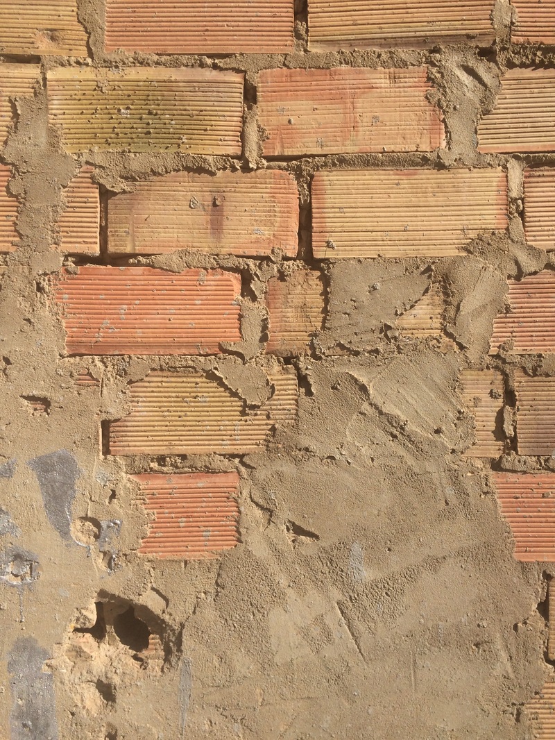
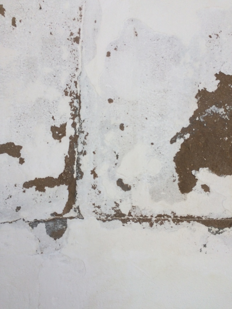
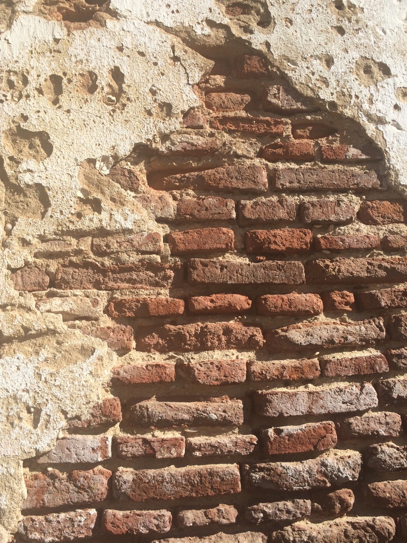
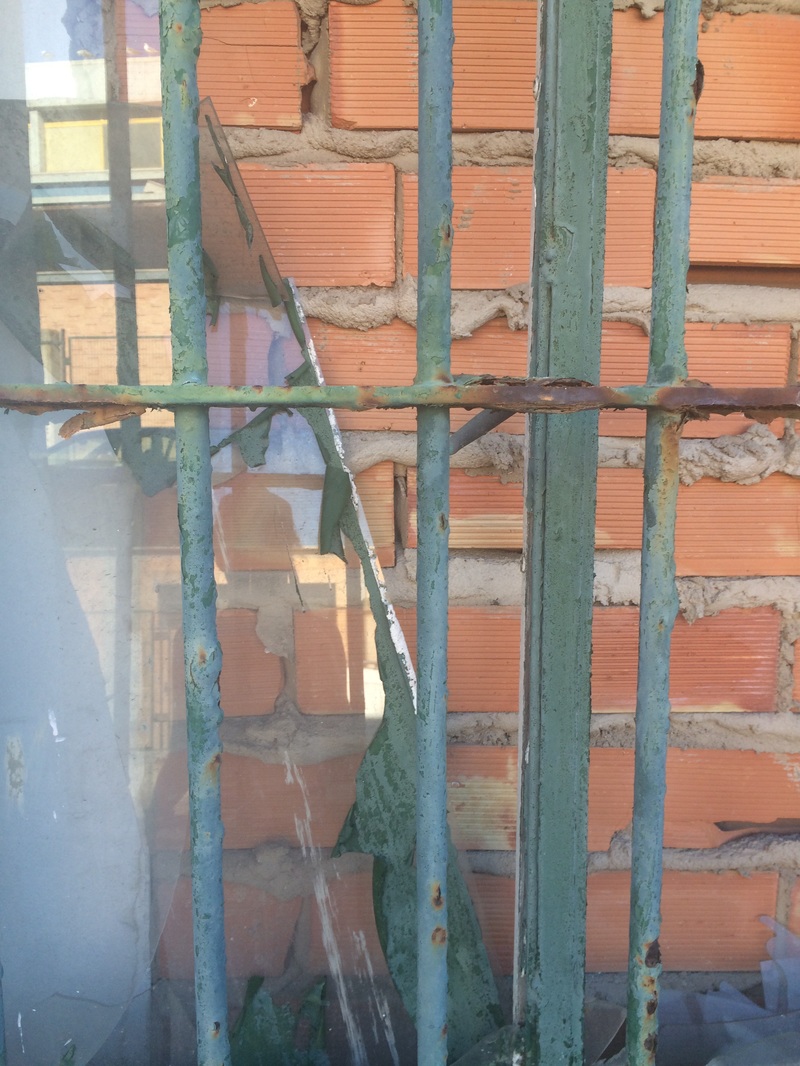
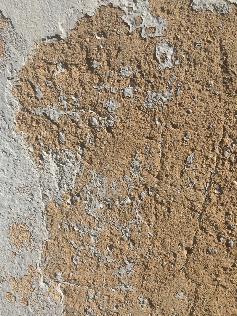
2. Close-up dilapidation - walls of buildings on which the paint is chipping, the bricks are crumbling, or there are cracks and bits of dirt. It relates to disorder because the focus will be on the broken, imperfect and ruined bits.
|
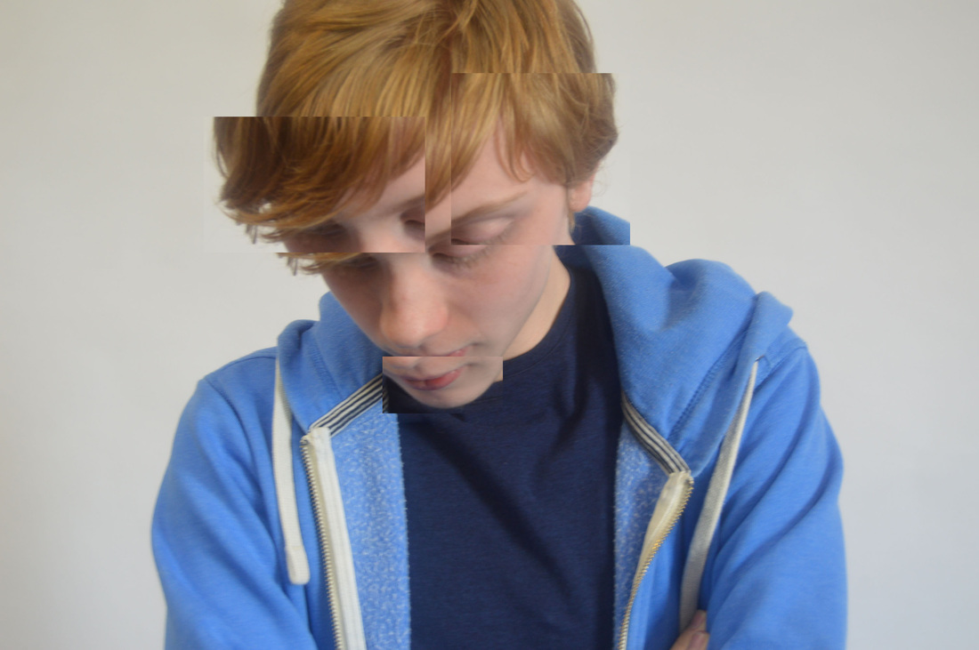
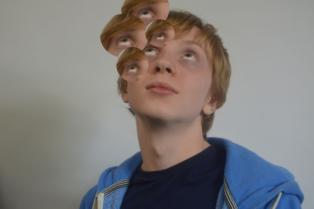
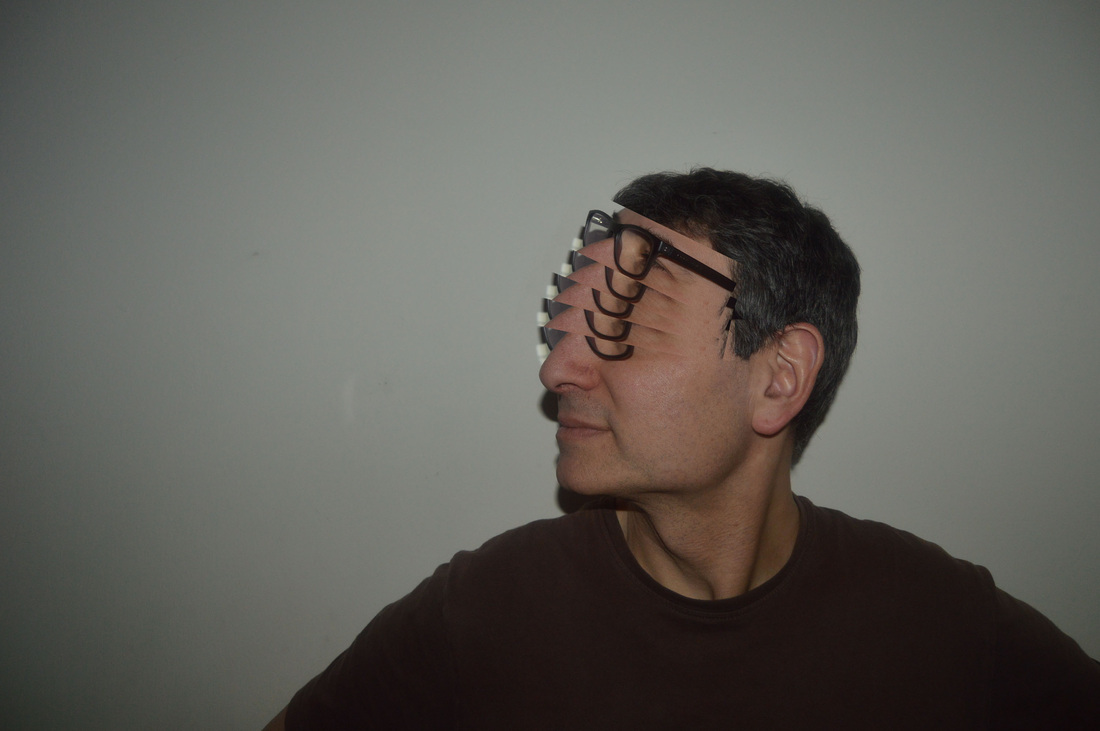
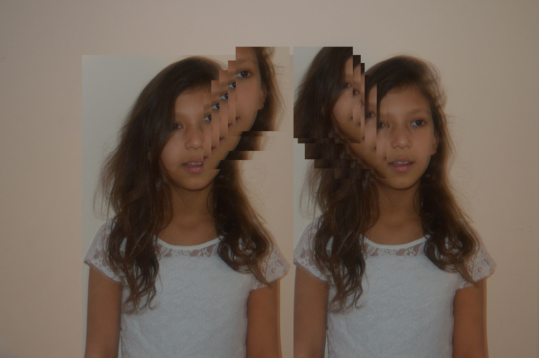
3. Portrait disorder - Using photoshop to move around parts of peoples faces, to make them look strange, or unusual. I can anaylse and take inspiration from artists like Gordon Magnin.
|
|
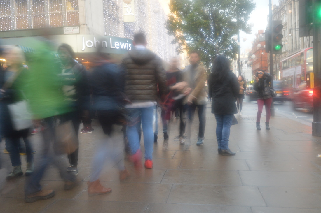
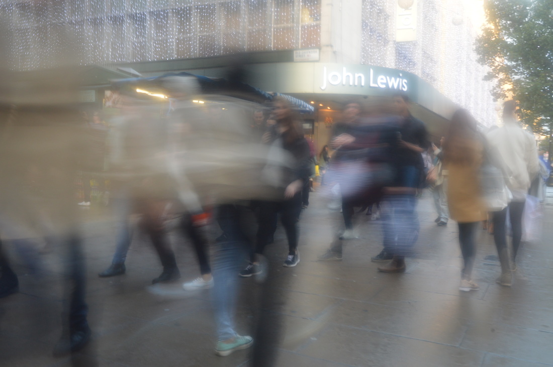
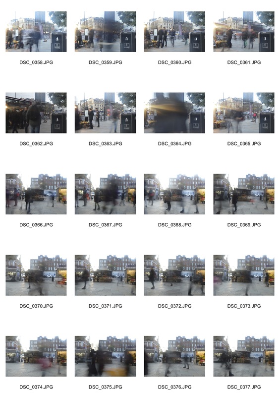
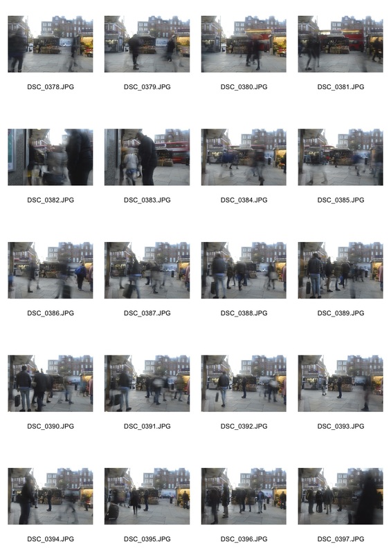
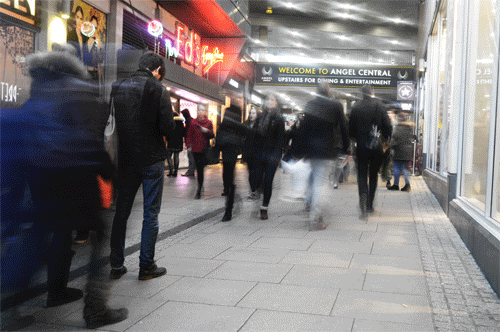
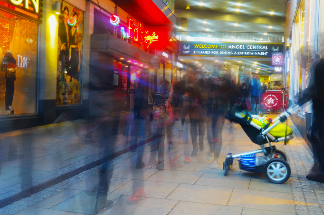
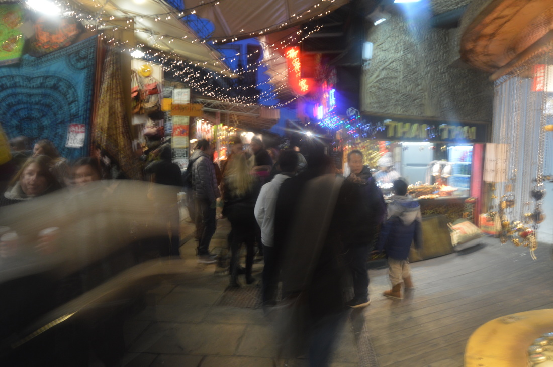
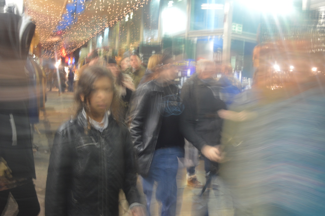
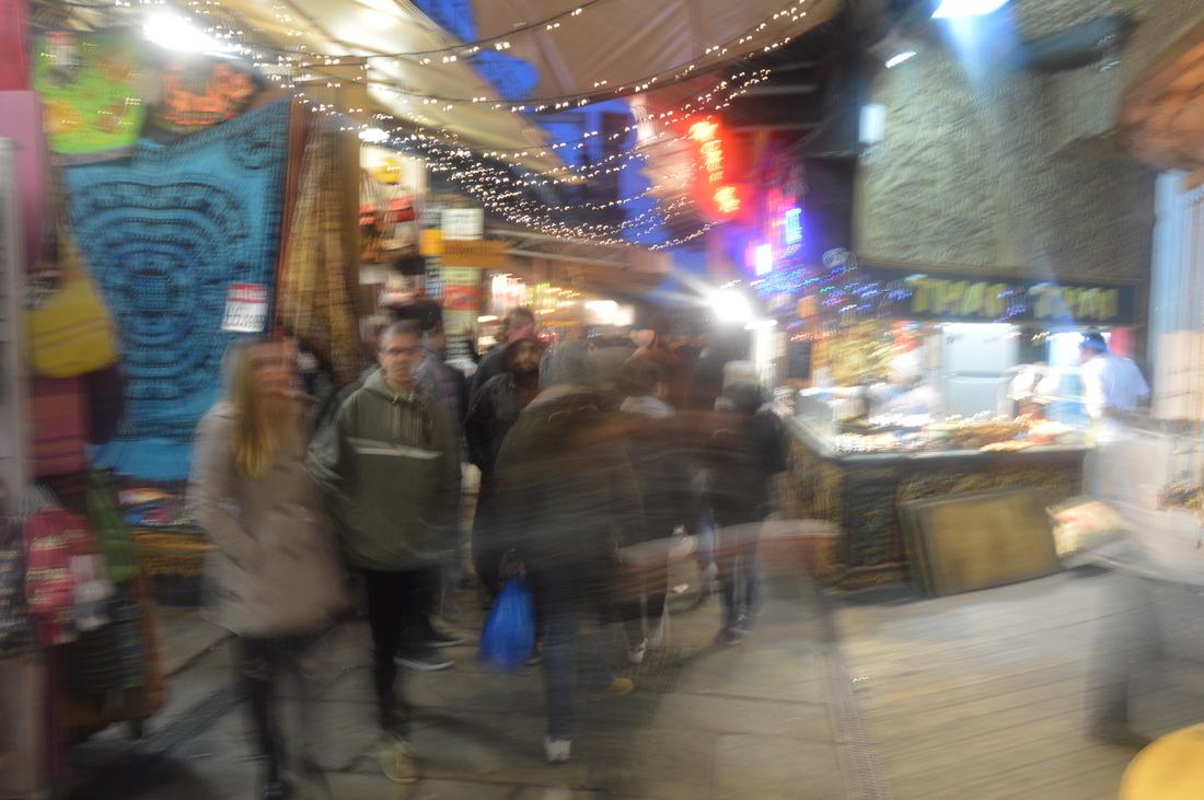
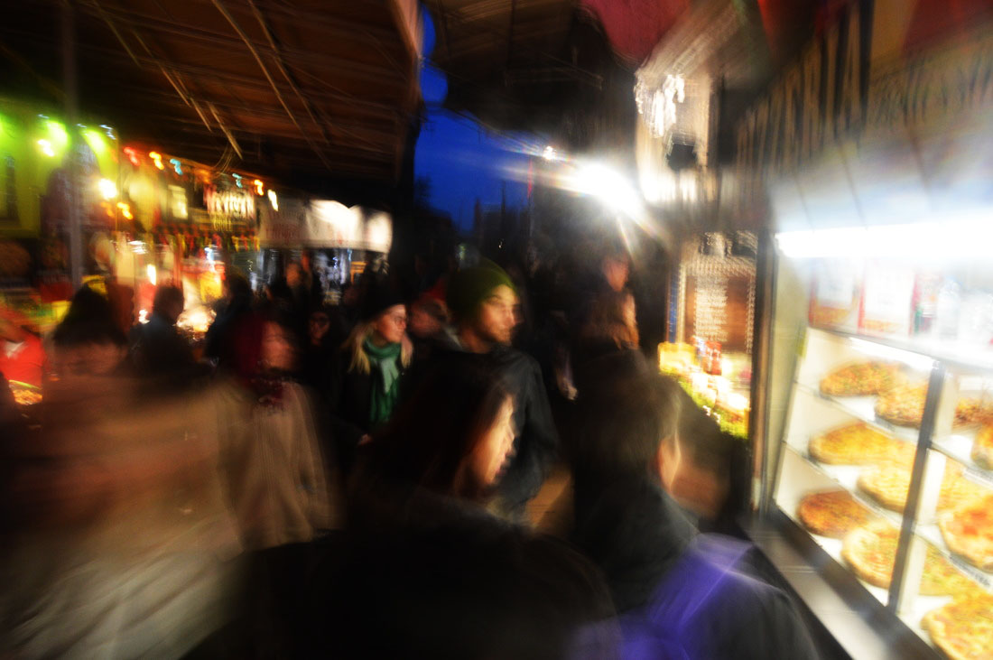
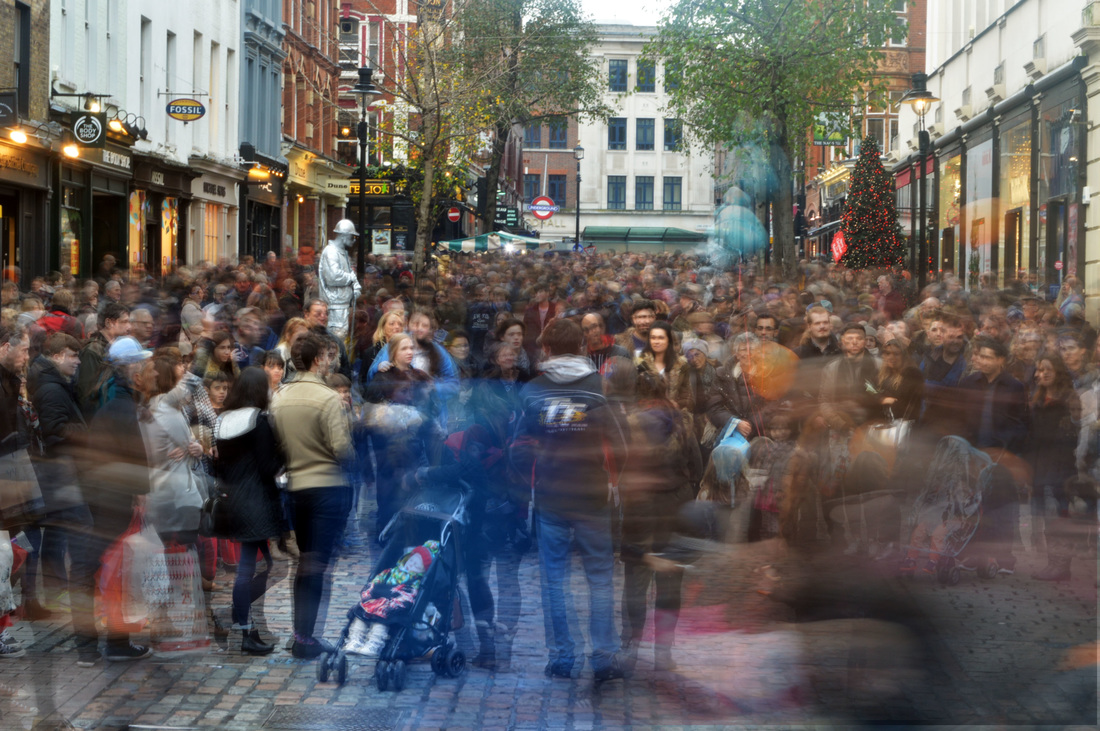
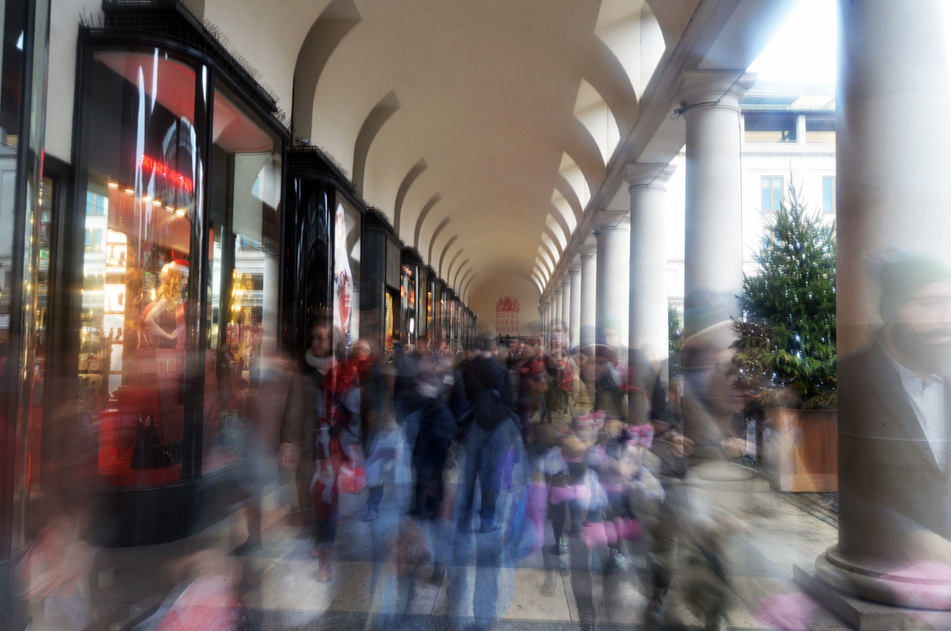
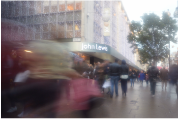
STRAND 1: CITY MOVEMENT
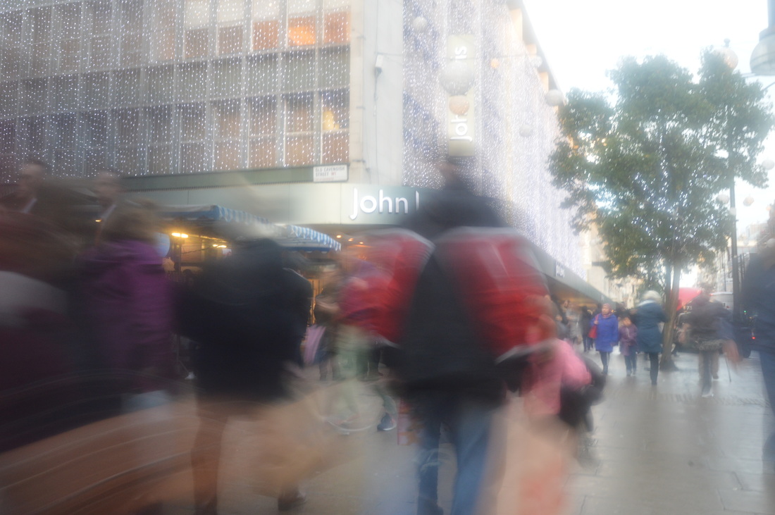
|
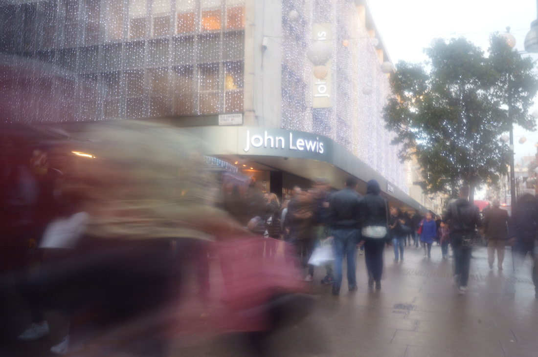
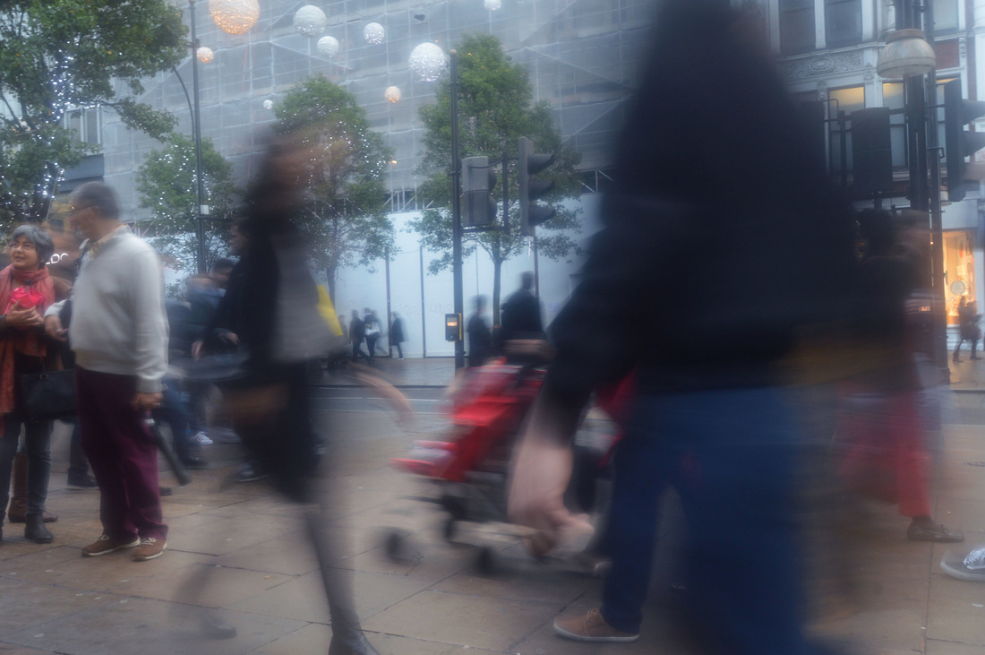
|
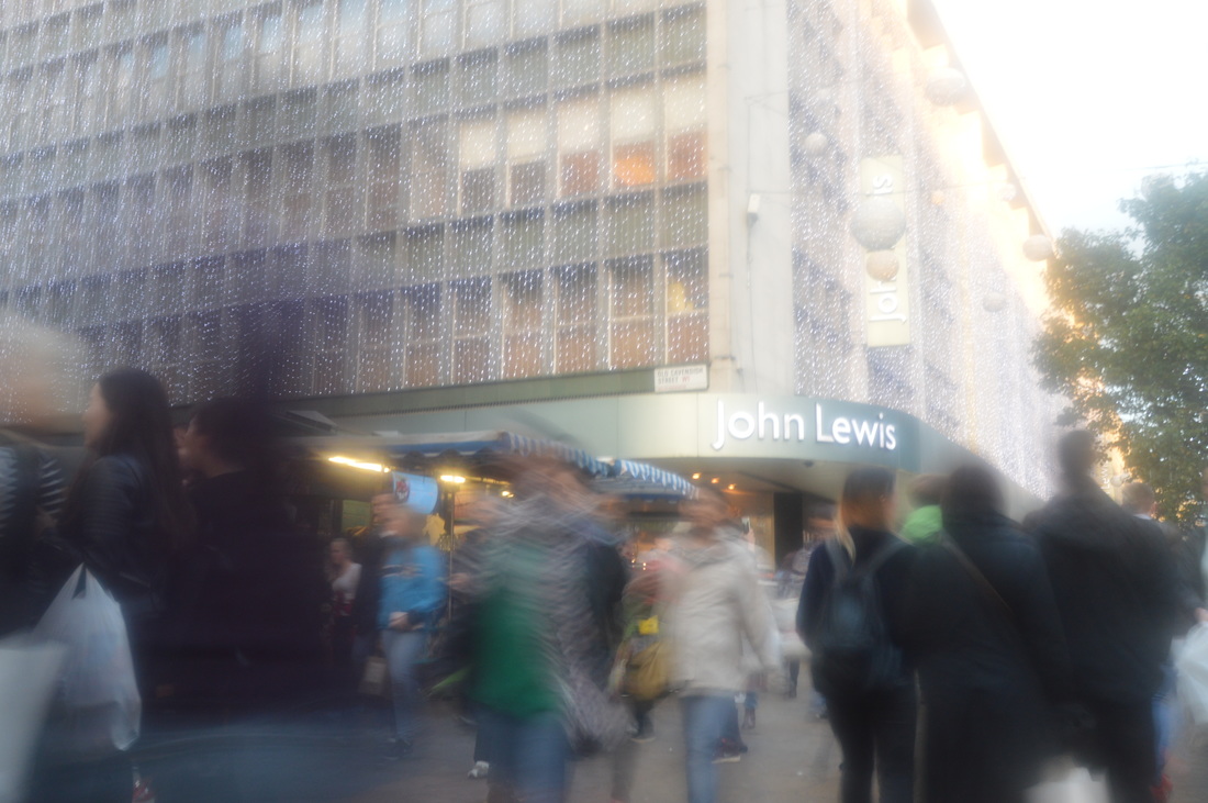
|
|
|
|
STRAND 2: CLOSE-UP DILAPIDATION
|
|
|
|
|
|
|
|
|
|
|
STRAND 3: PORTRAIT DISORDER
|
|
|
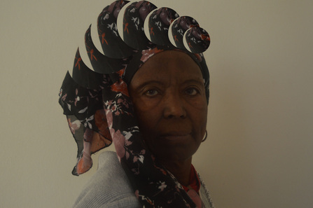
|
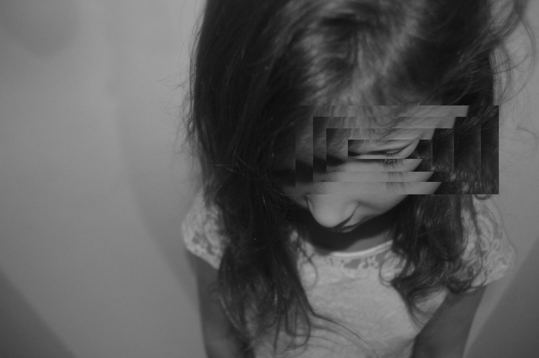
|
|
|
ARTIST AND ME
Gordon Magnin
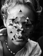
Gordon Magnin uses celebrities' faces and distorts them/creates patterns over them to question celebrity culture and create a new understanding of it. He uses geometric shapes over the celebrity's face and changes the angle of it to create this distortion. My images compare because, similarly, I used photoshop to select an area of a person's face and drag it out of place.
|

|
Gordon Magnin creates a much more complex distortion than mine, which covers the entire face. Mine is much more simple, focusing on merely one speceific feature of the face rather than the face as a whole.
Magnin uses a more complex geometric shape, while as all of my images merely use a rectangular or circular shape.
I also include much more background and negative space, which increases the simplicity of the photograph and makes the subject stand out more against the background. Gordon Magnin's image on the other hand, takes up the whole frame and there is very little background space.
Futhermore Magnin's image is in black and white while mine is in colour. The colour in mine contrasts with the plain white background.
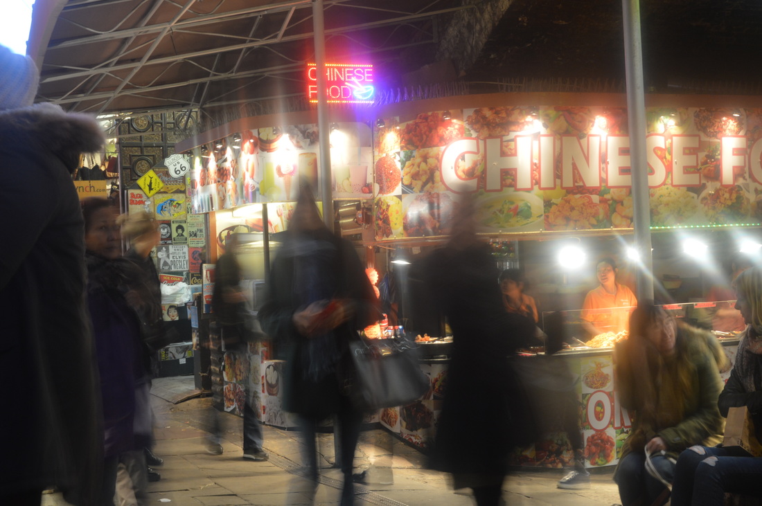
Chosen Strand - City disorder
FIRST DEVELOPMENT
|
|
|
|

|
|
|
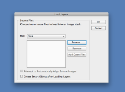
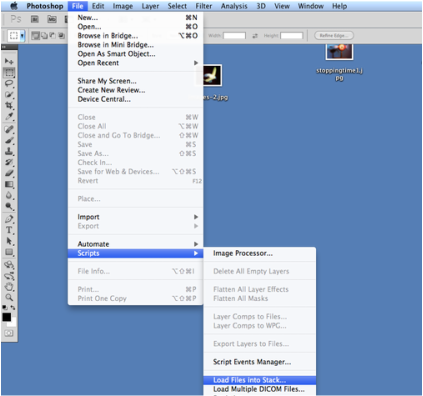
Click on browse to open the pictures to use. By pressing command enables selecting them all in one go.
|
After opening photoshop, select file, then scripts, and then load files into stack.
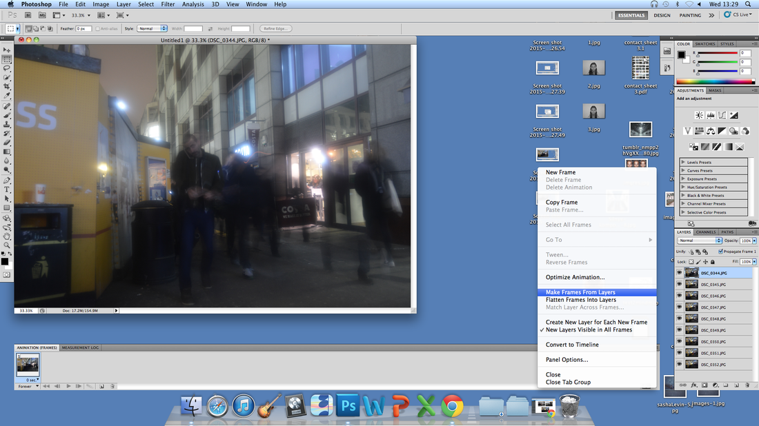
Click on window along the top, and then select animation. A bar should appear at the bottom of the screen like in the picture. Then click on the corner of it, and select 'Make Frames From Layers'. By pressing play on the bottom of the animation bar,the gif will play. Drag and drop frames to changes the order, or just press 'Reverse Frames' to flip the order in which the images show in the gif. To save the gif, press file, then save for web & devices.
ARTIST AND ME
Alexey Titarenko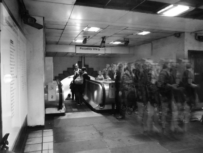
Alexey Titarenko's photograph is of the top of the escalators at a tube station. It shows a flow of people walking off it. Most likely the photographer layered images on photoshop to make it look busier, as the people look quite opaque and overlap each other slightly. His image is in black and white whereas mine is in colour.
|
Me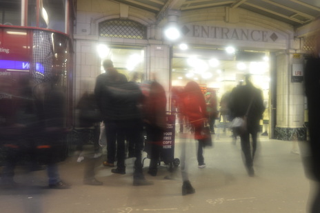
My picture shows people walking into a tube station, but because I did not layer images on photoshop, it looks a lot less busy than Alexey Titarenko's picture. The chaos of the people and the clarity of the rest of the image really contrast in Alexey Titarenko's picture, but mine is not as in focus and so does not really have the same effect.
|
SECOND DEVELOPMENT
Angel station
|
|
|
|
GIFs
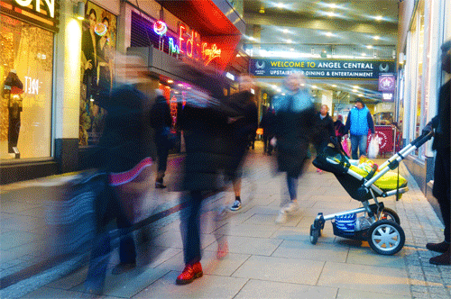
|
|
Layered images
|

|
Camden
|
|
|
|
|
|
ARTIST ANALYSIS
Stephanie Jung
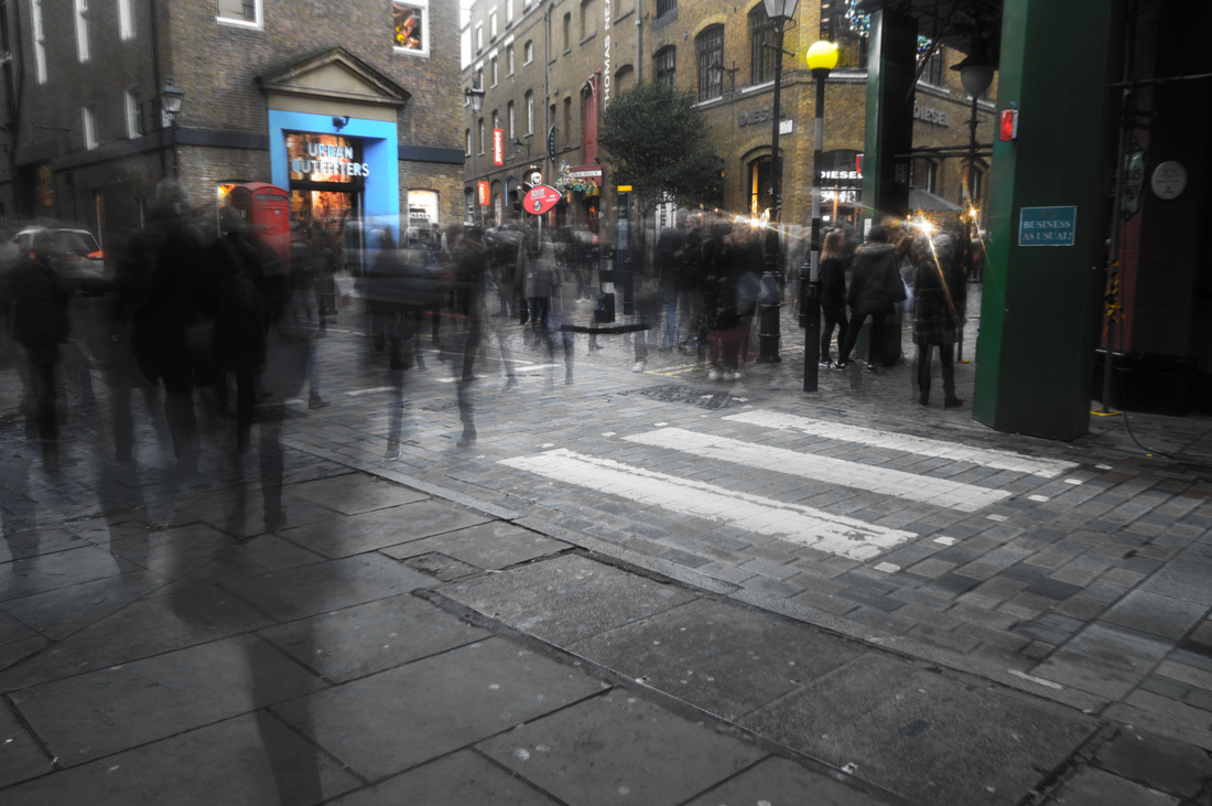
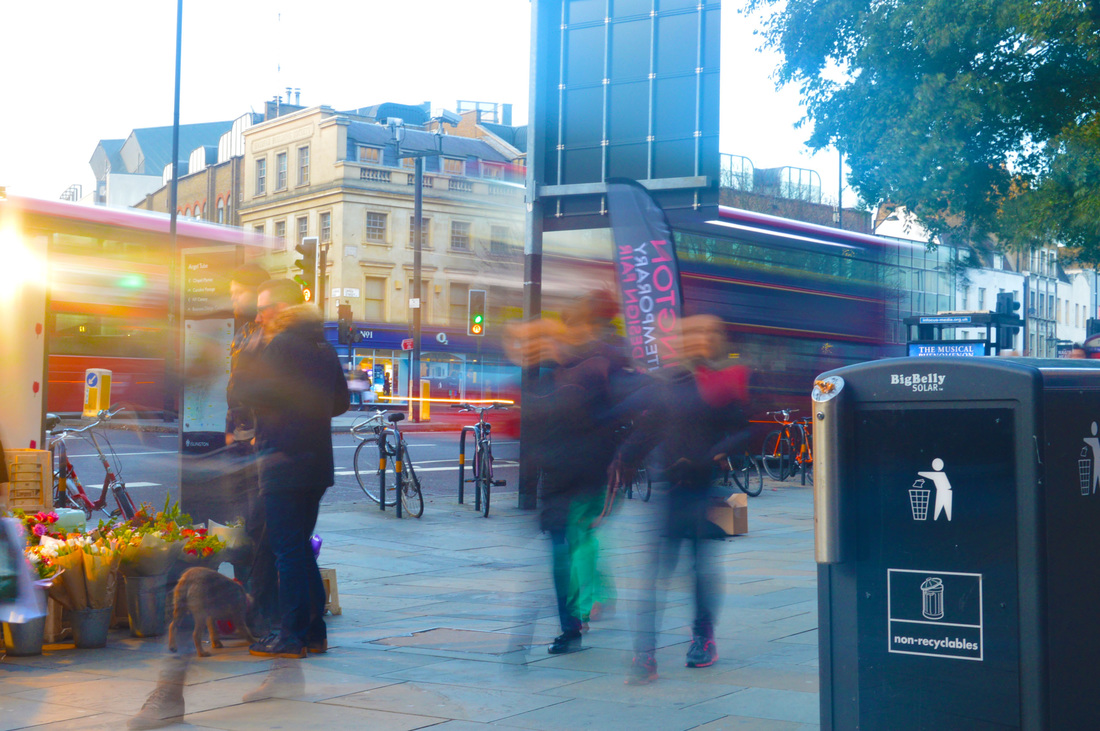
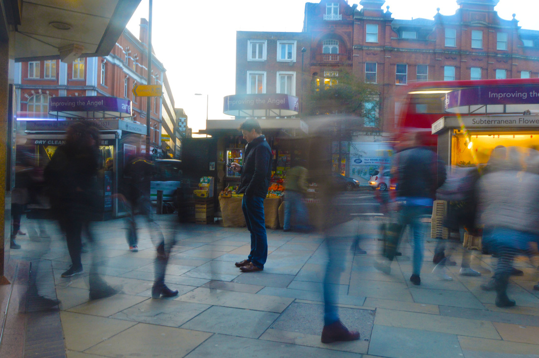
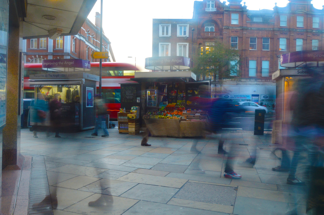
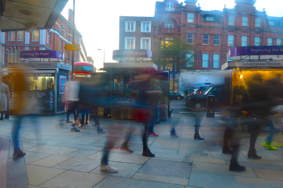
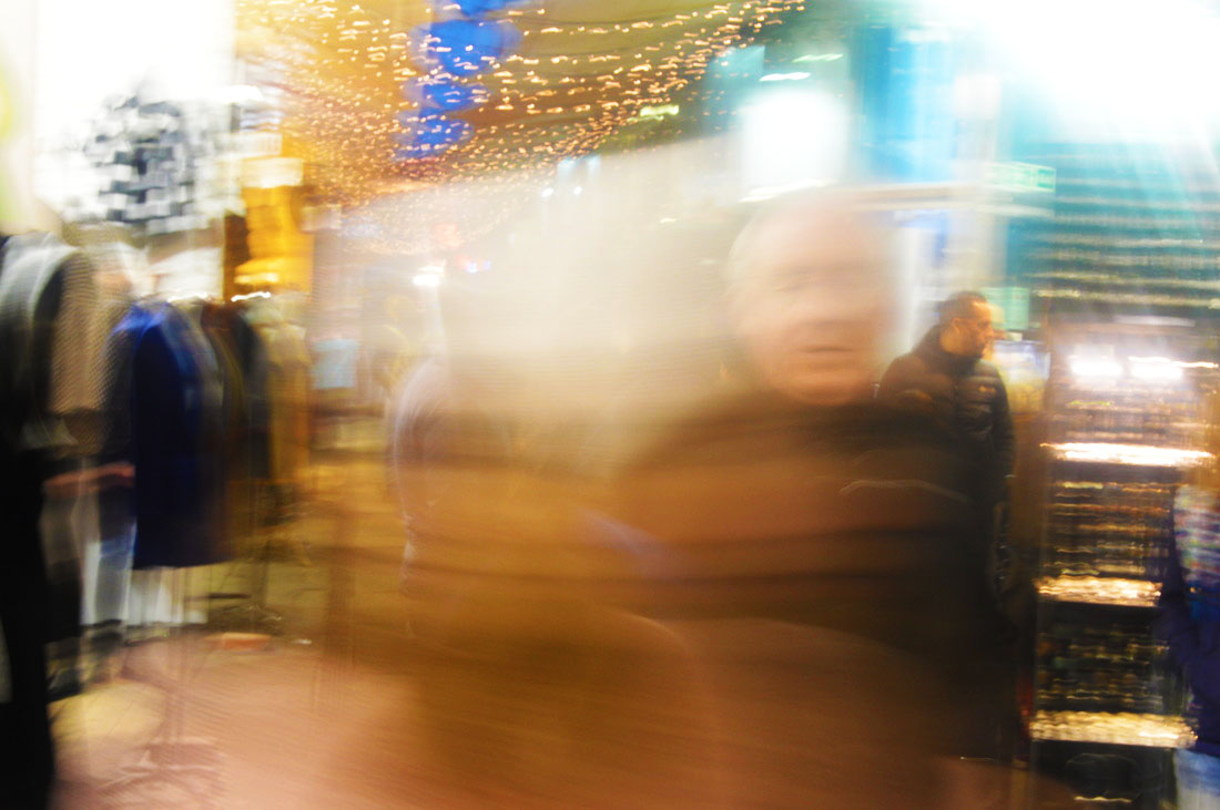
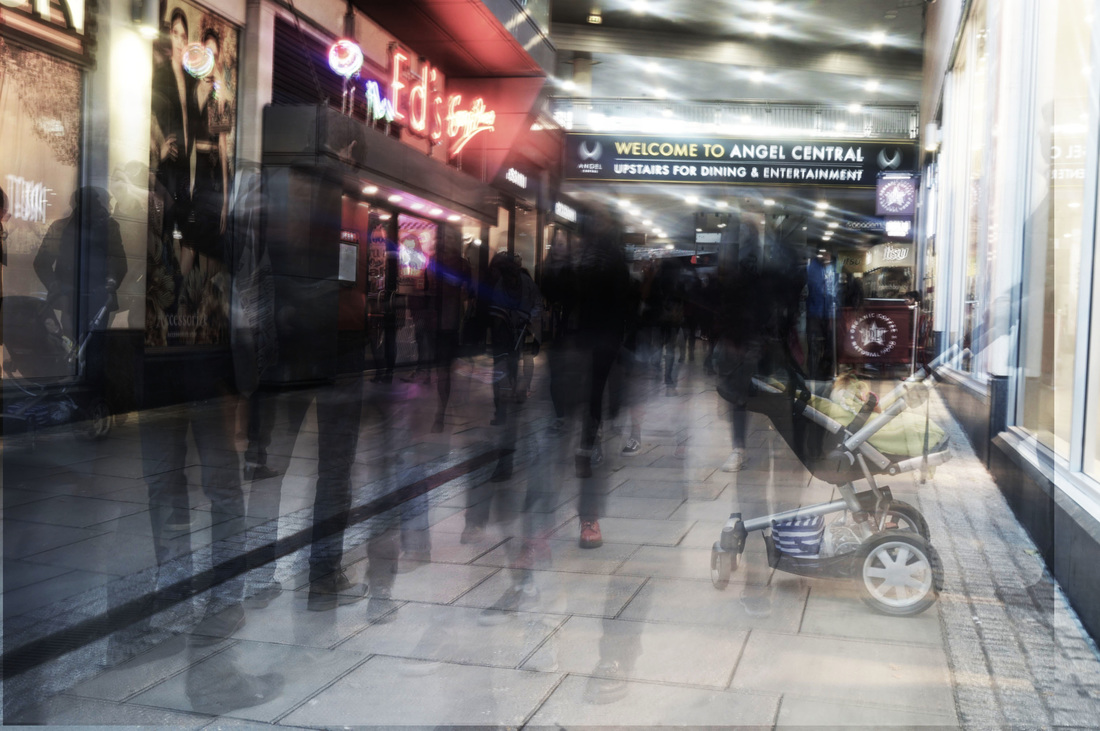
Stephanie Jung probably used photoshop to create layers and drag them so they are out of place with each other to give the entire picture a disorderly, chaotic effect. This differs from my images because I use a slow shutterspeed to make the people blurred but the background in focus. Stephanie Jung does not just focus on the disorder of movement and people, she focuses more on city streets with tall buildings and traffic. There is not just one main focal point, and the whole photo brings attention to itself instead of just one particular part of it.
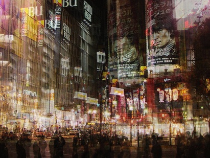
The picture shows a busy city junction. The people in this image, unlike in my images, are not the main focal point and are just a row of silhouettes along the bottom. buildings fill more or less the whole picture, and everything is doubled because of the out of place layers, and some parts of the image are opaque. The picture is quite dark, but the colours are warm, and the streetlights, traffic lights, and what are most likely shop windows along the bottom of the buildings add brightness.
|

The colours are quite dull, and most of the image is very opaque. The same sort of yellow and red colours as the previous image are used, but they are less vibrant. There is more focus in the people in this image than in Stephanie Jung's previous image. However there is still an equal amount of focus on the setting and the buildings in the background.
|
THIRD DEVELOPMENT
LAYERED IMAGES
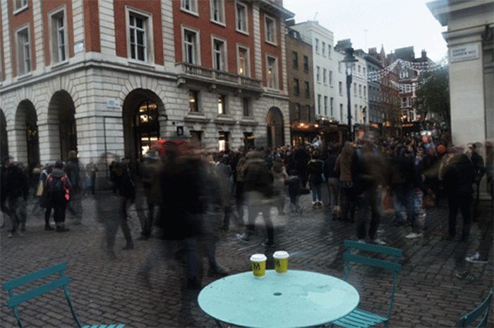
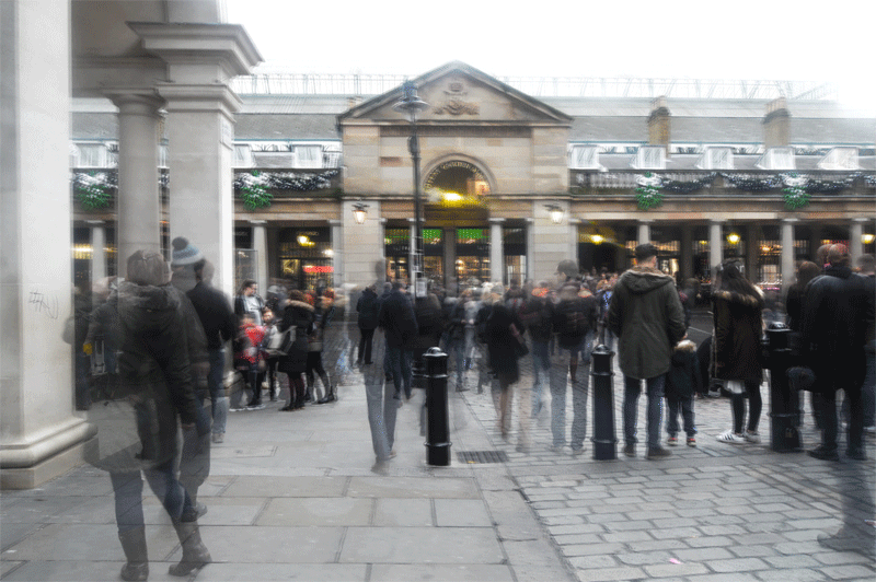
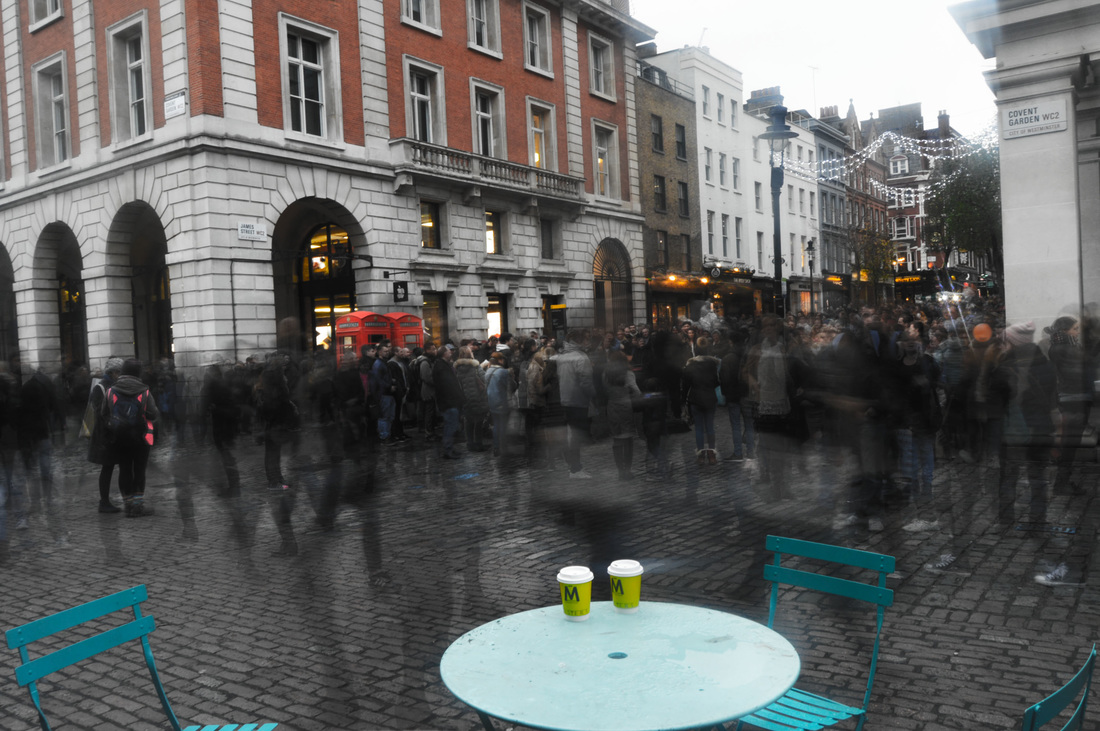
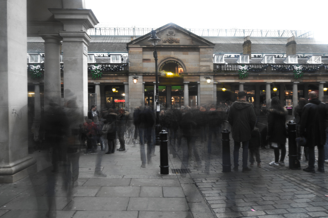
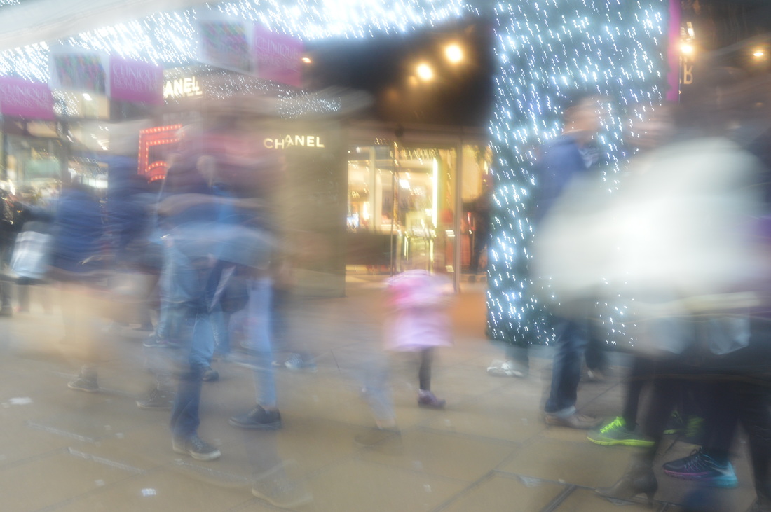
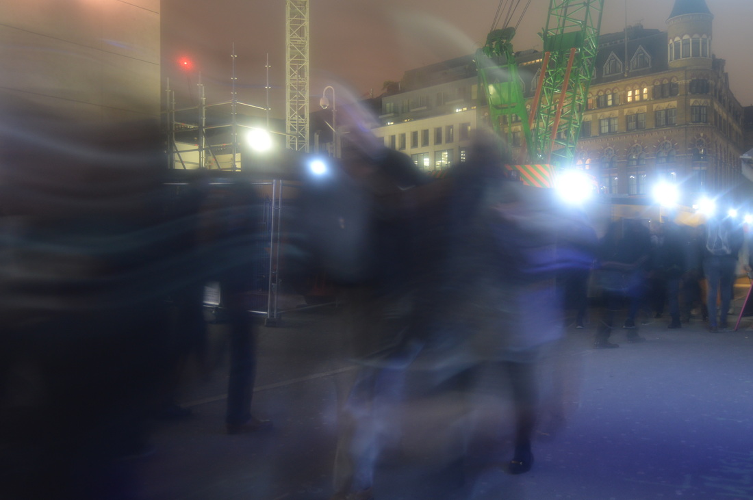
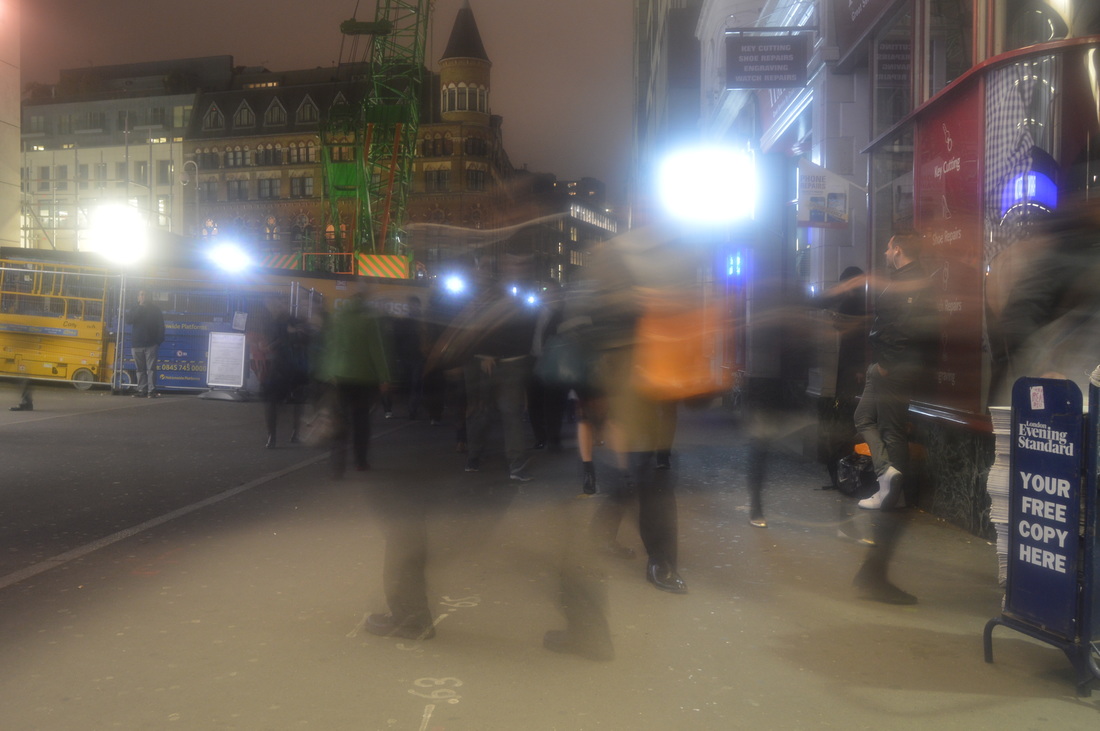
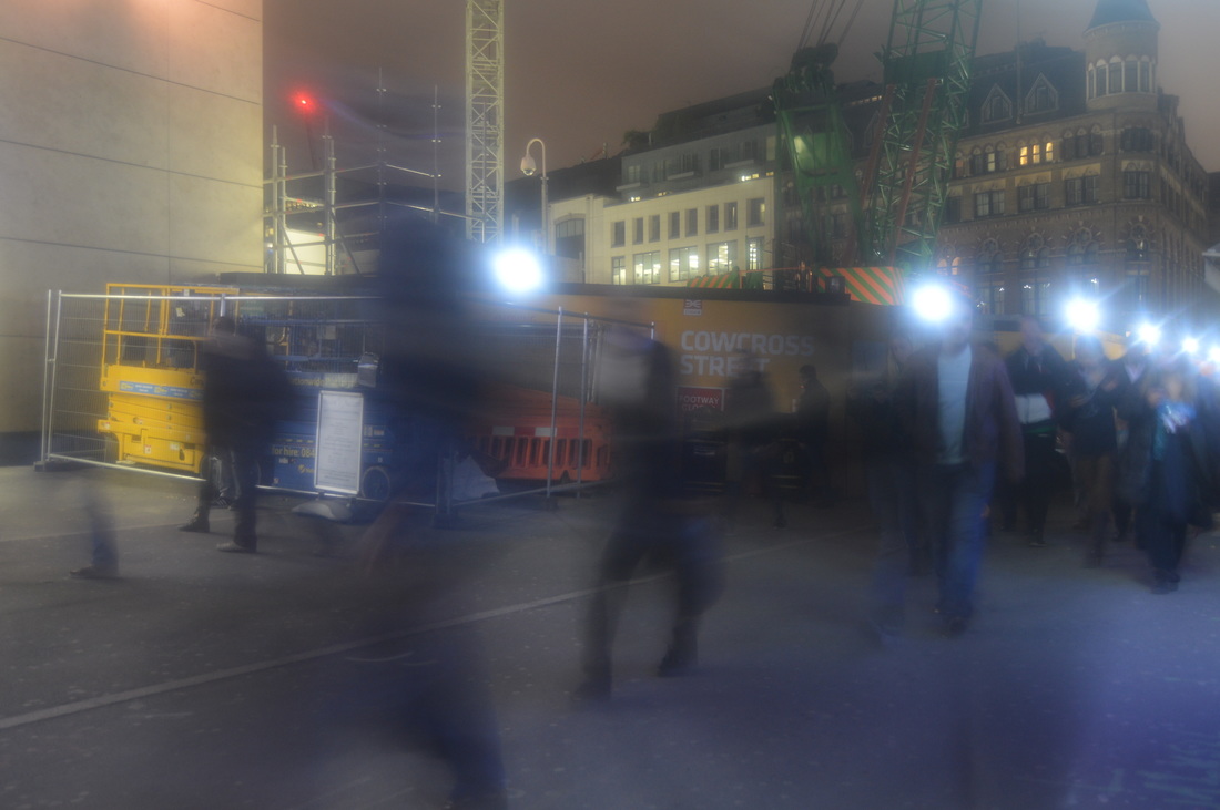
I made these images by layering two or three of my movement photos and reducing the opacity, to create an effect like in photographer Stephanie Jung's images. However, instead of dragging them out of place, I put them exactly in line with each other so that the surroundings are in focus, contrasting with the blur of the crowds. These images are more like the Alexey Titarenko photograph that I compared my first development work with.
HOW I HAVE REFINED MY WORK:
SIMPLE CITY DISORDER IMAGES |
|
|


TWO LAYER GIFS
Each frame in these gifs have two layers, and so it appears as though two scenes are going on at the same time.
MY PROCESS OF DEVELOPMENT AND REFINEMENT
F I N A L P I E C E
For my final piece images, I made a series of GIFs and layered images. I focused on contrasting the rush and disorder of the movement with the still and in focus background. To enhance this I edited the colours so that the people appeared darker and more ghost like.