P A S T , P R E S E N T , A N D / OR F U T U R E
|
past
pɑːst/ adjective
|
present
ˈprɛz(ə)nt/ adjective
|
future
ˈfjuːtʃə/ noun
|
PINTEREST BOARD
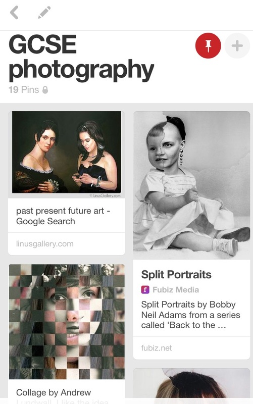
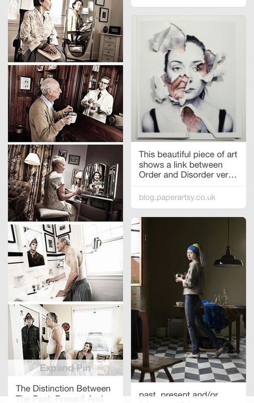
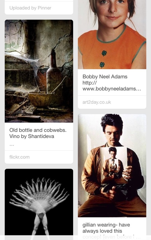
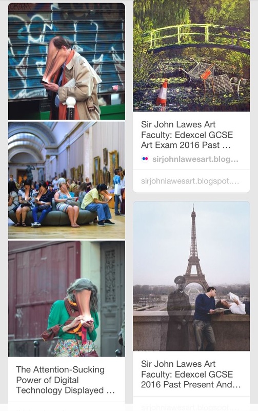
I created this Pinterest board in order to get inspiration and bring together lots of different images that relate to this topic from which I can gain ideas.
|
|
|
LOCATION
ARTIST ANALYSIS
Taylor Jones
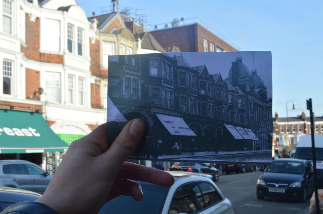
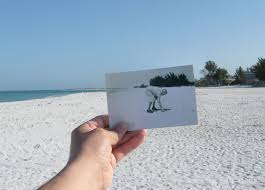
Taylor Jones is a Canadian artist who created the web-based project 'dear photograph'. He began by holding an old picture up to the exact same location and photographing it, capturing and contrasting past and present. He called for people to 'take of a picture from the past, in the present', and the trend caught on as millions of people did the same, sending in their own memories, accompanied by a caption beginning with 'dear photograph'. The picture does not just show a location, but also the memories it holds, as there is usually a person or an event going on in the old picture.
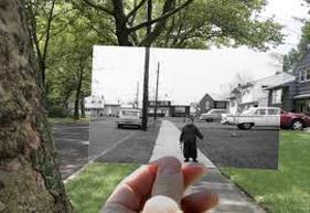
The photographer has carefully lined up the edges of the pathway and the road to the old photograph. The colours of the present part of the photograph contrast with the black and white image, and strongly emphasize the difference between how moments are recorded in the past and the present. The fact that the trees are full of leaves whereas in the old picture there are a no trees and it looks a lot more bare also contrasts.This, being due to the change in season, highlights the effect of time in terms of change in just a matter of a few months. The alignment of the image is so precise that even the car in a driveway line up, contrasting an old car to a slightly more modern car.
|
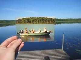
The old picture in this image is not in black and white but the tones are more dull and yellow so it still stands out against the more vibrant colours of the more modern part of the image. The old picture shows a row boat full of people in the middle of the lake as the main focal point of the entire image. Despite this, there is still a lot of focus on the lake and the area around the old image, as it is held further from the camera than in the other pictures. The lake in the present part of the picture is incredibly still and mirrors the trees in the horizon which creates a horizontal line that cuts through the picture. The stillness and emptiness contrasts with the activity of the family in the boat and creates a sense of nostalgia.
|
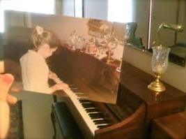
This picture shows an old photograph of a girl playing a piano, held up to line up with the exact same piano. It is taken from a side angle and not looking head on at the piano, and the old photograph is held at an angle in order for it to align. This is different from the other images, as usually, the old photograph is held up at a straight angle to fit the frame as best as possible. The different between past and present is emphasized through the faded tones of the old image which contrast to the present. Like the last, this picture also creates a sense of nostalgia. In the old picture, there are glass and ceramic ornaments lining along the top of the piano, whereas in the present part of the picture there are almost none.
|
MY RESPONSE
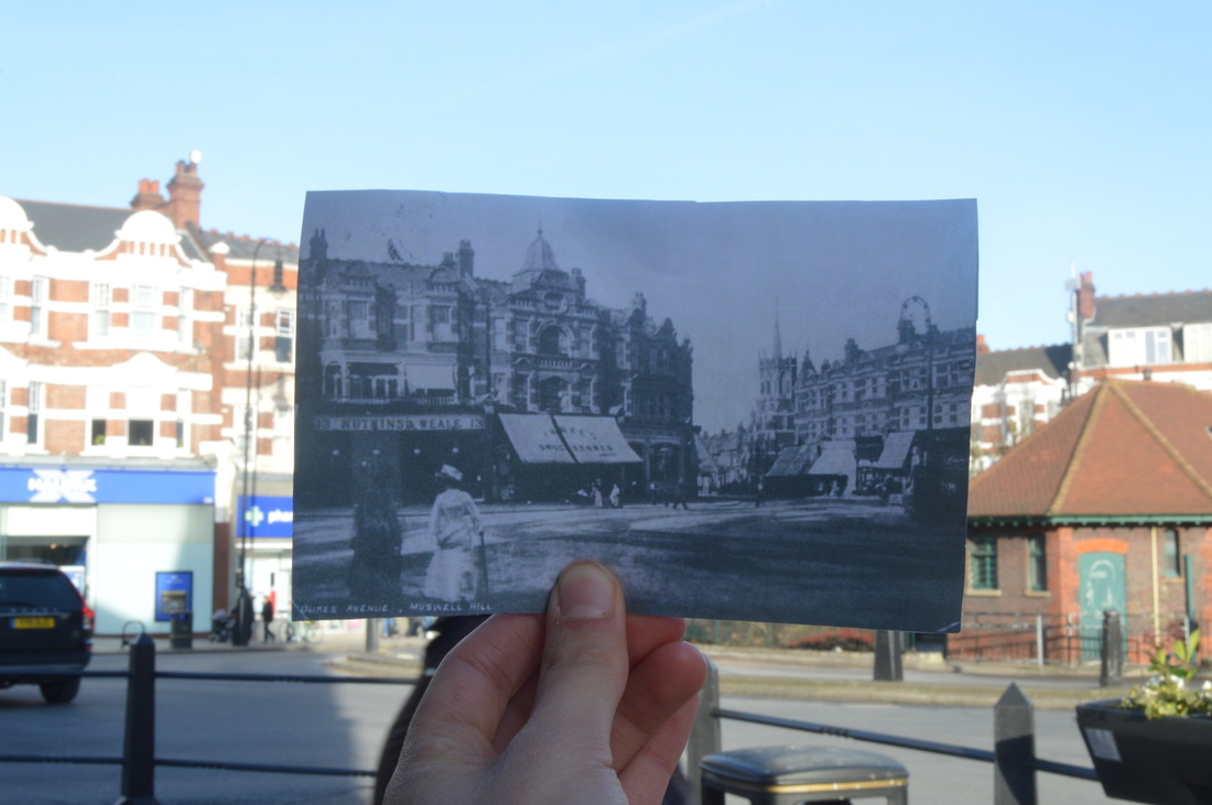
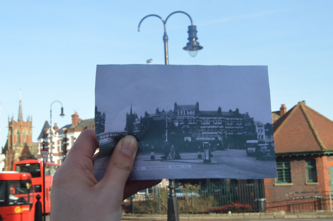
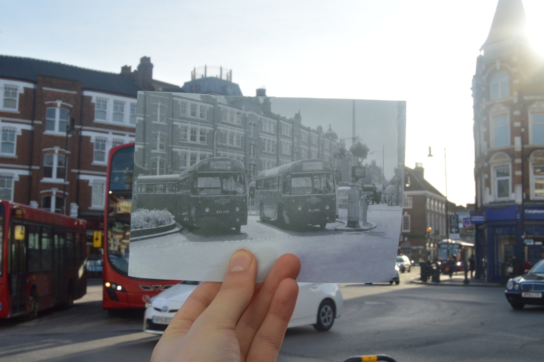
MUSWELL HILL
Using old black and white images of parts of Muswell Hill, I held them up to the same location now and photographed them to represent and contrast past and present, like Taylor Jones did. However my images just show the location, whereas Taylor Jones usually holds up pictures that have people, events, and memories in them. These means that my images don't have that sense of nostalgia that Jones' do, and if I were to expand or develop this response, I would try and include people too.
|
|
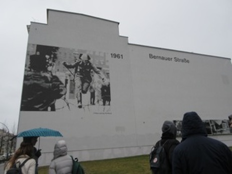
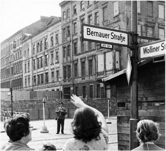
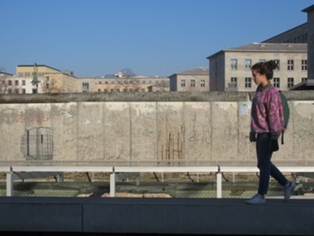
BERLIN
For this response, I did not hold up images to contrast past and present like Taylor Jones did, but merely took pictures that include elements of the past or can be contrasted to old photographs placed alongside them.
|
|
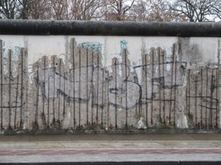
The Berlin Wall
The Berlin Wall dividing East and West Berlin came down in 1989, but sections of the wall remain. I photographed parts that are left to represent the past (a divided Germany where Berliners where trapped and many died trying to cross the wall), and the present.
|
|
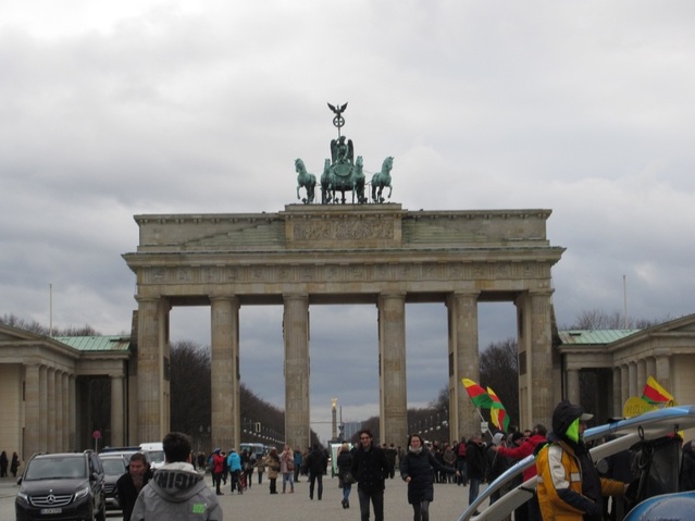
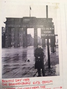
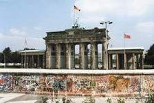
Brandenburg gate, before and after the wall came down
|
|
The Reichstag
The Reichstag (German Parliament) was burnt down in February 1933 but has since been rebuilt. I took a photo of what the interior looks like now and placed it alongside a picture of the interior before 1933.
Now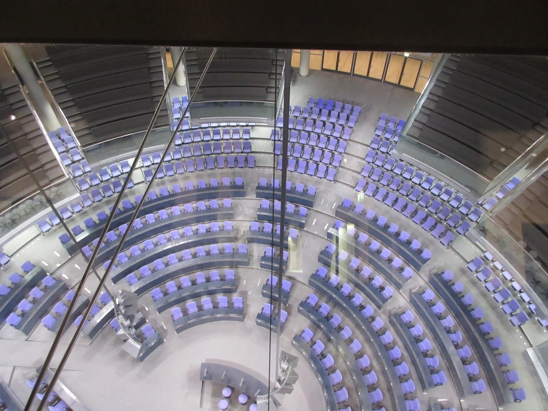
|
Before 1933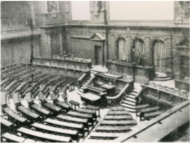
|
RECREATING OLD PHOTOGRAPHS
ARTIST ANALYSIS
Irina Werning
Irina Werning's 'Back to the Future' project is similar to Taylor Jones' 'Dear Photograph' project in the sense that she is returning to the atmosphere of an old picture to contrast past and present. Furthermore, she too called on people to take part in the project and create their own response. Many dressed as their past self in an old photograph, returned to the same location, and imitated the same pose to take up Irina's challenge.
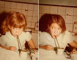
In these images, the photographer has even replicated the same yellow tones in the new picture as in the old. One shows a girl sat at a kitchen table sipping through a straw from a mug, and the recreation of this shows the same thing, but with the girl now as a woman. The old photograph has been taken at a slightly slanted angle, and the new photograph has replicated this by taking the picture from this angle too.
|
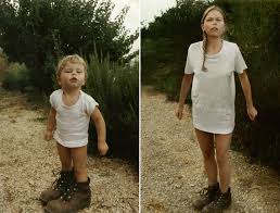
Both the photographs are taken from a relatively high angle, and include the whole of the subject of the photograph in the framing. They show a girl in a white T shirt and walking boots looking up towards the camera. The photographer took the photograph against the same background as the old one, so both the images are taken on the edge of a pathway, the side of which cuts though the pictures diagonally, at exactly the same angle in both.
|
These images focus on just the person's face, and only their head and shoulders are included in the framing. They are wearing the same clothes, the background is the same, and they are even pulling exactly the same face in both images. I feel as though this image in particular really represents how even as you grow, characteristics stay the same and even your bits of your childishness remain. That is one thing that time/past present and future cannot change, even if appearance does.
|
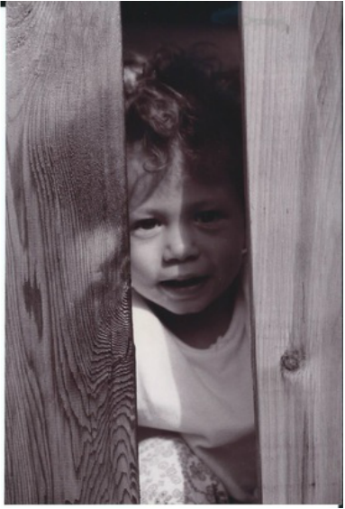
MY RESPONSE
Then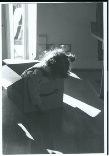
|
Now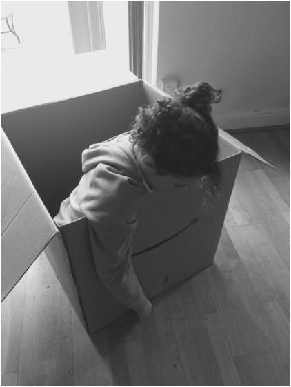
|
|
|
|
|
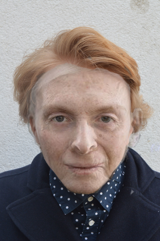
AGING A FACE ON PHOTOSHOP
I used photoshop to merge the image of a young person and the image of an old person, showing the inevitable change from youth to old age.
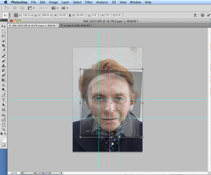
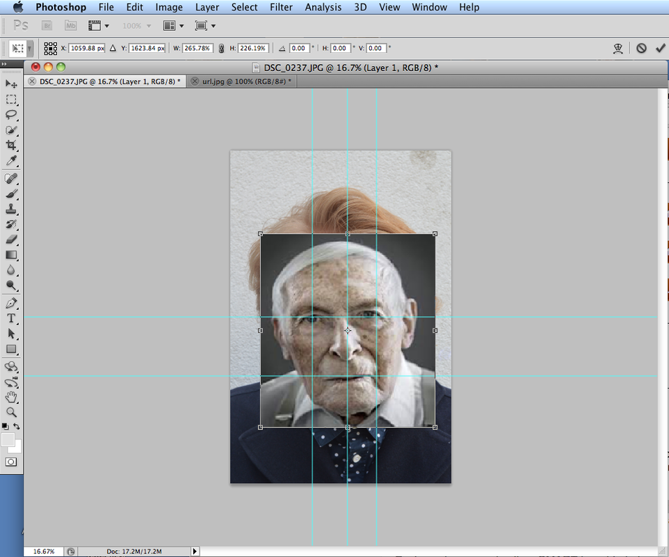
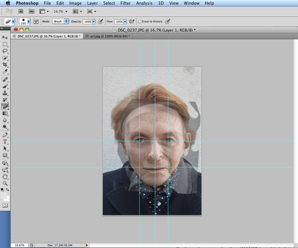
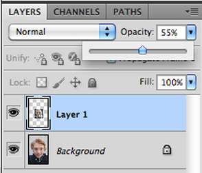
On photoshop I used guides in order to accurately place the picture of the old person over the picture of the young person, and then reduced the opacity. This way, both the pictures can be seen. By using the eraser tool, I could neaten up the edges and make the merged image look more realistic. It was difficult to get the faces to align exactly, as, inevitably, the face shape is different. In my images you can see that the alignment is slightly out. The only way I can think to perfect or improve this is by choosing images that are more similar in feature size/face shape.
On photoshop I used guides in order to accurately place the picture of the old person over the picture of the young person, and then reduced the opacity. This way, both the pictures can be seen. By using the eraser tool, I could neaten up the edges and make the merged image look more realistic. It was difficult to get the faces to align exactly, as, inevitably, the face shape is different. In my images you can see that the alignment is slightly out. The only way I can think to perfect or improve this is by choosing images that are more similar in feature size/face shape.
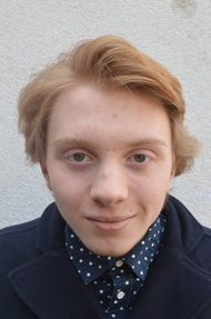
Young person
|
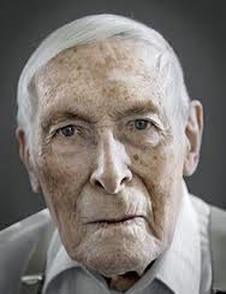
Old person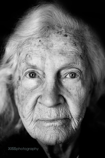
|
Merged/aged image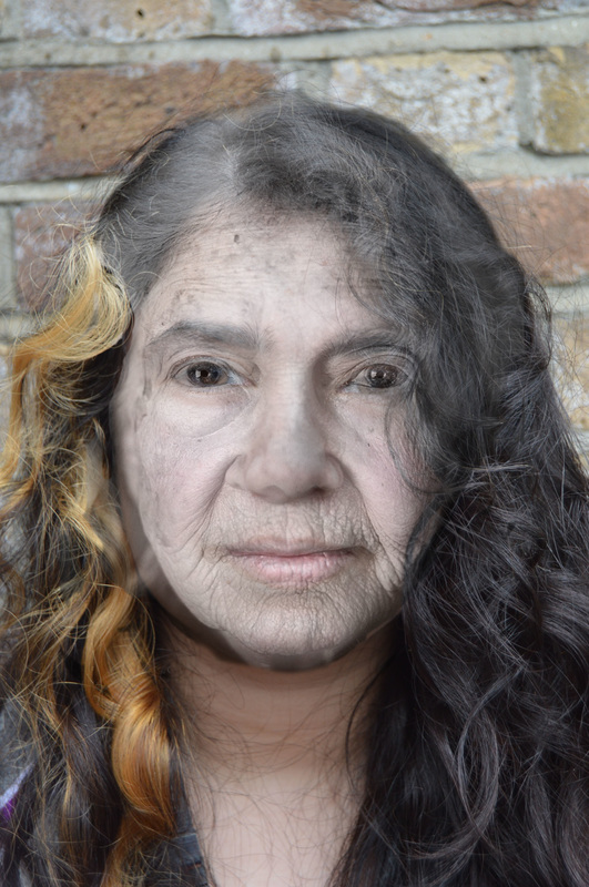
|
|
|
|
MY PROCESS:
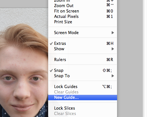
Open the picture of the young face you want to use, then go to 'view' along the top, and select 'new guide'. The guides will help you place the two different photographs together and align them as accurately as possible.
|
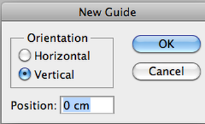
The box that pops up enables you to decide whether you want the guides to be horizontal or vertical. Begin with a vertical guide, but eventually you will need three vertical and two horizontal guides in total. Leave the position as 0cm, because you will be able to drag them into the positions you want more easily using the mouse.
|
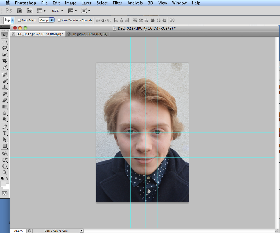
place one vertical guide along the centre of the face, and the other two through the eyes. Then place one horizontal guide so that it cuts the other way through the eyes, and the second horizontal guides so that it goes through the corners of the mouth.
|
|
You can still change the positioning of the older face to make entirely sure that they are as accurately aligned as possible. This is more or less what it should look like at this stage.
The final step once you have finished is to clear the guides. You can do this in the same way you added them, simply by going to 'view' and selecting 'clear guides'. You should now have a completed aged face.
|
ARTIST ANALYSIS
Bobby Neel Adams
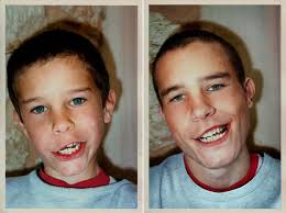
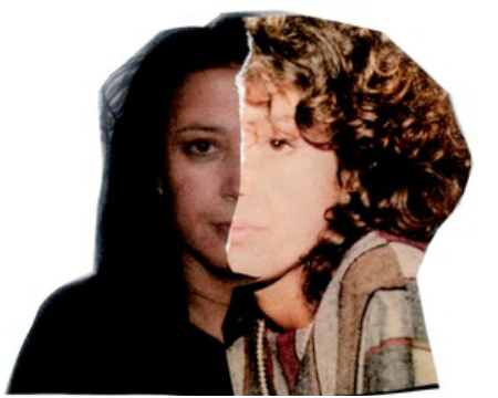
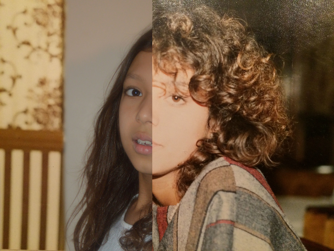
Bobby Neel Adam's Age Maps series places together an old photograph a more recent photograph to contrast and show the physical human changes in appearance through time. Adams says that the jagged tear between the old side and the new side represents the boundary line between decades of passing time. I think that the fact it is not a straight line represents how change is not sudden and neat and perfect, but unpredictable and varying. Furthermore, that small sections of the old photograph side jut into the current side, shows how even when you have matured and entered adulthood, there are still aspects of your child-self that influence your personality.
Adams also says that 'they provide an eerie life-map, staring towards our future', and indeed, his images show almost a timeline of ageing as you scan you eyes form one side to the other.
Adams also says that 'they provide an eerie life-map, staring towards our future', and indeed, his images show almost a timeline of ageing as you scan you eyes form one side to the other.
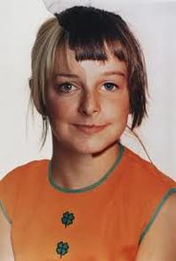
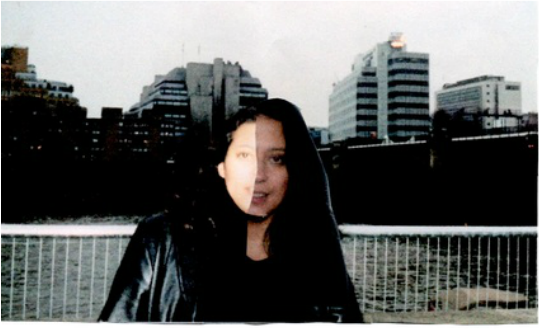
This picture compares how a woman looks now to how she looked as a child. The lighting and tones are quite similar in both pictures, resulting in the two pictures looking more smooth and similar and being less of a drastic difference. The biggest difference in the woman's appearance is her hair colour.
|
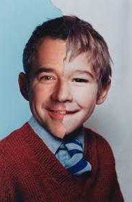
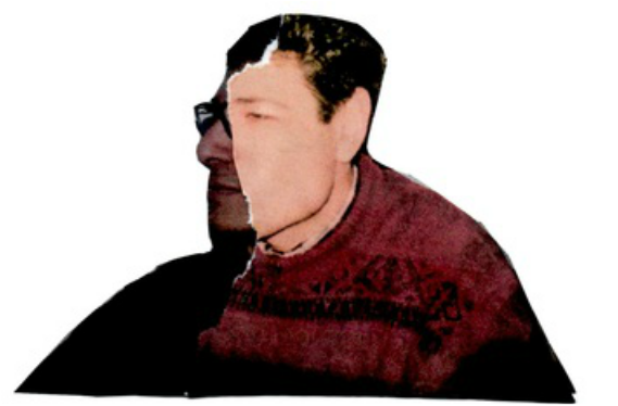
This picture makes the same comparison as the previous one, but the colours are more different and so the transformation from young to old is less smooth. The man has replicated the same smile as in his child photo, but the effects of time can be seen as there are lines by his eyes that are not in the other half.
|
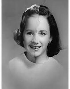
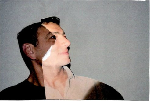
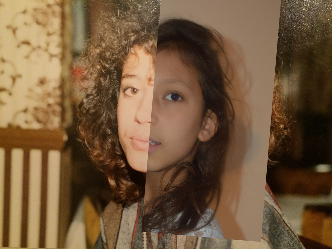
In this picture, both the past and present side are in black and white. The woman's hair, outfit, and expression are the same in both parts of the photograph making the comparison of her age and change with time more evident.
|
MY RESPONSE
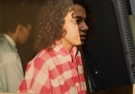
In response to Bobby Neel Adam's Age Maps series, I found old pictures of my parents and placed them against recent pictures of them in the same positions. I did not use photoshop in this response, but printed the photos, physically tore them and placed them together.
|
|
SECOND RESPONSE
Response to Bobby Neel Adam's Family Tree series
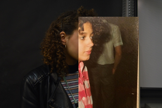
In Bobby Neel Adam's Family Tree series, he uses different family members that look similar, and places them together, instead of using two different images of the same person. I did the same thing in my response, placing together pictures of myself and my sister with old pictures of my mum. I did this using photoshop, and not physically like in my previous response.
While the age maps series shows the difference in time, the Family Tree series shows the difference between two generations, and therefore links just as closely to the topic of past, present and future.
While the age maps series shows the difference in time, the Family Tree series shows the difference between two generations, and therefore links just as closely to the topic of past, present and future.
|
|
|
|
EXHIBITION VISIT
|
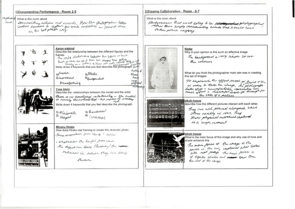
We went to see the exhibition 'Performing for the Camera at the Tate Modern. Simply, the exhibition was about capturing events on camera.
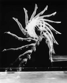
Different rooms of the exhibition contained different approaches. whether it was about capturing and documenting events as they unfloded in front of the artist, or performances and events that took place solely for the purpose of being photographed. The photographer I liked the most was Aaron Siskind, and his images of different figures in different falling positions arranged in a square, as can be seen below. The thing I gained from seeing this exhibition is the ability to analyse the purpose and effect of taking certain photos and how this relates to the way that the images are framed and taken and the techniques that the photographer employs. |
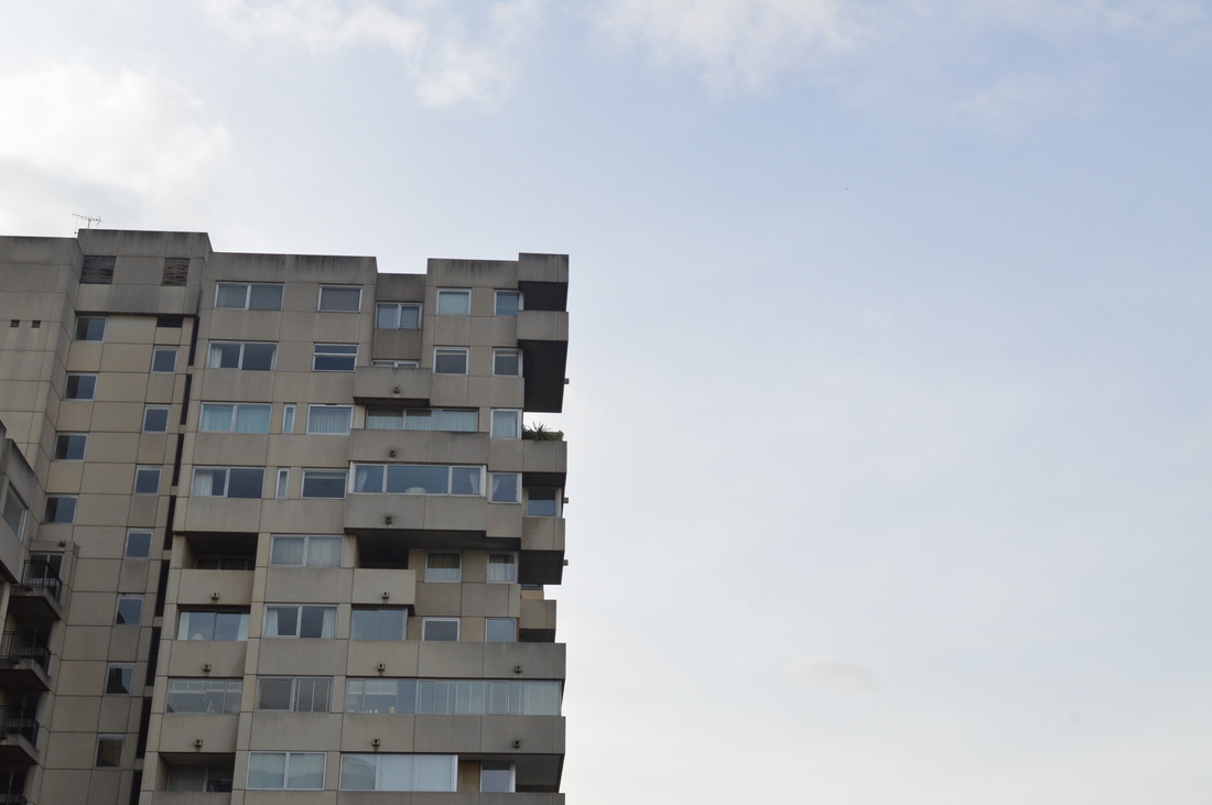
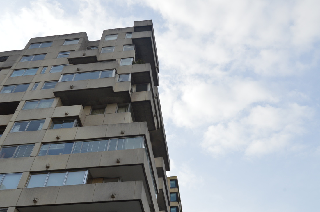
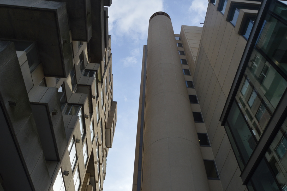
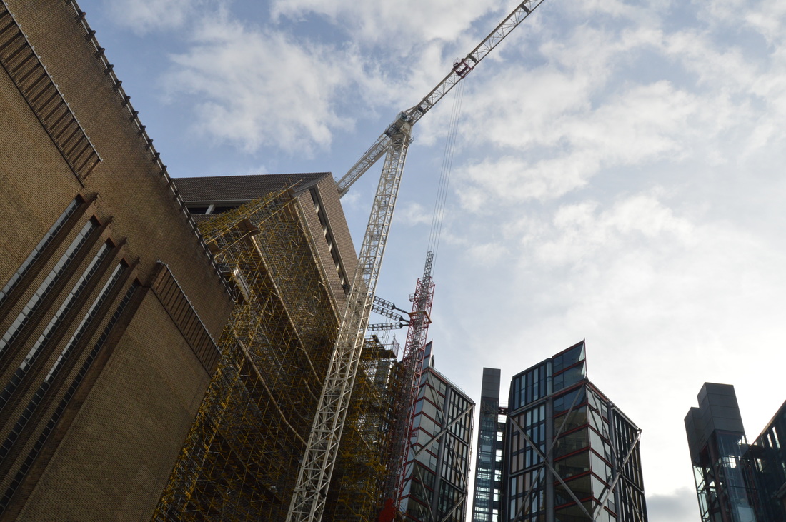
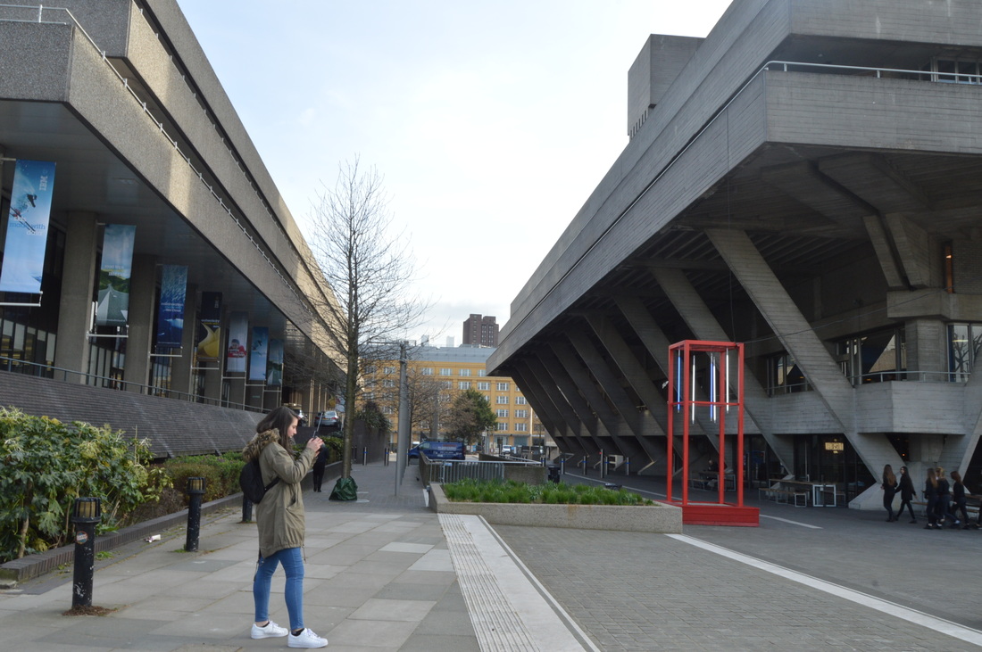
ARCHITECTURE
After the exhibition, we walked around the area, taking pictures of buildings. Architecture is very relevant to past, present and future, because the style of architecture will vary depending on when it was built, and will therefore perhaps represent a particular decade in the past. Cranes and building going on currently in the pictures represent the future as they are yet to be built and completed.
|
|
|
|
|
|
|
THREE STRANDS PLAN
|
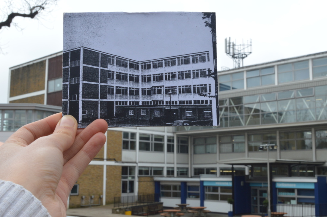
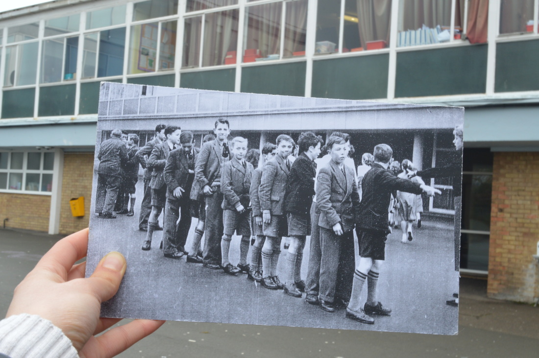
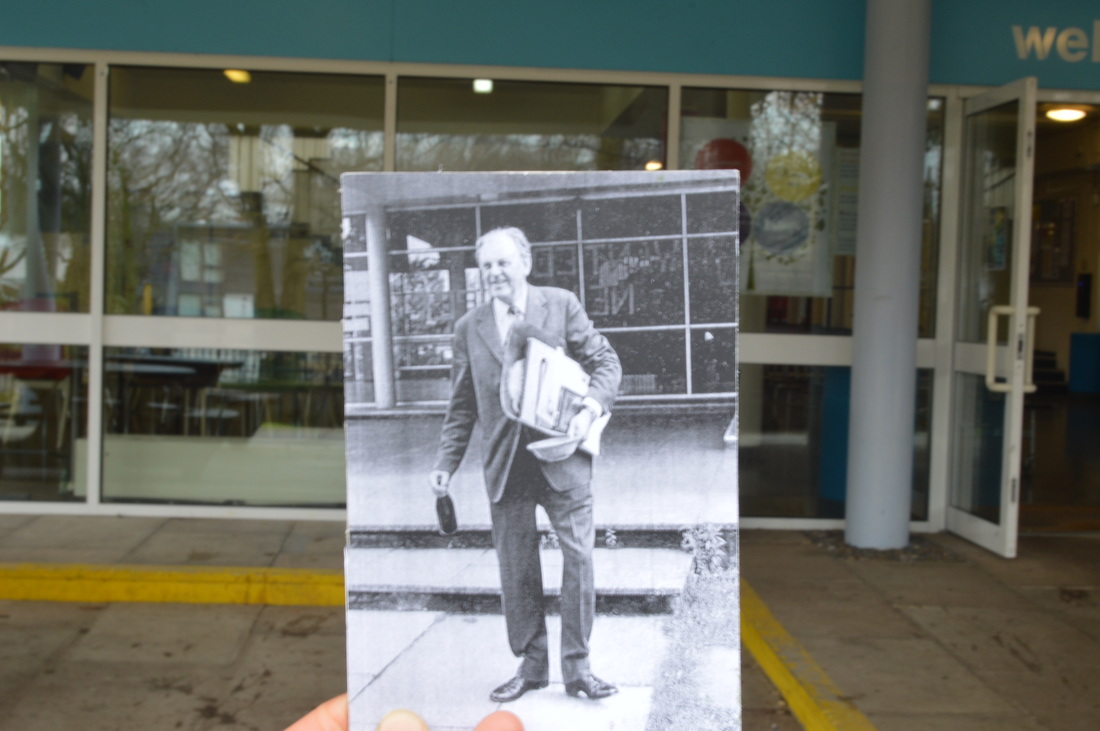
1. Location - Continuing and expanding on my earlier response to Taylor Jones' 'Dear photograph' project. I am going to use old pictures of my school and compare them to now. I plan on making it different from my first response by using old pictures that have people in it, more like Taylor Jones, so it shows more aspects of the past and captures a memory.
|
|
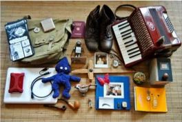
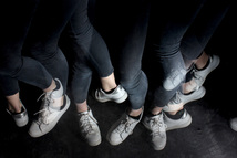
3. Burning house - based on the series of images by Foster Huntington (one of which can be seen on the left), I am going to ask people what items they would save if their house was burning and they were able to save certain things. This represents past, present, and/or future, because personal items usually become personal because they have some sort of history, hold memories and link to your life in the past. I will accompany each image with a brief description from the person whose items I am photographing, explaining why those objects were chosen.
|
|
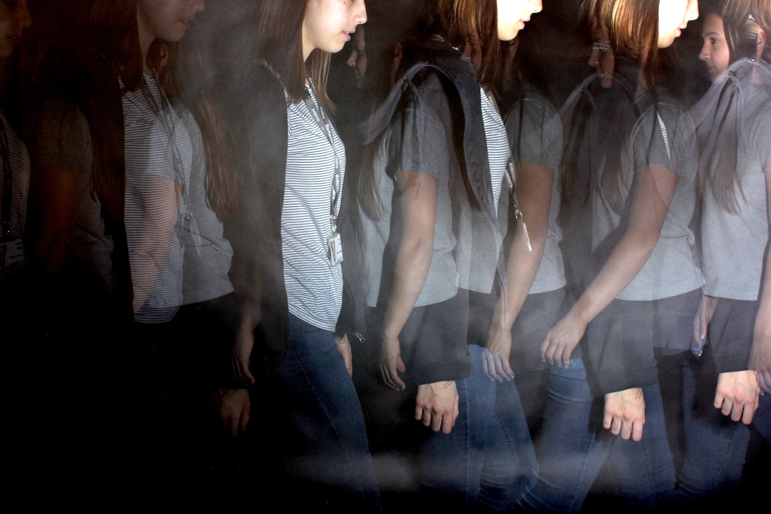
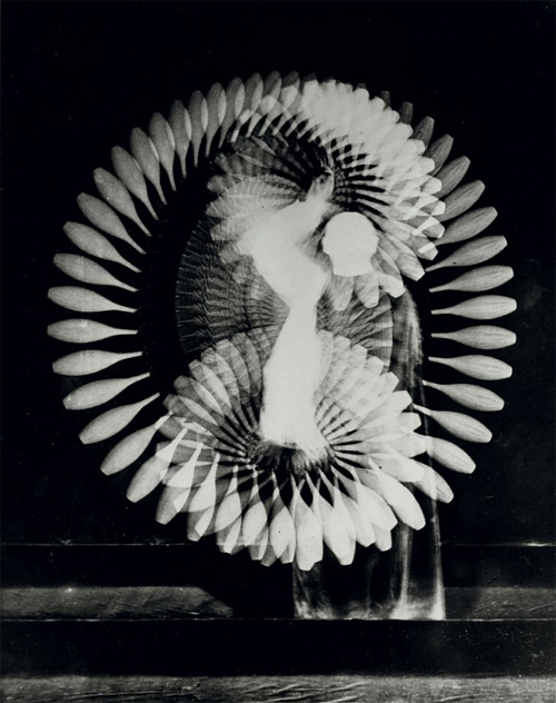
2. Strobe light - I am going to use a strobe light and a slow shutter speed to capture moving people/objects at different moments. This links to past, present and future as the past or the future can be just two seconds ago or two seconds later, and does not always have to be concerning a matter of years or decades. These images will capture these moments and represent the speed of transition from future to present, present to past. The artist I am using for inspiration is Harold Edgerton.
|
FIRST STRAND
LOCATION
|
|
HOW I HAVE REFINED MY WORK:
There are no technical differences since my first response. However, looking at Taylor Jones' 'Dear photograph' images, I realized that all of the images included a person or a memory that created a sense of nostalgia and reminiscing. Therefore in order to take a series of photographs that are different from and have more meaning than my last ones, I decided to take pictures around my school, choosing three old photos which actually have people in them.
FIRST RESPONSE
Old photo of the location held up to contrast past and present
|
|
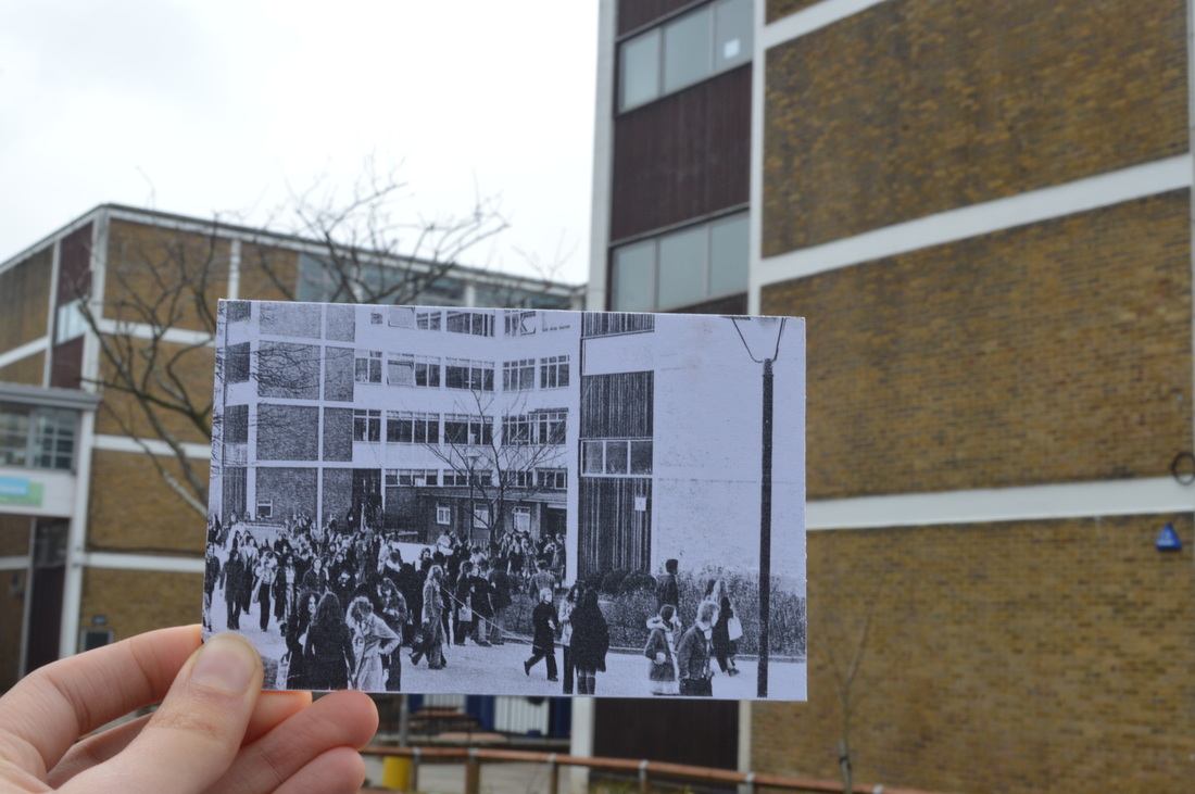
TAYLOR JONES ANALYSIS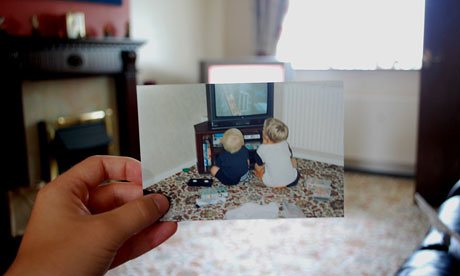
Taylor Jones photograph contrasting past and present that shows people/a memory
|
|
STRAND (2ND) RESPONSE
Photo that contrasts past and present, including people - showing what the location was like with more meaning
|
SECOND STRAND
PERSONAL ITEMS
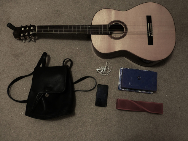
WHY THESE OBJECTS WERE CHOSEN:
|
"I chose these objects because they are sentimental and unique to me. For example I chose my guitar because I love playing and performing, and it was the first professional guitar that I ever bought. I chose my phone because it has all of my photos, videos and music on it, and I like seeing how, for example my taste in music has changed from when I was younger, so contains snapshots of my childhood in it and is very important to me as well."
|
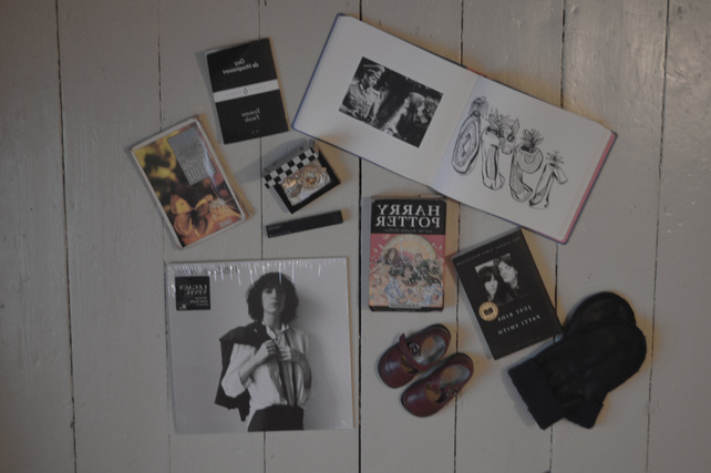
WHY THESE OBJECTS WERE CHOSEN:
|
"I chose these items for a number of reasons. Some, like the Harry Potter book and red shoes, have sentimental meaning because they remind me of my childhood and memories I would hate to forget. Others, like the gold earrings are expensive. But mainly, what unites all of these objects in my eyes is that they give me pleasure when I look at, wear or listen to them, and I know that if I were to lose them I would either have to replace them or spend an unnecessary amount of time mourning the loss of inanimate objects."
|
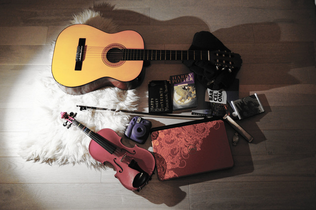
WHY THESE OBJECTS WERE CHOSEN:
|
"I chose to put instruments in the picture because I like music, particularly my pink violin which I got into Fortismere by playing. I chose my Polaroid camera because I like using it to take pictures, my photo album and a framed photo show this as well as holding happy memories. One of my closest friends and I bonded over our obsession with Harry Potter so that is why it is it is one of my objects because it reminds me primary school and my childhood."
|
THIRD STRAND
STROBE LIGHT
|
|
|

|
|
|
|
ARTIST AND ME
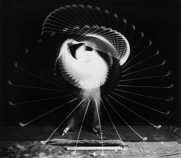
Harold Edgerton
Harold Edgerton developed the strobe flash and created images such as the one below using it. During the second World war he constructed stroboscopic units and he worked in association with photographer Gjon Mili who used stroboscopic equipment. My work compares because I am using the same method as Edgerton for the same effect. Harold Edgerton, however, takes his photographs for a scientific purpose, so his aim was not to represent concepts of time in the same way as mine are. However, he began the use of strobe light in photography and so probably inspired other photographers using stroboscope processes that do aim to represent such concepts.
|
|
The framing of Harold Edgerton's photograph is much more precise. It encompasses the whole of the subject in the photograph, while mine cuts the subject off at the edges slightly. Edgerton probably had more space to work with and could afford to take the pictures form more of a distance to achieve this. However this means mine are taken closer up and it means that the subject of the photograph can be seen a lot clearer, which is quite effective.
The difference between each individual flash of the strobe light is much clearer in Harold Edgerton's. I used photoshop to adjust the levels and try and achieve this clarity, but it did not work to the same extent as Edgerton's.
The most evident difference between mine and Edgerton's photograph is colour. Mine are in colour while his are in black and white. In later responses I could potentially experiment with this and try switching my images to black and white.
Both mine and Edgerton's images have a central point at which the person's movements overlap and are caught in the same place by each flash of the strobe light.
To conclude, from this I shall improve my own work in my next response by focusing on the framing and composition of the image.
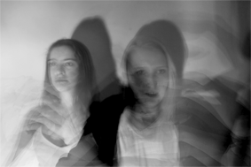
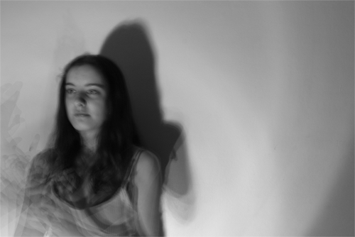
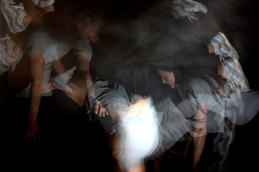
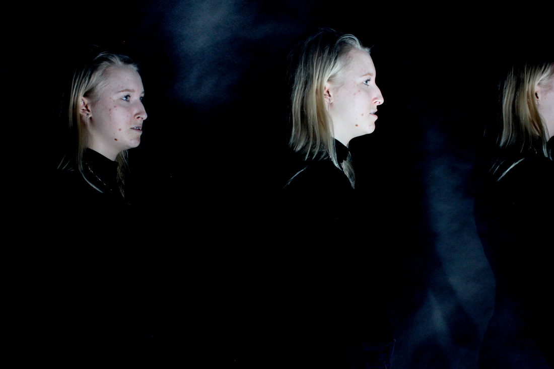
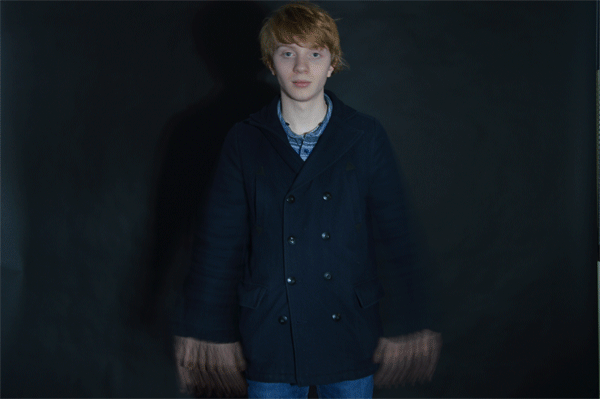
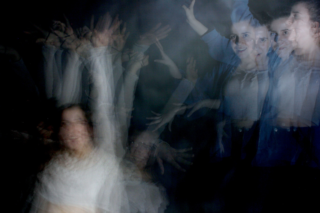
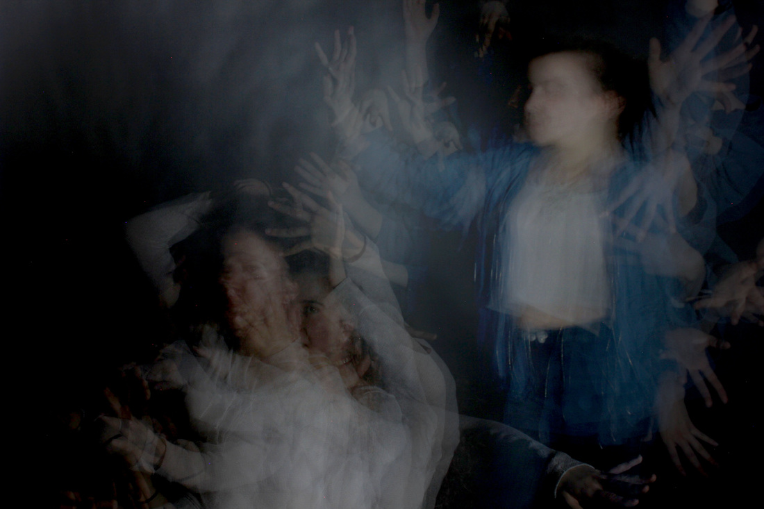
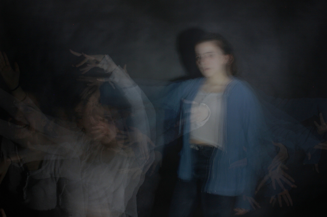
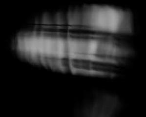
CHOSEN STRAND - STROBE LIGHT
FIRST DEVELOPMENT
I chose to develop my strobe light strand because it is a more unique way in which to look at the past, present, and future. When people think of the past present and future, most would think of it in a matter of years, and not a matter of moments, perhaps because change is more evident over a broader period of time. They tend to forget the significance of a single moment. For my first development in comparison to my strand work, I tried to focus more on simple movements such as just the arms or the head, as opposed to movements of the whole body. This way, I could focus more on the framing of the photo, and take into consideration how I could use Harold Edgerton's work as an example to improve my own.
|
|
|
|
HOW I HAVE REFINED MY WORK: FRAMING
STRAND RESPONSE |
|
HAROLD EDGERTON'S WORK |
|

DEVELOPMENT
|
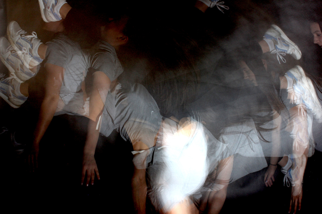
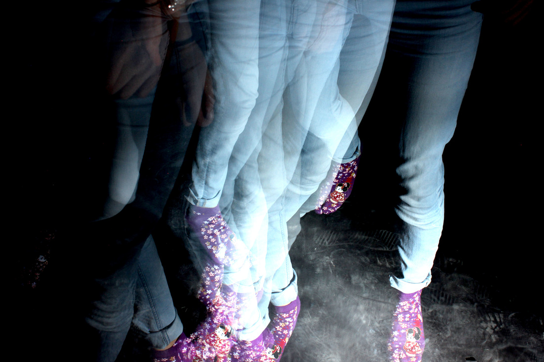
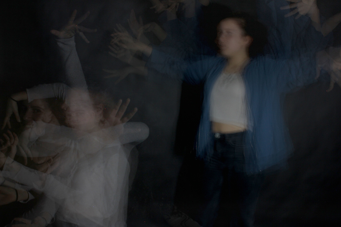
SECOND DEVELOPMENT
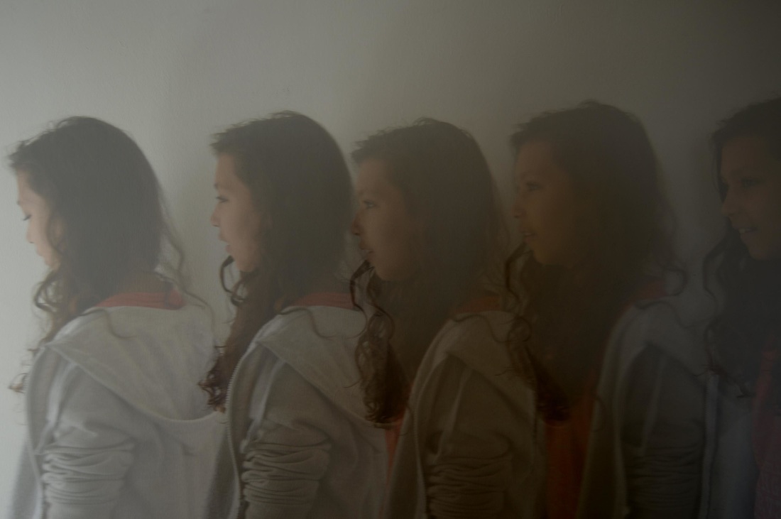
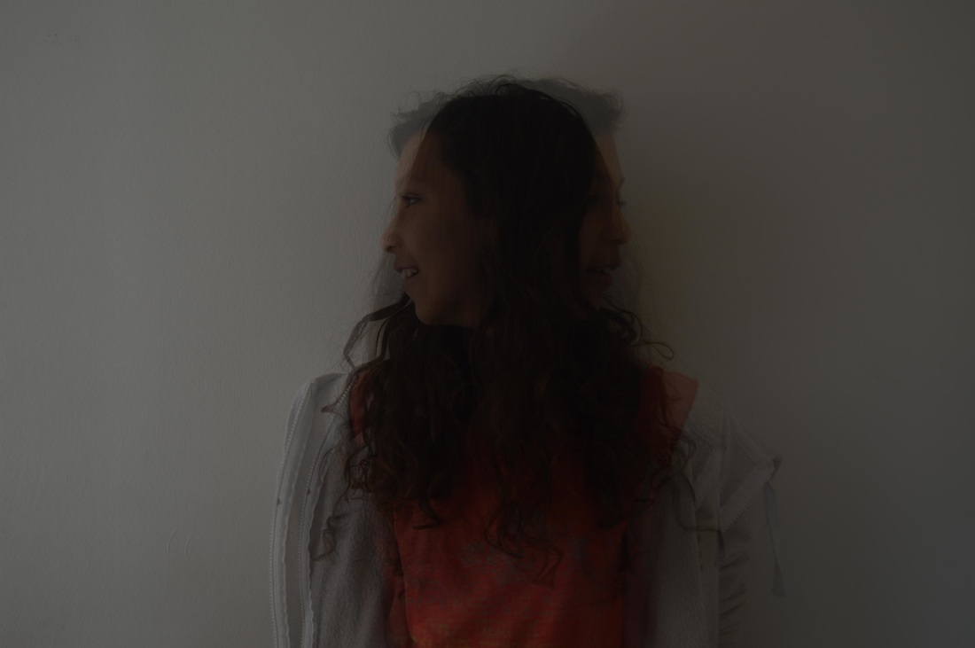
In this response I played around with the shutter speed and frequency of strobe light flashes to make the image captured in each flash a lot clearer, like Harold Edgerton's. I think that this response is more successful than the last and shows development as they are a lot clearer. Also I have taken inspiration from another artist to improve my work.

|
|
|
|
HOW I HAVE REFINED MY WORK: CLARITY
FIRST DEVELOPMENT |
|
RETURN TO LOOKING AT EDGERTON'S WORK |
|
SECOND DEVELOPMENT (IMPROVED DISTINCTIVENESS) |
ARTIST ANALYSIS
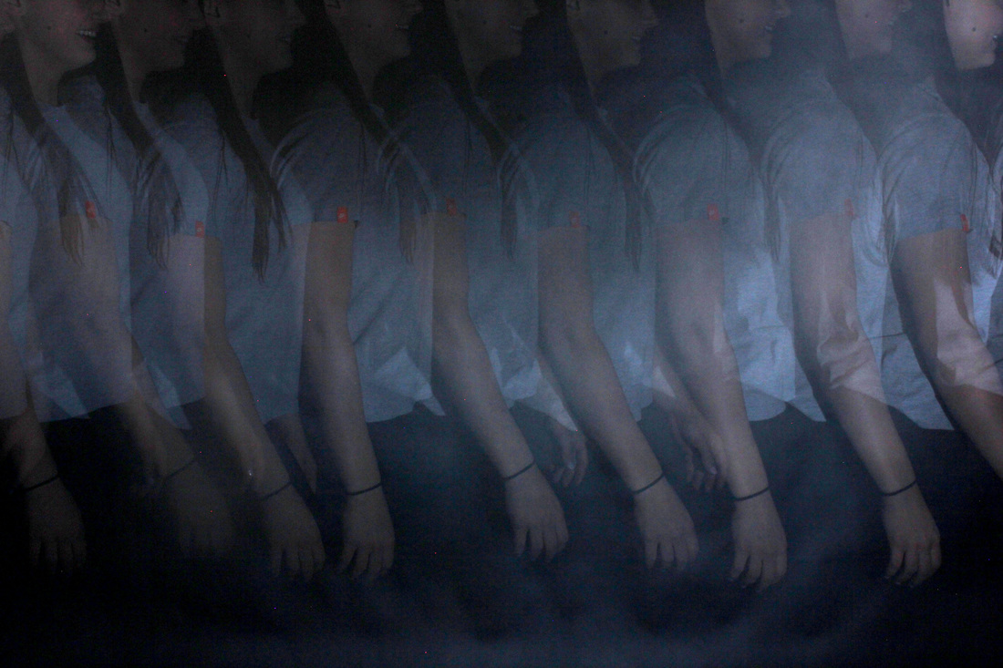
CHRONOPHOTO BY JEAN-YVES LEMOIGNE
Jean-Yves Lemoigne's Chronophoto series is a good example of how well strobe light pictures can turn out without photoshop, as there was no postproduction on these images. Although in my work I do use photoshop, it is only to brighten the picture and make the subject of the image to stand out more, and the effect I'm trying to achieve can be achieved without photoshop, but merely the strobe light and the camera.
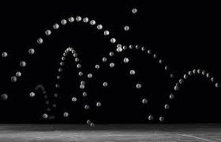
The picture shows the path of a tennis ball as it bounces across the frame of the picture. It looks as though there are many tennis balls all bouncing in the same pattern and it creates quite an intriguing image. It also differs from my own work/work of other artists I have looked at as it uses an object as opposed to the movement of a person.
|
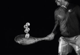
This image shows a tennis player bouncing a tennis ball on his racket. The main focus of the image is not the tennis player or the racket, but again the tennis ball. What I love about this picture is that the movement of the tennis ball can be seen while the the movements of everything else in the frame are so minute they can hardly be seen.
|
The picture shows the smooth, flowing movements of a tennis player swinging a racket. It looks as though a high frequency of strobe light flashes have been used to create this effect. This is because each movement looks very close together. This tennis player is in the middle of the frame.
|
EXPANDING MY WORK -
FURTHER STRAND DEVELOPMENT IDEAS
capturing the same idea without a strobe light:
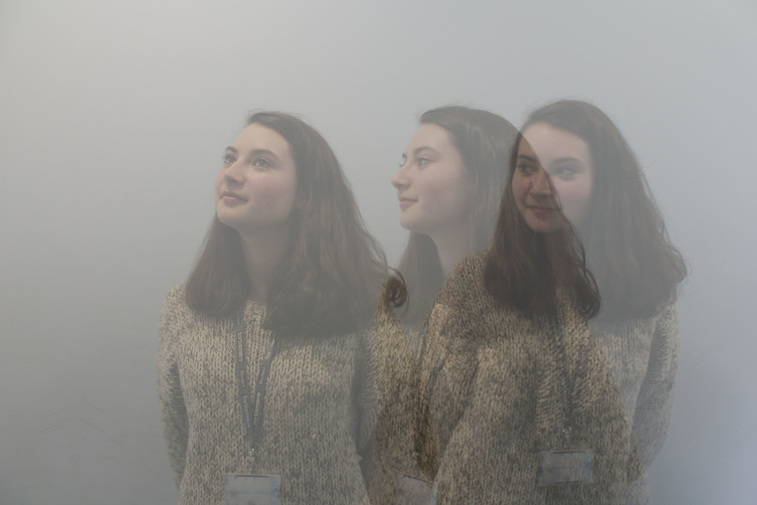
One alternative to using a strobe light is to take a number of photos separately and use photoshop to put merge them together. It still captures the same idea of different moments merged into one, showing the past, present, and future in a matter of seconds. It also enables me to spend more time and photograph more responses in my own time at home, instead of only being able to take pictures when the photography room/strobe light is available. I have already attempted one image to see how well it would work, and below is the result:
GIFs:
I could make gifs to create a more complex response, and combine merging different moments with playing different moments one after another. I have already experimented with one set of photos by making a gif, and it turned out relatively well, but I know I could improve it by keeping the position of the strobe light and the camera as still as possible between each shot. I also know that with more time I could make them more complex.
THIRD DEVELOPMENT
USING PHOTOSHOP INSTEAD OF A STROBE LIGHT
A I M :
To capture the same idea as in my strobe light images of different moments merged into one, showing the past, present, and future in a matter of seconds. However, without using the strobe light.
M Y P R O C E S S :
1. I opened the first image up on photoshop, and the copied and pasted the second image over it.
2. I reduced the opacity of the second image, so that the first and second could be seen equally, and it was not the case that one stood out more than the other.
3.I repeated this process with the remaining images, until they could all be seen and my image imitated my strobe light images.
4. Because reducing the opacity made the subject look almost ghost-like and near invisible, I edited the levels so that this was less so much the case. However, this was the biggest flaw with this response and for this reason, I much prefer the responses I made using the strobe light and shall continue that for my next response as well as my final piece.
|
|
FOURTH DEVELOPMENT
G I F s
M Y P R O C E S S :
To create this gif I began by using photoshop to layer to images (hence the person I am photographing being in it twice). I did this by copying and pasting two together and reducing the opacity of one of them.
Secondly, I adjusted the levels of the image to make the subject of the photo a lot clearer against the black background.
Then, to actually make it a gif, I clicked file, scripts, load files into stack, and opened up the images. Following this I selected animation from windows and from the corner of the bar along the bottom, selected make frames from layers.
O U T C O M E :
My gif didn't quite turn out as I had hoped, and the main reason for this was the fact that I hadn't kept the camera still between shots so it looks as though each frame is jumping around a bit. In order to improve this for my final piece, I shall keep my camera in the same position the entire time.
Another way in which I could improve this is to keep the shutter speed the same each time. I had my camera set to 'bulb', and as I was able to control how long the camera took the picture for as i was taking it, did not keep it the same each time. Consequently the lighting changes each time.
Furthermore, I could plan her movements out more. In this response. I took pictures of her moving randomly, and if I planned out her movements, it could be much more effective.

|
|
|
|
FINAL PIECE PREPARATION
ARTIST ANALYSIS
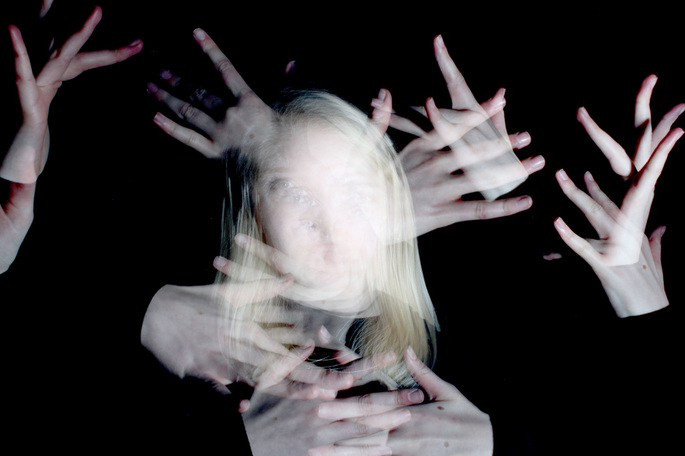
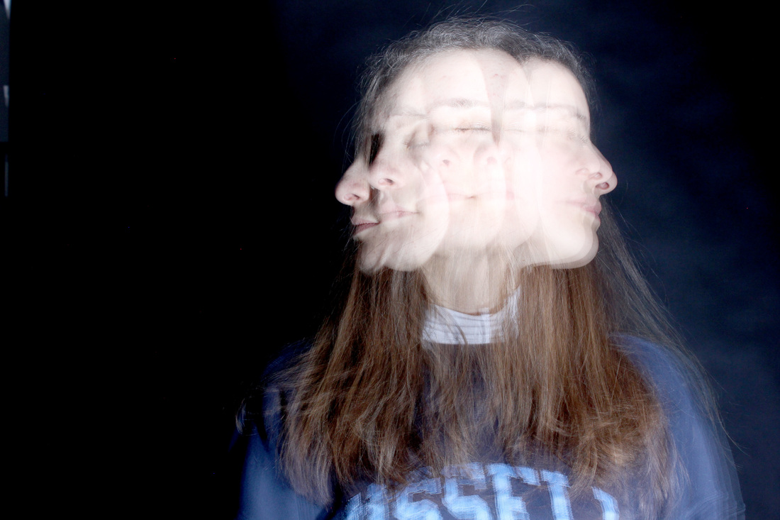
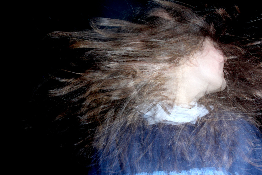
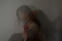
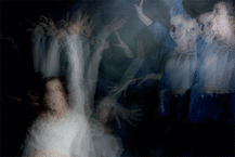
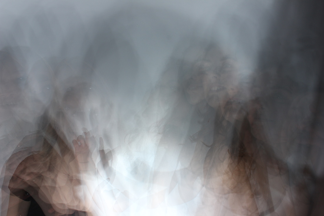
Kalliope Amorphous
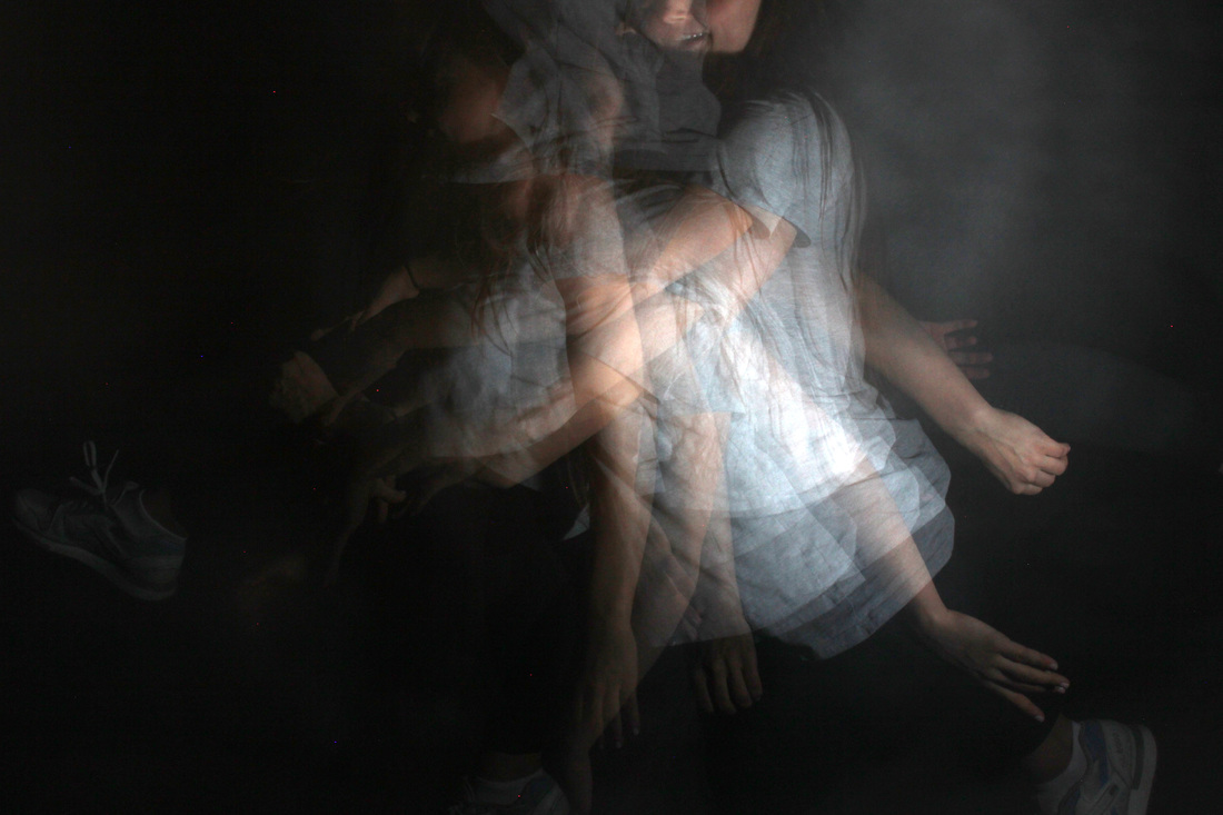
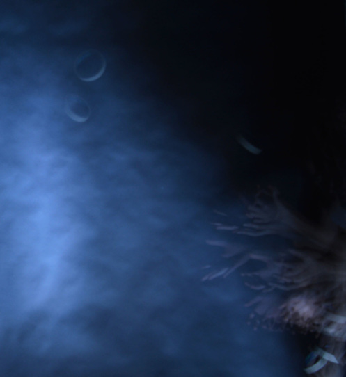
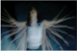
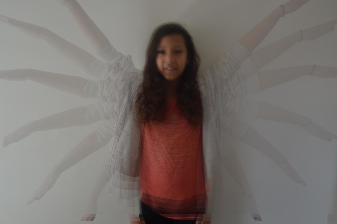
Kalliope Amorphous' photographs compare to mine because she uses light to create very similar images. What makes Amorphous' images different from the other artists I have looked at and more similar to mine is that the shapes are less sharp and distinct. They appear slightly hazy or blurred, while all of Harold Edgerton's and Jean-Yves Lemoigne's photographs are more clear and defined. This gives them an eerie feel. Indeed, the artist says that her work reflects her love of myhtology and the juxtaposition of light and dark, beauty and beast. She says that she is drawn to the concept of time, and therefore she provides a good connection between the exam title of past, present and future, and the processes I have been using in my work. Her photography is experimental and she uses handmade lighting.
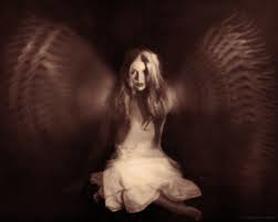
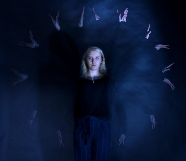
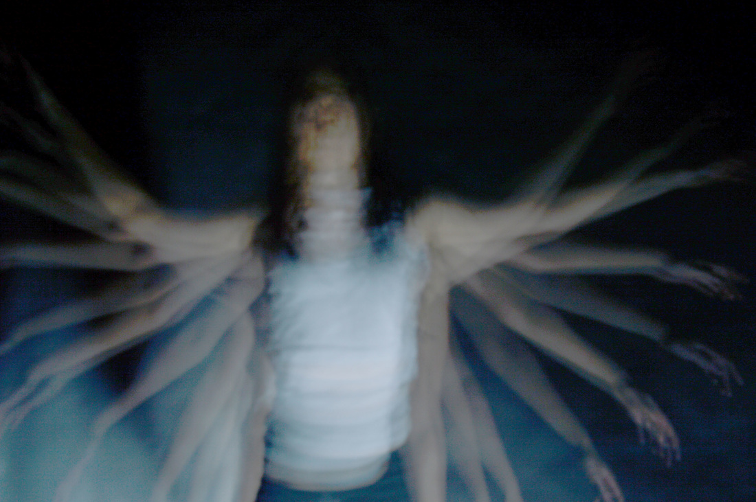
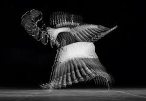
Similar to multiple of my previous images, Amorphous has used the movement of just the subject's arms to create what looks like wings. She has framed it so that the unmoving body of the subject is the central point, almost surrounded by the moving arms, and encompasses the whole of her body. Amorphous has also used sepia tones, which differs from all the other strobe light images I have analysed which are all in black and white. The subject of the photo looks like a mythical creature, which links to the artist's love of mythology.
|
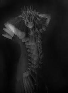
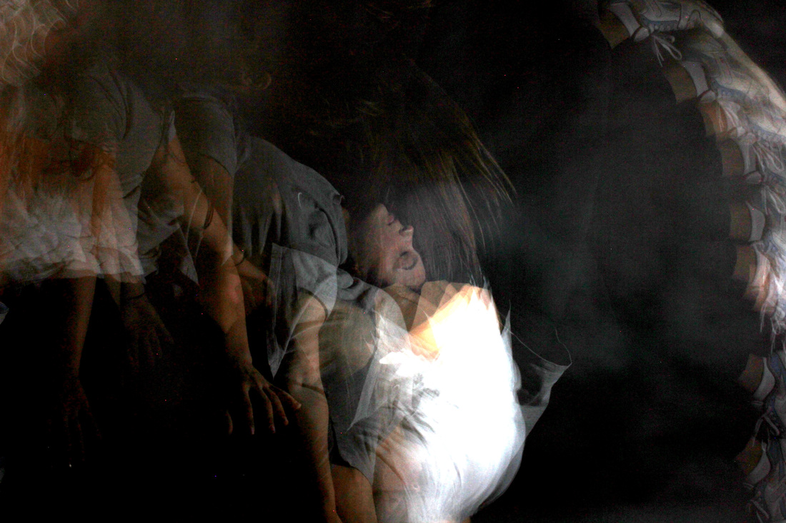
The artist has used a portrait orientation for this photograph. Exactly what the subject of the photo is doing to achieve this outcome is unclear, but their movements create a curved shape. Sharp and jagged angles have been created by the subject's fingers and bent elbows. Again, this makes the subject of the photograph look inhuman. The artist has left negative space along the side of the photograph, to contrast light and dark.
|
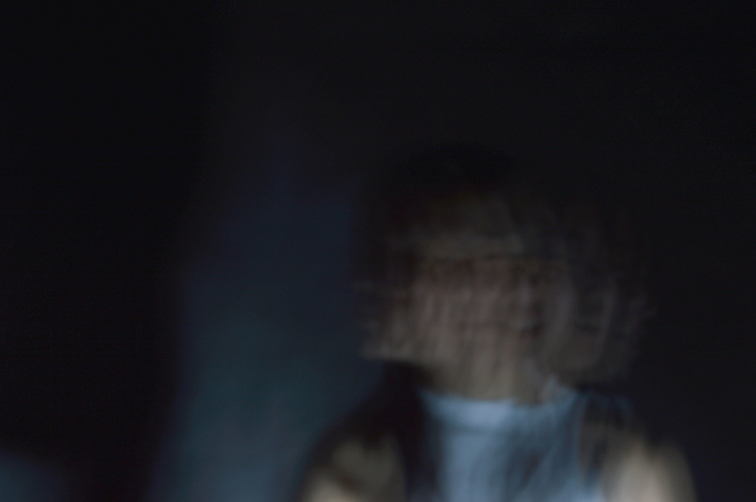
This image has the most sinister feel. It is also quite blurred and unclear which creates a sense of mysteriousness and ambiguity. The artist has focused on and captured merely just the face in the framing of this photograph. If the artist has used photoshop on this image, most likely it was to adjust the levels to bring out the pale ghostly tones of the face and darken everything else. This connects strongly to her statement about juxtaposing light and dark.
|
REVIEWING MY PROCESS OF DEVELOPMENT SO FAR
|

|
FINAL PIECE PLAN
1. I aim to include 3 individual photographs, and two gifs - one layered.
2. I will change the colours of my final piece to black and white, like the images of the photographers I have looked at in preparation and during my development.
3. From the experience of how my other photographs have turned out, I will aim to make my work more similar to that of Kalliope Amorphous than Edgerton or Lemiogne.
4. I will use a white background instead of a black background to make my work more diverse
TRIALLING THE WHITE BACKGROUND
|
|
|
|
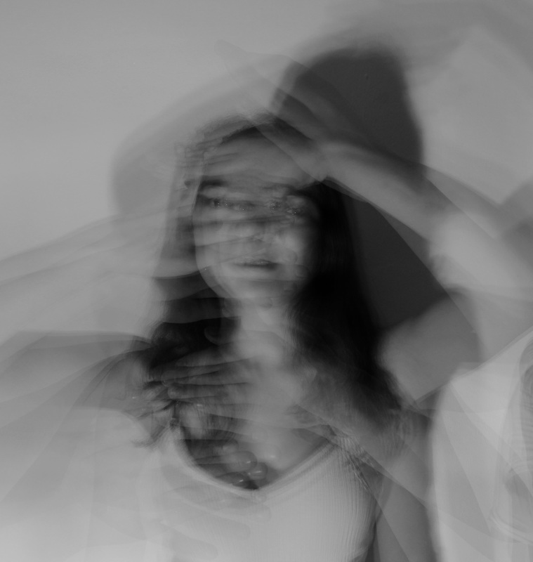
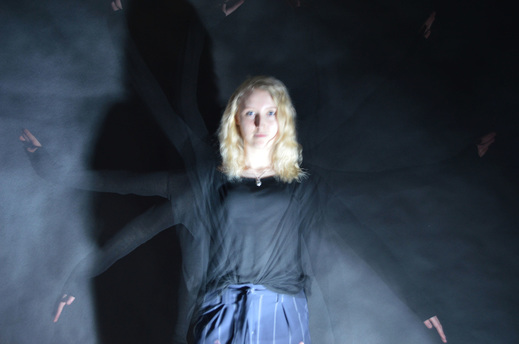
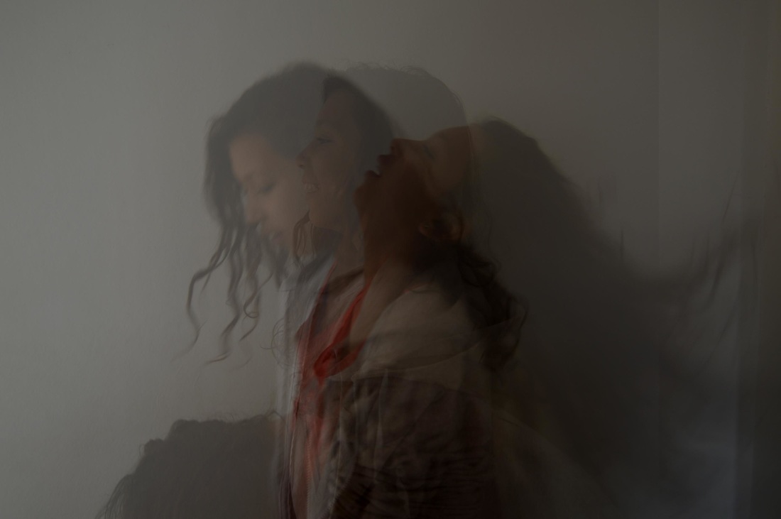
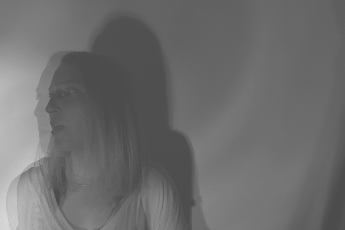
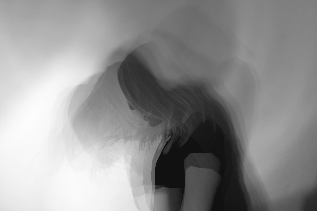
In order to ensure that the white background also worked and make the pictures turn out too bright, I took some pictures of movement against it. Overall, I think that it provides a better contrast between the person and the background. It also allows me to capture the shadows of their movements, increasing the complexity of the image, which I could not do with a white background. Due to this, I will continue to use a white background for my final piece.
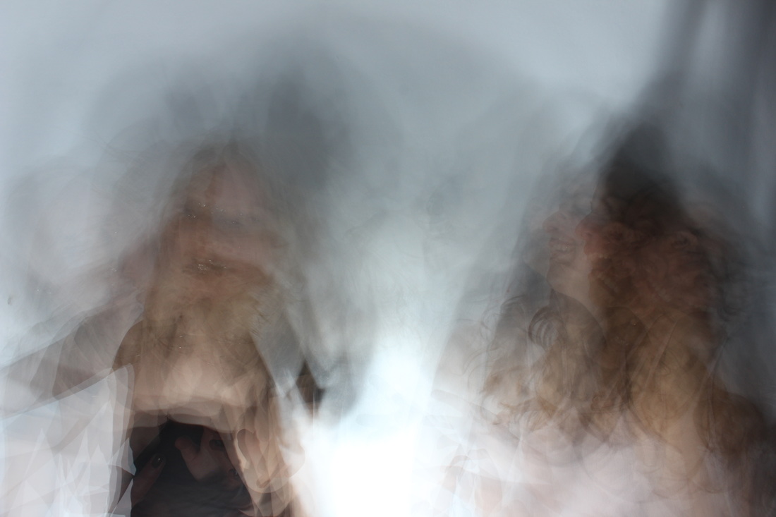
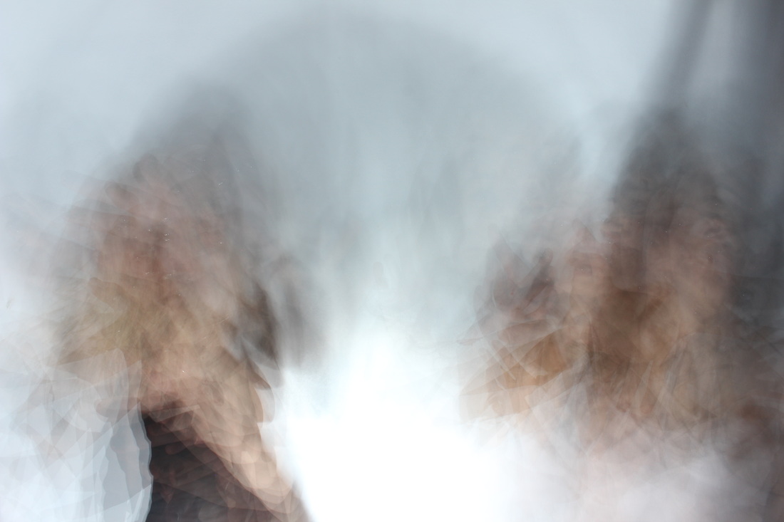
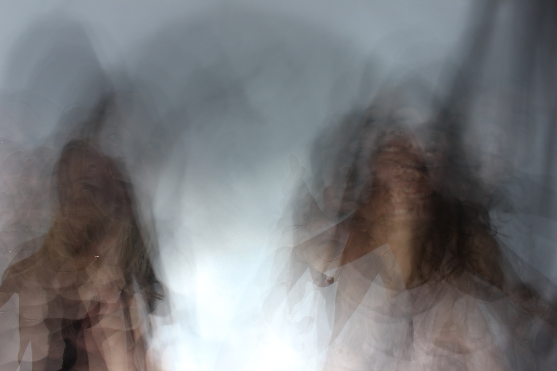
F I N A L P I E C E
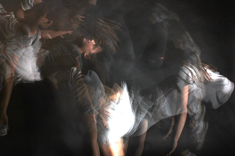
I took my final piece images using a strobe light against a white background. I photoshopped them to black and white in order to be comparable to and have a similar effect to images by other artists I have looked at in this unit. I also used photoshop to adjust the levels and put together my GIFs. In one of my GIFs, I placed two images over each other and reduced the opacity to create layered images before I put them together in the GIF. The artist that my final piece work draws to the strongest parallels to is the work of Kalliope Amorphous, as they give have a slightly eerie and hazy effect. The theme of past, present, and future is captured in the way that individual movements from different moments of time can be seen together in one image. Like my previous images, this series captures the speed of transition from future to present and present to past.
|
|